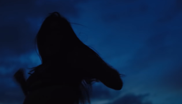
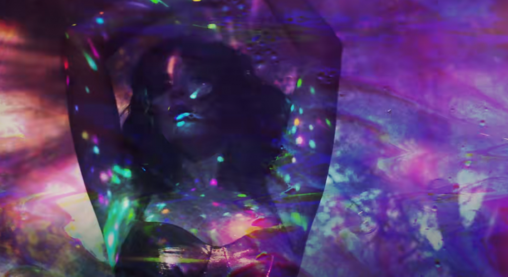
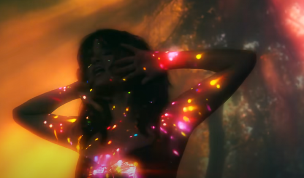
The initial stages of this project started with some introduction seminars from Jim Hobbs and Steve Kennedy on working methods for large scale projects. The introduction to their methodologies and work acted as fuel in generating further thoughts and ideas for my own practice.
We also looked at an interview script with Matthew Ritchie, who is an artist with a focus on installation and painting practice drawing. The interview focused on practice based research and making. One aspect which I found interesting for my own practice and would like to reflect on is the idea that public art is colourful and fun. On one side , I would like to reflect on how art which is out there, more vibrant or magical, might be more welcoming for the viewer. More appealing to look at, more open to interpretation and in turn possibly make it more successful? If the art is made for the viewer, viewer interaction or provoking thought from them would be that success I speak of. Although where art is not made for the viewer, but for the maker, the success rate lies in the eyes of the maker and external perception ceases to matter? I personally have always struggled with making my work for me and only me. I have always considered the way it might be perceived, whether it is good enough to raise some internal questions in the viewer.
Another aspect I considered in relation to this article and public art being fun, is that public art is also often very far away from this concept of a playground for children.
� Well, this notion of complexity in the public sphere. There�s a tendency to think that the only way people will be happy is if they behave like babies, build them a playground a give them sugary drinks�which is true, of all of us, we all love a nice, warm, cushiony environment�but that doesn�t solve the public sphere� M.R.
In fact, public art is often a disguise of anti-homeless structures, especially in big cities. In this instance, when I talk about art, what I am referring to is design and architecture specifically. The way parks, benches, covered foot tunnels and etc are designed so that homeless people cannot take advantage of the minimum the streets have to offer. However the design is passed off as a piece of art and not as a restriction. I repeatedly ask myself the question of what is art supposed to do, what is the aim of creating it. One of the many answers I come up with is that art is supposed to help people in one way or another. These structures in big cities are doing just the opposite. They are contradicting the statement made by M.R. about art being like a playground for children or adults, but they are also going against the core of creating art.
Moving on from this article and into Jim Hobbs’ work, I found out that A Clear Day and No Memories takes its title from a Wallace Stevens poem which I would like to reflect on.
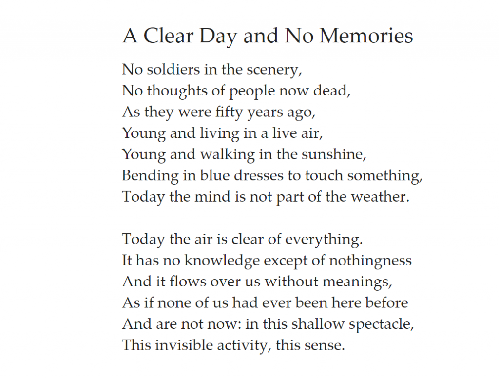
There is lot of serenity in this poem, calmness, also a lot of negation but no sense of regret. It is almost like a poem of becoming free of something. Also of accepting the entirety of something through the denial of memories and thoughts. It’s a very humbling poem in a way that it denies knowledge, meanings and more and it focuses on the here and now through the elimination of these multiple external factors through the use of written words.
Meanwhile, A Clear Day and No Memories by Jim Hobbs takes on the medium of moving image and sound in order to communicate its message. My instant question was whether the work is a visual representation of the text by Wallace Stevens, or it only takes on the name as as a not so direct approach but rather reflecting on the poem or paying respect to it as a core inspiration.
Many aspects stood out for me in the experience I had whilst watching this film. The speed of the film to begin with along with the doubled screens and constantly changing numbers were overwhelming as a start point of a film. I didn’t feel the need to anticipate action or experience but was instantly dragged into it because of these factors. Then comes the flashing or rather pulsating light. This pulse reminds me of unfinished business, of a place that is nowhere because it doesn’t belong to the existence of the light, nor does it belong to the lack of it. This sort of bring me to the poem and the calmness it projects, this pulsating light is what calmness feels like.
And suddenly time starts to move backwards, neglecting the rules that people have assigned to it. Which again bring me back to the poem and my understanding of it which includes denial of knowledge and meaning. The overwhelming presence of clouds also brings some sublime and heavenly quality to the film, which also I feel like could have not been achieved by using a digital camera. There is just something much more surreal about these clouds on film, also the way film has encapsulated the frame in this deep black borders.
The soundtrack created by experimental band Kinski adds to the experience in a eerie yet calming way. I imagine it being a factor which almost entraps the viewer/listener in the space of the screening. The alternations between ambient sounds and almost aggressive guitars and feedback acts as the vessel which brings the whole experience in full circle.
Tutorial w/ Jim
This tutorial worked very much as a way of pitching ideas about my work as a whole. Some main points that I cam out of it with were: I would like my work to be about what some may call unnatural or surreal experiences, a perspective which is not quite �the norm�. It�s like an alternate reality that doesn�t exist in a physical form, but I am trying to build it visually through a physical space.
Moving forward, I will initially focus on finding the right locations for the changing environments. I think light and the colour of it will play a big part in this piece as it has in previous ones, but this time I will approach both natural and artificial light. Natural for analogue and artificial for digital. I think that sort of compliments the materials and the processes I have chosen to use. I guess my methodology in a way is within process but also in location. The environments I choose to film the fictional character could act as a reflection of their inner state and that would be generated from me exploring different spaces, documenting them and reflecting on their qualities?
After discussing place and space in relation to my thoughts so far in this tutorial, Jim Hobbs introduced me to a few new artists.
Kurt Schwitters
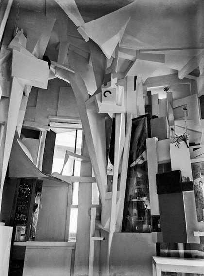
was one artist who I related to in terms of installation and space. He uses space in a way where he shifts and deforms its original being into something totally different. Although his work seems rather geometrical and minimalist in comparison to what I practice, the aspect of how he forms space is something I admire.
Kurt Schwitters
Merzbau
This work is considered the inspiration for many installation artists. Schwitters started the Merzbau over again every time he moved home and I find that incredibly impressive. The Merzbau acted as a part of his life and a part of him, rather than a piece which exists by itself. As this work became a lifestyle he also came up with a word for it, merz, a nonsense word to describe his collage style installations/ assemblages. Merz could mean anything really, for me it is about space and the deformation of it. A whole environment which shifted constantly.
When I think about the deformation of space I imagine a space which is inconvenient and unconventional. One which might not be what we expect, use or explore in our daily life, but rather a space out of the ordinary. A space that challenges perspective and preconceived notions of what we believe space to be.
Laura Hindmarsh
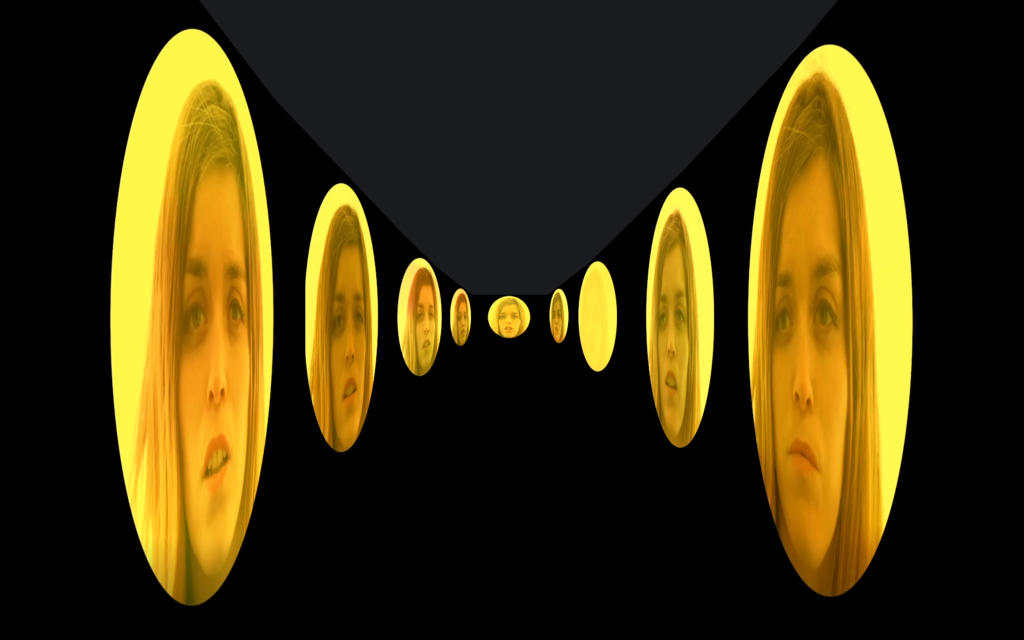
Finding Focus (2016)
This work instantly spoke to me. Because of the infinity present in the space being explored, the unknown but also the touch of divinity in the saturated light.
The woman comes into the shot using a light meter to check the light, which makes me unsure of whether this film is a test shot or a performance.
As I continued to watch I realised there is a loop being created with the slight difference that every time the women stands in front of the camera, it is a bit further away.
The horizon also plays a part in hiding the woman from our sigh as she runs into the saturated light.
This work has visualised some thoughts and ideas I’ve been having about a sequence I want to shoot on 16mm in the woods.
Laura Hindmarsh has another film shot on 16mm called Atlas (2018) which also focuses on light. Although Finding Focus (2016) has been given that name, it does in fact focus greatly on light. From the choice of the artist to present the light meter and the action of measuring the light. To the fact that the light seen in the horizon has engulfed the space we are presented in and also masks the woman as she runs away from the camera. Hidmarsh also makes use of light leaks as transitions into the following sequence of the loop that she presents the viewer with. We can say that the light leak makes the woman disappear I supposed, but I do see it more as a reset button in what the protagonist is aiming to achieve.
That idea of a reset button a loop makes me think back to the concepts I explore in terms of mental spaces or states and choosing to exist in a psychological space that people might create for themselves. Consciously or subconsciously. This idea of a reset button could act against the ‘glitches’ or in other words the destabilization of ones mind.
Anyways, back to Atlas (2018), Hindmarsh is using a light reflector and her shadow to block the last rays of daylights in what seems to be the same field she filmed Finding Focus. She also uses the same technique of loop, repetition and plays with distance and scale. In her artist statement, she talks about being uncomfortably close to her subject of work, often using repeated snippets and the re-enactment in order to shape what is uncomfortable into a new form and create anew relationship with the subject matter.
Thinking about video feedback loop
The idea of feedback loop also came up during the tutorial, as alternate reality and destabilizing time and space were discussed. Positive feedback loops enhance or amplify changes; this tends to move a system away from its equilibrium state and make it more unstable. Negative feedbacks tend to dampen or buffer changes; this tends to hold a system to some equilibrium state making it more stable.
A feedback loop is also how the human brain learns. I can imagine a sequence of a bit delayed feedback loop video, as a way of remembering or learning and confirming what we’ve seen or experienced. So what happens if we experience or learn something we don’t recognise or can’t comprehend, would that feedback loop destabilize, create a glitch? Maye one of the feedbacks won’t be identical to the others, but would be representing an alternate reality. A reality which exists out of our three dimensional perception but has somehow found it’s way into our subconscious mind maybe. Although as we are built to understand only this 3D world, this new information can become very difficult or impossible to digest, damaging our cognition.
I suppose there is much to be explored here, but for the purpose of what my work aims to do, a feedback loop can be used visually as a way of communicating the transition or travel into an alternate reality, a world where time operates on a different level. I could also incorporate it sonically, which would create an instant disruption in the embodied experience.
Pecha Kucha
My presentation was based around the idea of using light in order to reform a space and use its properties to create something new and otherworldly. My focus on light began unintentionally with my previous project, Expressions.
And so, I would like to explore that further possibly in relation to different states of mind. More specifically I want to manipulate light by intentionally adding external factors into the equation.
I would like to note that I filmed Expressions at the King Cross Light tunnel which as seen in this photograph is literary half covered in this long panel of light which extends to the ceiling. What I did not take in consideration was that the high frame rate which I was shooting in (120fps) would distort the lighting and make it impossible for me to get rid of a very obvious flicker.
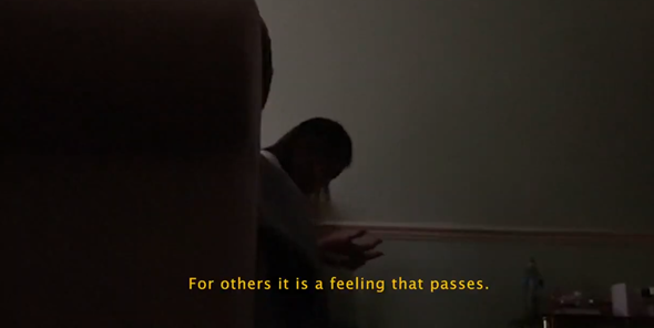
I decided to embrace the flicker and turn it into intentional flashing light. And I think that probably at this point light became a big part in communicating this state of panic and anxiety. The flicker on one side contributed to the time unreality and to communicating this mental place. On the other, it induced this sense of unease and fear through its repetitive and never-ending nature, which reminded me of this scene called 2 seconds of nothingness which presents the protagonist looking for 2 seconds of nothing instead of the panic and anxiety she is going through. (Euphoria, Sam Levinson).
This scene is what pushed me into my decision of further exploring the use of light in different creative ways which also included the use of different colour, shapes or reflective surfaces and intervals, meaning the slowing down of flashes to allow complete darkness on screen at times.
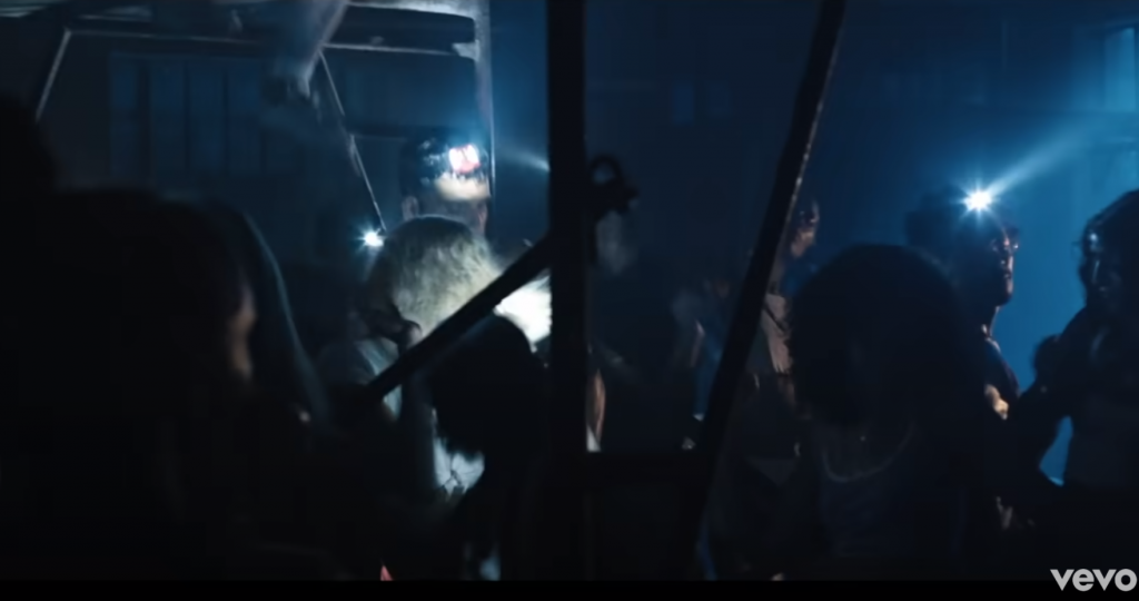
Whilst considering the different ways of manipulating light and taking colour in consideration, I had a look at the music video of Rare directed by BRTHR (Alex Lee and Kyle Wightman) who are known for using overwhelming light and colour and the one for Electricity directed by Bradley and Pablo, which focuses on darkness. I began with some experiments based on the so far mentioned use of light. One being the slowly changing intensity of light inspired by the 2 seconds of nothingness scene. I initially did it with a white light but decided to add some colour in post and later project in further experiments as a source of light
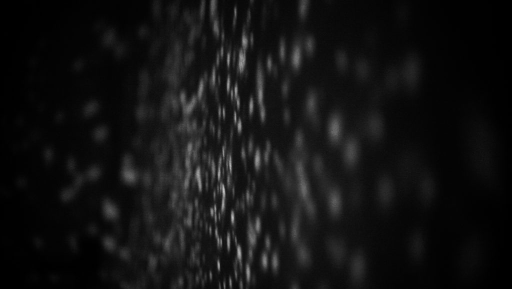
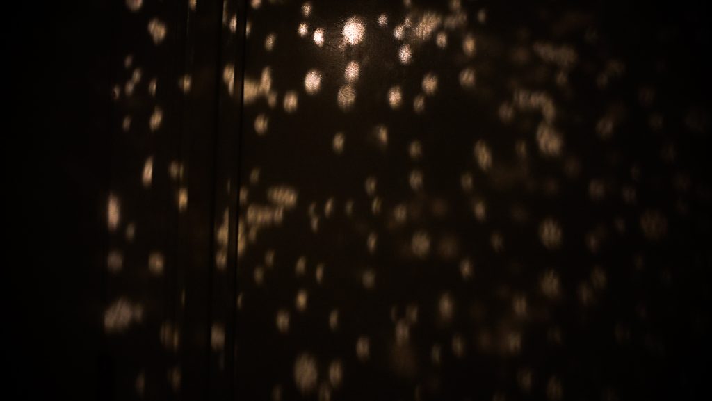
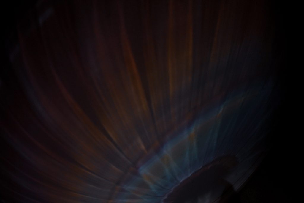
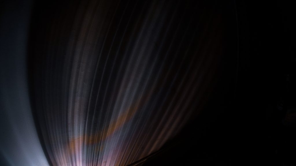
I then went on to simply examining the shapes created by a glass which has a lot of indentations in it and manipulating the image by moving the light which created some very interesting stretched and distorted shapes. This was rather easy to do as I only had one light source which was a small torch. Following this, I moved onto experimenting with different colours which I have so far seen used in creative projects that have drawn my attention. I also continued using glass for this experiment to get the colours I was seeking. Some interesting texture also came through in this experiment.
I also thought about stencils. Some creatives had done DYI projects to create this specific stencil, however I luckily had a little gadget at home which I could test out. There are some downfalls to it, so I would ideally create a larger scale one and customize it to my liking if needed in the development of this project.
These simple experiments led me to understand that there are so many ways to manipulating light. Although they focused on material and process rather than concept, it is evident in the examples of series and music videos that I have given that it is possible to use light in communicating a certain state of mind.
I will have to do further research in to developing that aspect. Most importantly research into the common connotations to certain colours such as the ones of yellow to danger or warning as presented in my Expressions piece. This further research would be vital in order to avoid visual miscommunication. I would like to develop these experiments further by introducing actors, models or even dancers and focusing on creating a sort of communication between the use of light and the performer through colour and movement, but before that I would like to do some experiments with text.
I will quickly touch upon this aspect of using typography which was only recently introduced to me by Fraser Muybridge. Considering my project will most likely be focusing on communicating a state of mind I thought that I could introduce some sort of typography as a representation of thoughts and feelings. I have previously used simple text in my work as a way of adding on another layer of narrative to the visual one. I would like to challenge this plain usage of text in the commonly seen subtitle form and experiment with its position, size, continuation and other aspects.
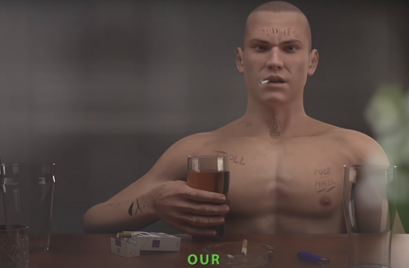
I had considered this development for my Expressions piece as inspired by Ed Atkins who uses narration as a way of communicating the thoughts of his animated character. He uses different types of fonts, also a variety of font sizes, as well as colours as seen in the example on screen.
One Week Project CRIT
Light and Reality: Thinking back to Peter Barhurst lecture about reality, can I use optical illusion and the light to question what is real, maybe showing 1 figure in multiplicity and asking which one is the authentic and original one or maybe just asking which light source is real and which is reflected and if that even matters in terms of our reality. If the sun wasn�t real but it was like in the Truman show, as far as we are not aware of that, our reality stays the same, the sun is real.
I thought further about the use of VR in Peter’s work and the concept of reality he explored and found a video on YouTube, Metaphors of Presence: An Experiential Design Framewok for VR & AR. One thing that really stood out for me is the division it takes in Representations of Reality in relation to the 4 elements of fire, air, water and earth, known as the Elemental Theory of Presence. Fire being the active presence, air being social and mental presence, water being emotional presence and earth being embodied presence. When I think about my work, despite using the word mental very often, I really feel it is more about the embodied presence. This becomes almost ironic as the embodied presence is described as bringing grounded sense of reality, and what I am aiming to do is question ‘reality’ as a concept and the way the word suggests this indefinite uniqueness or rather its singular existence.
Another theory this video suggests is that light refers to spiritual presence. When spirituality is brought up, people often tend to resort to assigning it to a religion, where there is also many references of light being a divine presence or a way for human beings to express themselves in non-physical ways.
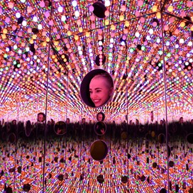
Yayoi Kusama, Longing For Eternity
I was searching up hall of mirrors and optical illusion works for inspiration and I came across this infinity room curated by Yayoi Kusama. The room is filled with lights and different types of mirrors. Some positioned to reflect in each other and other for capturing the reflection of anyone exploring the space. The playfulness of the lights through the colours chosen is almost purposefully misleading whilst looking at the darkness that comes with the infinity illusion presented. Similarly to the exploration of dissociation I have taken on before this room bring in questions of how much of this initially exciting and vibrant world is really what it seems to be.
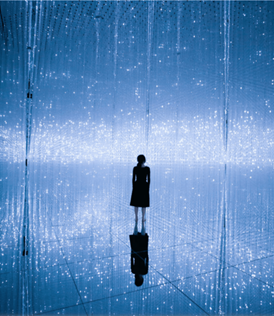
Teamlab, Planets
This is another image I came across and it is a digital installation created by Teamlab. Their work is very much focused on immersion and I feel like although they might be often looked down on in the art world, it doesn’t cancel out the fact that they can create magic through glass and light. This installation and pretty much any other that they have created looks like it is a scene from an amazing futuristic, sci-fi universe and I’m there for it. I would love to actually experience one of their works so that I can have a first person perspective, but their website is quite informative and includes videos which make it easy to assume the experience one might have.
All of the above led me to the Light CRIT experiment which aimed at creating an optical illusion through the use of glass and light.
Experiment
What I end up doing is break glass into many small pieces and shoot at 120fps, getting that light reflection in. I had a selection of glass; from white, green, vibrant multicolour and etc.
The experimental video end up being divided into a more surreal vs real ‘part’. The first part, the surreal one, gives off a sense of a weird experience of going on a late night drive and falling asleep at the back of the car. It tells a story about traveling in a vehicle but also travelling back in time, there is something nostalgic about that experience.
The beginning could also be considered as euphoric ,whilst the second part brings you back to reality.
Interested in the narrative � idea of people sying its telling a story, doesn�t need to reveal what it is, the abstraction can allow for misconception of scale and that can be very exciting in understanding of who you are in relation to that. There’s a huge potential for playing with the gesture of scale and how the viewer reacts to that. When something is abstracted we don�t have a visual reference for it at all , when something is abstracted we loose a reference of the scale it can be in and we can make it in much bigger or smaller version of it.
Phantasmagoria � idea of sequences that relate to dream .
When we begin to put together a series of images which take into a hallucination. One moment of blue light hovering, trying to come into being, suddenly being taken into a different narrative to what it started off as. The experiment seems to be most affective when it is most organic and not having a full mirroring.
Questions and Notes.
History of ambiguity and amorphous shapes that can�t take form, that exists as pure light of the unknown � used in old sci-fi movies.
What can’t you see behind in the darkness? First part was like a portal into the second part.
Idea of are you trying to give an illustration or give an experience?
When does the illustration stops and it becomes an experience?
.quasi
Tutorial w/ David Waterworth
I had a tutorial with David Waterworth and we discussed all things conscious and unconscious mind, reality and perception, relationship between science (psychology) and art, and finally light and colour. All of these are aspects I have been exploring and questioning in a rather existential way. I hope that tutorials such as these, as well as further research and experimentation, will help me establish a more concrete definition or question in regards to my work. One artist David has suggested to explore and who I feel has helped me get a step closer to there if Susan Hiller.
Light and Susan Hiller
Her work explores the unknown phenomena we all question but cannot scientifically prove. From near death experiences presented as multi screen installations of interview excerpts with a multitude of people (Channels, 2013) experiences of unconscious, subconscious and paranormal activity.
Although I would not quite use the word paranormal activity in relation to my research, my work does look at phenomena of the immaterial existence. It longs for understanding the relationship between body and mind, but also of mind and body in relation to external factors. I tend to create these digital surreal spaces as a way of ridding the world the work exists in of boundaries and possibly allowing for the subconscious of the viewer to take over in a way that the mind of the protagonist that exists in this digital realm has transformed.
Light acts as a a way of grounding the presence of the protagonist in the ambiguous place they exist in, as well as captivating and immersing the viewer into the experience. There is also something about the ability of light to alter details into silhouettes that I find captivating and will explore further in this study.
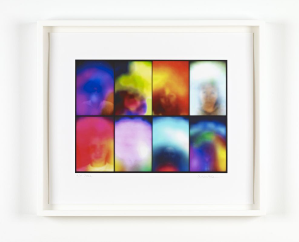
On this piece: Small Study for ‘Homage to Marcel Duchamp’ , Print, 2012
This work caught my eye with its illuminating colours and the layering that exists being without boundaries. Often with layering images I find it, the layers can exist separately as well as together, however in this work of Hiller’s the extraordinary light and the people captured exist as one and that is very clear. Light in this instance is creating some immense energy that is being emitted through this imagery. It is as if the people captured have become this energy and are generating movement within a still photograph. These visuals might be described as aura which is a quality surrounding or generated by a person, in this case most definitely generated by.
On the use of light as energy , bathing people in light, Susan Hiller’s work on this website.
CRIT 2. After Effects Portals
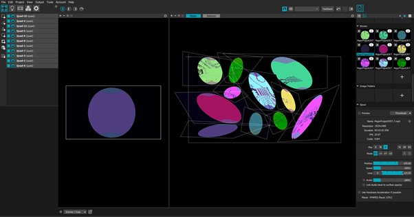
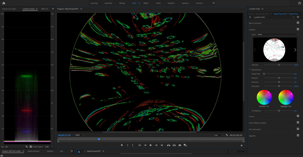
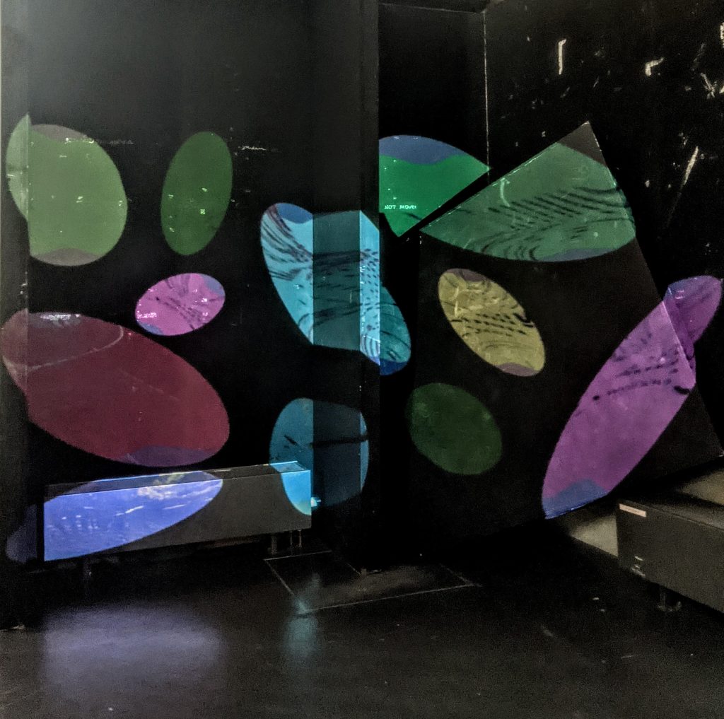
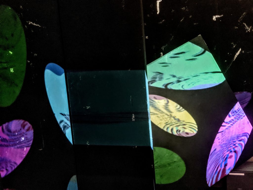
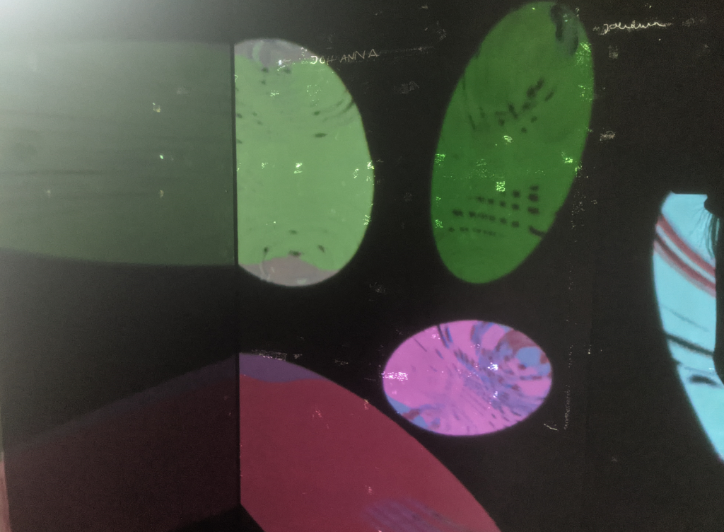
Based on up to date experiments and research I decided to create some graphics within after effects with the idea of simulating previous experiments with glass and light. I played with a circular shape and positioned many ellipses within a 3D space, some small, some large, some stretched and etc. I almost was looking for some sort of ripple effect to create to start with but later went with a randomised movement of the ellipses within the sphere.
That followed with altering colours and creating many of the same graphic. I then used MadMapper to bring together all of the different coloured ellipses created in AfterEffects and looked for an interesting surface to experiment with for installation, as I wanted to learn more about projection on a non flat surface.
When it comes to concept, I had 3 key words that I was working with which were multiplicity, reality and insanity.
Installed
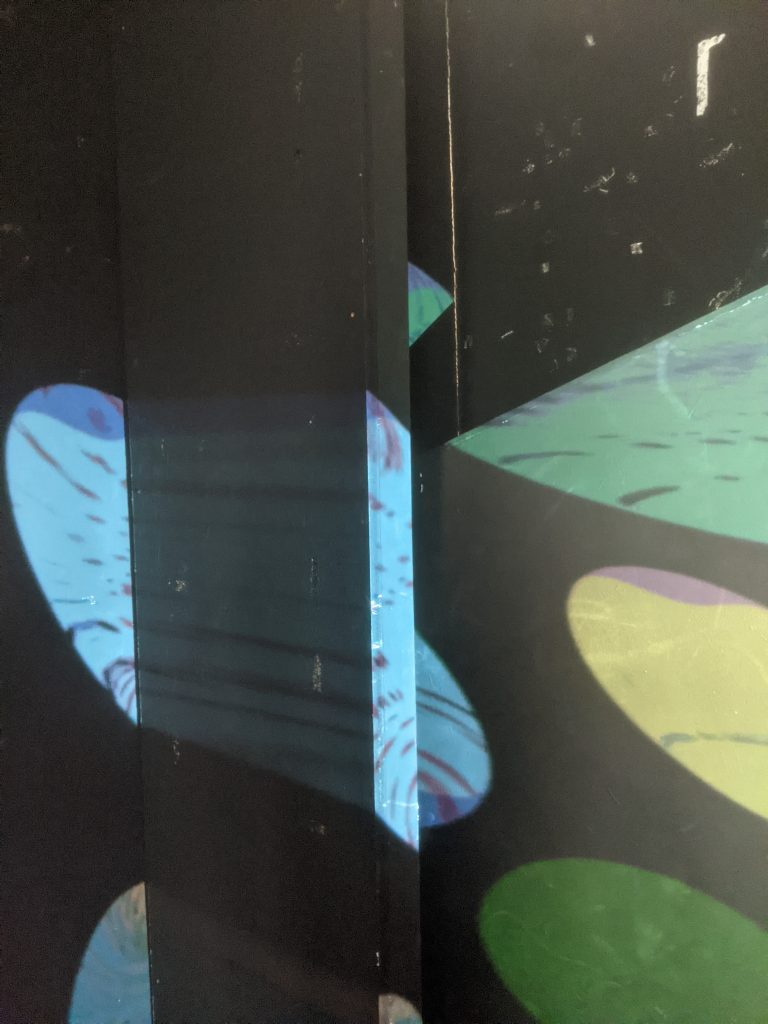
What came out of the installation was not something I would repeat per say, but it did work as a catalyst for some new ideas. It was the second time that the words portal and scale have come up and so I considered scale is relative to many external factors and although these portals might be seen as rather small , the world that potentially exist within them can be infinite. There is definitely the idea of multiplicity as well. Different viewpoints, velocity of movement being increased by the shape of the surface being projected onto. But also fractured perspective as the shapes are distorted by the material or shape of structure they’re being projected onto.
There is something about the aesthetic that suggests that these portals are visualising the different dimensions that exist, also known as the multiverse. If I had to ground my project into a particular word for people to easily digest the notion of the space being explored, I would say that it works under the ‘rules’ of the sixth dimension or is even it, existing within us as humans.
Presentation Proposal
/Presentation Transcript
For this project I will create an installation which presents 3 different psychological worlds through projection onto portal-like sculptures. I will incorporate previous works such as Expressions and Blue Esc as the worlds of panic and dissociation as well as a new short experimental film which will aim to transform environments as a reflection of the inner states of the protagonist. More specifically mental changes from melancholia to elation.
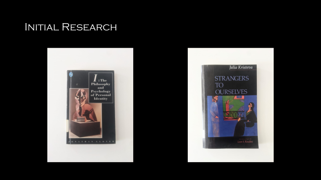
I originally looked at Jonathan Glovers text, which states that the belief that a person has an indivisible unity is mistaken. Arguing that ones physical body and consciousness can exist separately, whilst maintaining a unity to a certain degree. The only exception of this unity is in pathological cases and when this unity is so radically shattered, perception of reality often becomes distorted.
In Julia Kristeva�s Strangers to Ourselves, one particular word which stood out for me which was fugue. In psychiatry, dissociative fugue is a loss of awareness of one’s identity, often coupled with flight from one’s usual environment, associated with certain forms of hysteria and epilepsy.
This led to further exploration into distorted perception, particularly in understanding this distortion presented in different and drastic ways from desolation to elation and communicating that visually through the transformation of environments.
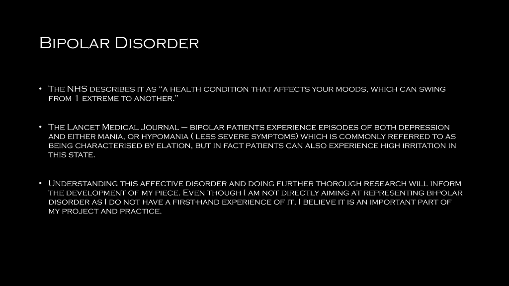
As already mentioned, the installation will be made up of previous work relating to different psychological states recognised in mental disorders research. This final experimental video will look at the breach in perception of reality, through different experiences in bipolar disorder. It looks at multiple definitions of bipolar disorder to understand its complexity
Understanding this affective disorder and doing further thorough research will inform the development of my piece. Even though I am not directly aiming at representing bi-polar disorder as I do not have a first-hand experience of it, it does aim to inexplicitly emphasize the complexity of mental disorders through focusing on these 2 particular extremes, whilst also incorporating previous works about psychological states
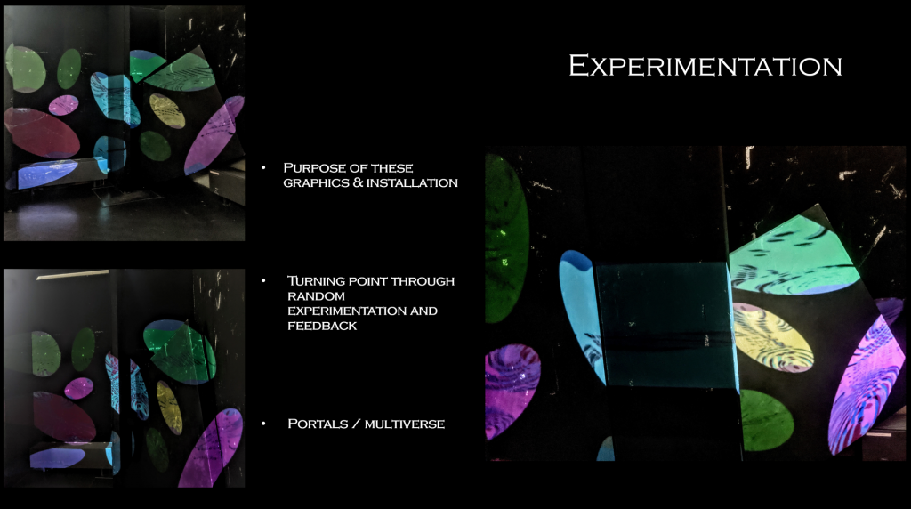
In the feedback I got during this CRIT many suggestions were made such as the circles being polite to each other, that maybe it is not about the art but rather the space that it creates. Potentially a space where one can sit, enjoy the nice colours and relax and more.
The comment which helped me in further developing my work from here however was that they feel like portals or a multiverse. I have so far been exploring different states of mind, these intangible places and it seems like transforming them ,as well as one more exploration of a different psychological state, into portals would create well rounded immersive installation.
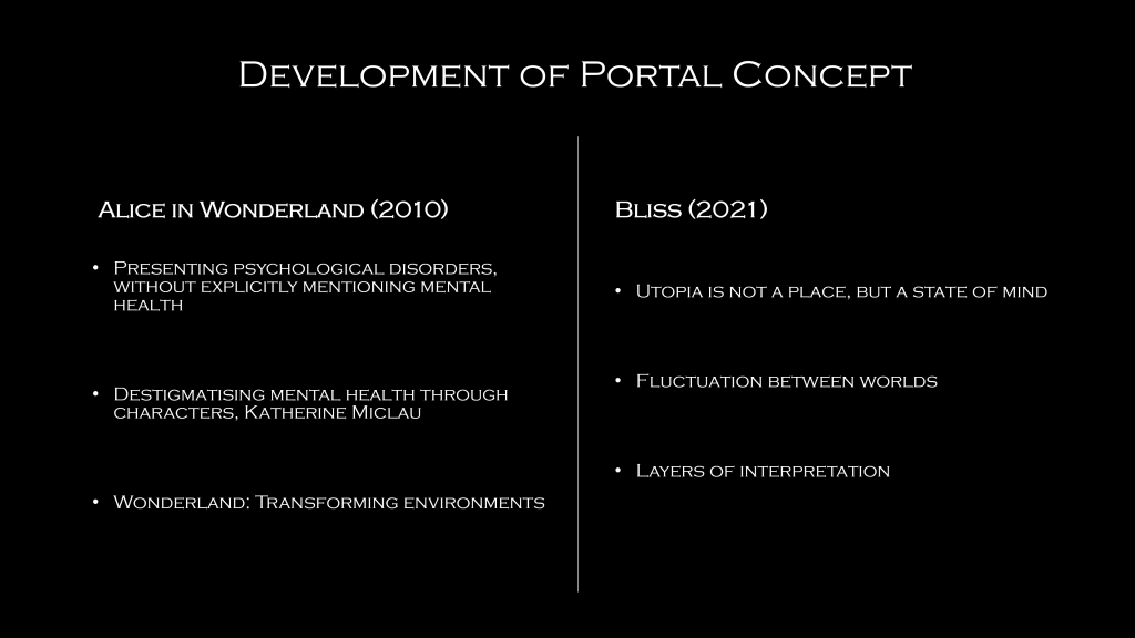
When further exploring the portal concept I instantly thought of Alice in Wonderland (2010, Tim Burton) Initially because of the obvious concept of Alice travelling into the abstract world of wonderland through a portal but also because of the way that mental health is being inexplicitly explored in the movie.
Furthermore the visuals and vibrancy in Wonderland and the unrealism is what specifically brought me to my interest in using expressionism as a means of communicating a characters inner emotions through the transforming environments.
Another movie which informed my research is Bliss, directed by Mike Cahill. Bliss looks at how aiming for perfection and utopia is unrealistic and can�t exist. Within this concept there is a repeating question of reality which yet again is inexplicitly a reflection of the protagonist who suffers from schizophrenia. The visuals in this movie do not quite resonate with my work, however the fluctuation in-between a dystopic and what seems to be utopic world is something that led me in the direction of shifting environments from melancholic to elated.
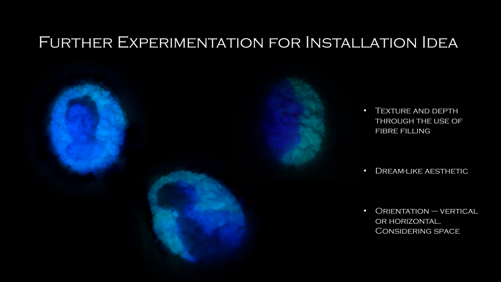
I followed this research by going back to the creation of the portal and thought about what type of non flat surface might be best to use as a way of communicating visually the possibility of entering another world. There is something about the lightness of fibre filling that seemed right as it contributes with these dream like aesthetic which I believe is created by the random bumps in the texture and the way that shapes the light being projected onto it.
The material used also adds on in sense of depth unlike when projecting onto a flat surface.
These experiments were done with the �portals� laying on a flat surface however I would like to experiment further with propping them up as a suggestion of them being like a door one could wark through. Having the portals vertically would also make the technicality of projecting into them easier whilst taking in consideration the space of the Heritage Gallery.
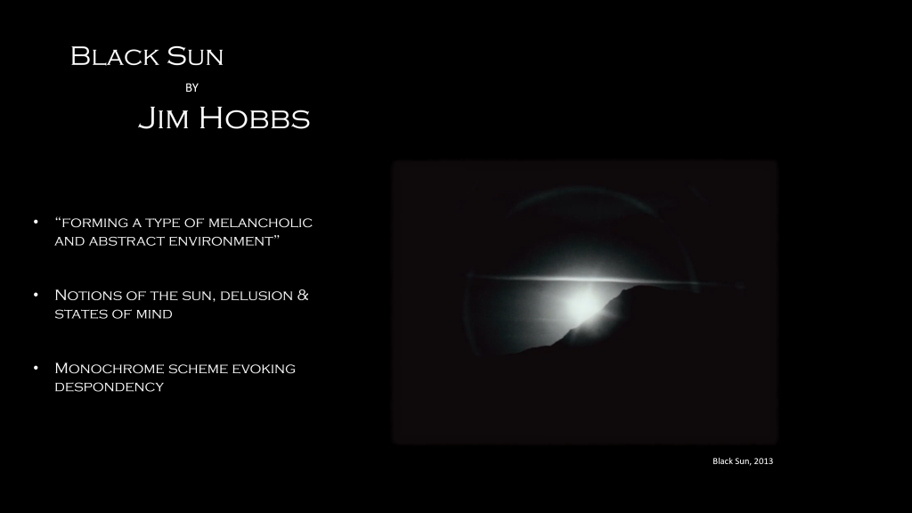
Moving on from the experiments to do with the installation aspect of this proposal, I considered my up-to-date research and decided to explore communicating the changes of environments through the use of black and white film as melancholic moments and vibrant and surreal visuals for the euphoric ones.
Jim Hobbs recently gave a lecture on his ways of research and referred to many of his projects with reoccurring themes of observation, landscape, monuments as well melancholia.
One specific work piece will act as a core reference in my work is Black Sun, seen on screen, described as a pensive observation of the sun itself, �forming a type of melancholic and abstract environment�. In some ways the notions of the sun and its potential of eliciting delusion remind me of a portal into another state of mind. Meanwhile the monochrome scheme is what evokes a despondent reaction from the viewer.
All these aspects that make Black Sun, in my opinion, are a reflection of an internal �place� which will be reflected in the making of the video work for this project.
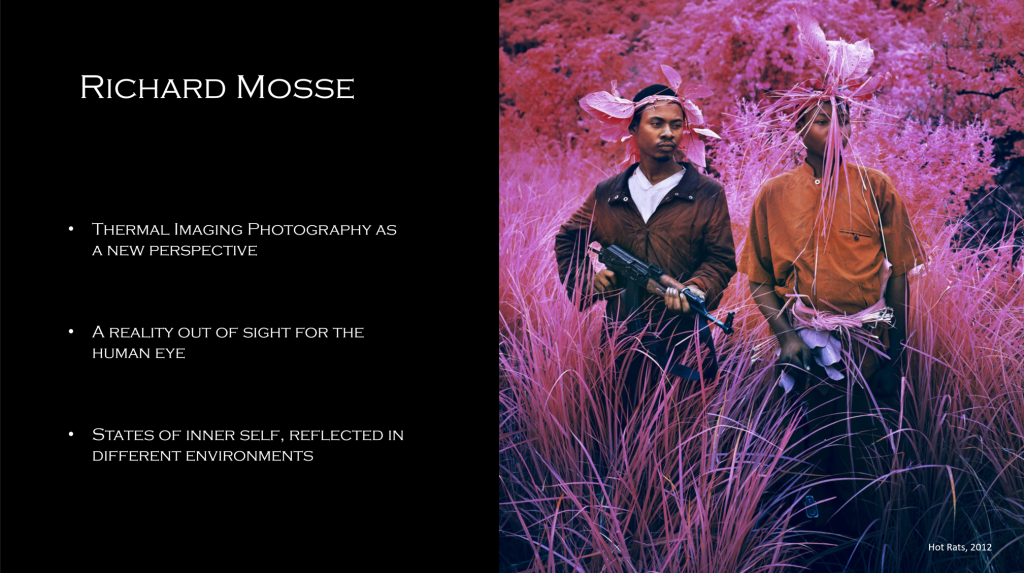
When it comes to vibrant and surreal visuals for environments externalizing the inner elation of the character the first artist who came to mind was Richard Mosse.
He is an Irish conceptual documentary photographer who transforms landscapes by using thermal imaging photography. He creates a new perspective on the war in eastern Democratic Republic of Congo through the use of color infrared film.
In his Infrared series, as seen in the photograph above named Hot Rats (2012), Richard Mosse has transformed a landscape which at the time served as terrain for war, into a totally different reality, something out of sight for the human eye and other-worldly.
This different reality and intangibility is exactly what I am aiming to achieve as a portrayal of the contrasting states of an inner self, reflected in different environments.
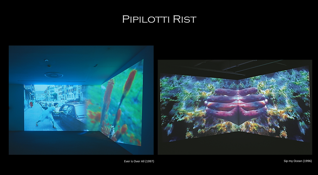
A further artist I have found inspirational for the development of my concept of Pipilotti Rist. Her work mostly focuses on creating experimental video art and installation art which is very relevant to the work I am proposing as it consists of both. What initially brought my attention to her work was the striking colours she uses and the surrealism these colours bring to environments she presents to the viewer. She creates worlds which are hyper saturated and are part reality, part fantasy.
In Ever is Over All (1997), seen on the left hand side, Pipilotti presents a video of a woman using a flower as a bat whilst excitedly swinging it at a car window and shattering that window. Meanwhile a female police officer passes her by and smiles. This work is often referred to as feminist but is more than that. It �transforms a destructive impulse into a hopeful, cathartic gesture� The calming blue hues, the slowed down pace and visual implications such as the policewoman all play a part in communicating to the viewer that this is a dreamscape, an illusion or a visual representation of thoughts or feelings, and not a real environment.
Sip my Ocean (1996), work seen on the right, shares similar aspect for the creation of a dreamscape, such as the highly saturated and vibrant colours. The introduction of duality or mirroring as seen in the image is another layer added to this work which creates a surreal environment and questions reality.
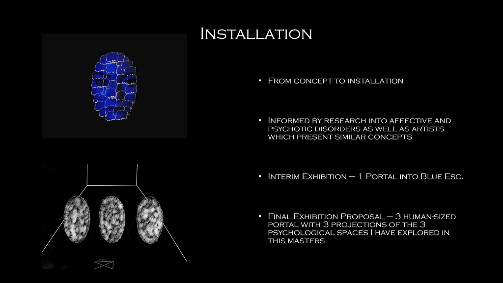
Overall the concept of this video piece, aims to create a visual representation of what extreme opposites of internal experiences might look like as a reflection in the world and it uses research into both affective and psychotic disorders to inform that as well as artists which present concepts of melancholia, elation, transforming existing environments and considering psychological spaces.
In order to take the piece further I would like to exhibit it as an installation thought the creation of multiple portals, as earlier discussed. For the interim exhibition I will create 1 portal sculpture either through fibre filling or a type of entangled thread with the underlying idea of a dreamcatcher or similar and I will project my aesthetics and practice piece, called Blue Esc. , as seen in the rough draft to visualise what I mean.
A sketch for the idea of the final installation can be seen at the bottom which will present various psychological states of mind that I have been exploring throughout the year. I am still considering ways of installing, but when it comes to scale I would like to make something human-sized as a way of realising the idea that it is a portal and one could travel into the psychological spaces through it.
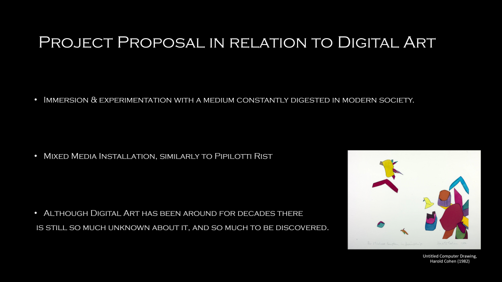
I would also like to touch upon the question as to what digital art means in relation to my work and how it fits within it. I see digital art as a means for immersion and experimentation with a type of media, it being video, which is constantly digested in modern society and is often an common way of spreading awareness, educating or creating experiences, which makes it the perfect way of realising my work.
In relation to this project digital art is also a mixed media installation, from fabric made sculpture, to video and projection. Similar to the way Pipilotti Rist uses digital Art in her work. And even though the term digital art has been around since the 1980s with the creation of a paint programme which was used by artist Harold Cohen as seen in the image on the bottom right, in my opinion there is still so much more to be discovered about digital art, as it is full of possibilities
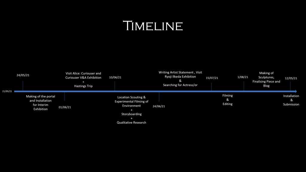
Along this some complications I anticipate are potentially not having my project approved by the university for ethical reason due to sensitive topic. I would have to be very cautious of the way I conduct this primary research.
Another complication could be that I fail to appropriately install the portals I want to create as they would be made out of very fragile materials which I might not be able to hang or create a base for.
Finally my constant worry when it comes to projecting is light. I will definitely have to come up with ways of isolating my installation in a way that light is restricted from entering that area in order to achieve the best projection possible.
Following the presentation I decided to start working backwords and shake the concrete guidelines and borders I had set with the plan put in place. I wanted to go back to some artist who have inspired me in the past and conduct some more experiments, hoping that it will lead me into the realisation of a great experiential piece, one which focuses less on illustrating.
I also need to force my work away from this label of mental illness as it is in fact not what it is exploring. I am not aiming to create a campaign about bi-polar disorder but am rather much more interested in Alternate Realities, places which operate on different timelines. When these things cross over, it just destabilizes everything. I am talking about the destabilization of the human psyche.
Laure Prouvost
“She combines existing and imagined personal memories with artistic and literary references to create complex film installations that muddy the distinction between fiction and reality.”
Lisson Gallery
Laure Prouvost is one artist I have explored in the past and have questioned my work and methods in relation to hers. She uses visuals which are sometimes uncomfortable to see and also incorporates this fluidity of pace in her work where it starts off with a slow flow which then translates into more chaotic and instant flashes of different objects, locations and etc. Most of the time these visuals wouldn’t really make any sense put together in a moving image collage, however Prouvost uses her editing techniques as well as her sound very particularly. Her particularity creates a certain mood and sets a tone to the experience where one cannot reject the choice of imagery combination.
I’ve always found Provost’s work intimate on so many levels. The most obvious one being that she records herself for the voice over, but she doesn’t just talk or say words, she whispers. The whispers make the work feel she is directly and up close engaging with the viewer. Maybe even telling them her secrets. She also uses a lot of breathing sounds which sometimes feel like they’re leaving you, as a viewer, out of breath or on your toes, really anticipating the next shot or sequence of shots and the development of the narrative. Other times, her breaths build up into long sequences which become to transform the narrative and the visuals into something sexualised, even if the image itself doesn’t hold such connotations to begin with. This is one way she plays with language as a tool for the imagination and rejects associations of visuals or words.
What I would like to take away from being reminded about her work is that I can make any visuals my own, I don’t have to adhere to the constraints that are put on them. I can choose what to film, how to film it and how to edit it in order to create a certain experience, to an extend of course. Although as an artist I’ve got the freedom in adding, twisting meaning or giving a certain perspective, my work is still very much about the explorer of the video or installation to make up their own mind and choose their reality in the spaces I create which hover in-between states, making them uncertain.
Prouvoust’s work also has the element of fantasy, and a sense of escapism which is something I repeatedly explore in my work. She proposes the opportunity to viewers to imagine they’re somewhere new or even to become something new. She asks whether we can use the image in order to escape into another state.
BRTHR
BRTHT are a director duo made up of Kyle Wightman and Alex Lee. I’ve always found the music videos other worldly and highly immersive. I think both through their choices of colour as well as unique editing techniques they really do transform places they shoot at into totally different and surreal to the eye realities. As these places are transformed, we are taken on an intense journey which sometimes feels like you’re travelling through time at warp speed. Their visuals, colours and editing literary suck in the viewer into a perspective from within the imaginary world they have created. Another way to look at it is as dream sequences or different realities sequences flashing before the eyes of the viewer, it becomes almost impossible to absorb so much information and overloads us until we become immune to the speed and our subconscious allows us to see only certain realities in this multiverse of images we’re being presented with.
Another aspect of their working style I really admire is their process. They do not tend to follow the traditional ways of production, some steps might overlap and others might be deemed unnecessary. For instance if colour grading whilst editing feels like the right thing to do, they’ll do that. They also don’t like conveying what the final product is going to look like, because they believe there is not really a way to know. A creative process sometimes requires spontaneous changes. Although their liberal way of directing and producing work against them sometimes as some companies want to change things that aren’t even finished yet which can ruing the flow of the experience they aim to generate through their work. I think they work like they do because for them, their music videos are simulated experiences of a different reality, and not simply a way of promoting a track for an artist.
For a taster of their work, check out their portfolio.
