Fraser Muggeridge
Fraser Muggeridge specialises in Typography and Graphic Communication. He has a graphic design company called Fraser Muggeridge studio which is very successful and has worked on a large variety of projects, from artists� books to catalogues, posters and more. The studio pride itself on its ability to prioritises the ideas and signature styles of the artists, rather than focusing on one particular branded style.
The knowledge I have gained from this lecture is all very new to me as I not come across the use of typography in my work before. He introduced typography in terms of spatial arrangements � typography without words, which teaches the variables and hierarchy of typography. His lecture focused a lot on the relationship between type size and thought me new turns such as “leading” which is the space between the lines in a text. He also noted the dimensional relationship between compositions of text as the fundamental on graphic design
Fraser prides himself on using a variety of principles in graphics all at the same time, but he likes to apply them in a �wrong way � which becomes a very rigorous approach. For instance one of his published pieces is a book he did that to which had a theme of things being spread over a wide area, which worked well with this chaotic type of structure.
A form of type design � without type design.
As already mentioned Fraser likes to create new ways of inventing by going against the set rules. Another example of this would be the way he implemented the fundamentals of watercolour robots. A machine which requires for an image has to be vectorised. As opposed to illustrator which can do auto trace with points, this robot maps a continuous line which is called a travelling salesman problem line (tsp). Fraser thought about how this would work with letters rather than images. That way, he is not drawing the letter but rather operating the machine which is choosing what the �tsp� of this visual would be. He runs through the same letter as many times as he likes and gets a variety of results.
This approach towards work is something I look to explore too as I am not too set on having the common predetermined results such as in automated printing, or when it comes to videography – such as storyboarding and following these images and script to the dot. Randomness and Experimentation is something my work has always incorporated within the development process.
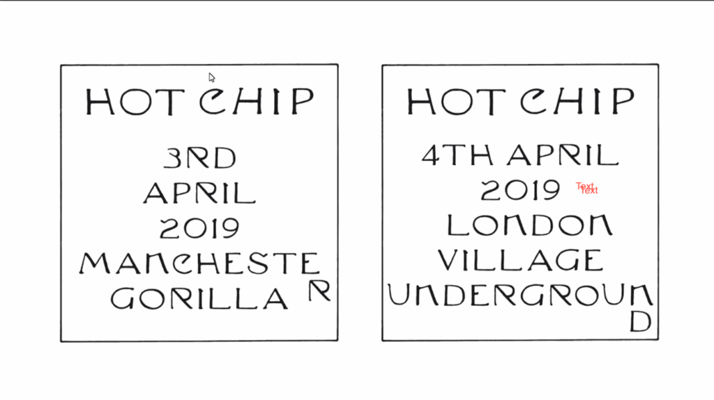
Another project of Fasers’ which process of development I found intriguing was the new album for synth-pop group, Hot Chip, was A Bath full of Ecstasy for.
The process he went through:
- inspired by a table number card at an award ceremony.
- creating a a background but decided it�s too �lazy� and also maybe more him and less them.
- went onto trying to replicate it with some variation. He was just looking for a wow factor.
- another session in basement studio, using white spirit on the roll and paper to interrupt the image which would come out on the paper, having some sense of randomness.
- The design was being made through the process. The process of unrolling the roll, the choice of speed or angle or force, made every hand print a little bit different.
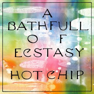
Fraser shared that this project went as far as creating some clothes as promotional material as well. I questioned whether this marketing system can be considered to be one of the systems within his work. The posters, the cover, the clothes, all these pieces are aspects of marketing and together they create a system which functions towards a mutual goal.
At the end of this session and presentation of his work Fraser told us that his process is that there is no process. In his opinion, process is about learning to see. He refers to Sister Corita, who was a screen printing teacher and was a nun in the 50s in America. She wrote a book called Learning by Heart which explored the importance of being open to anything.
Text in videos
I looked into variety of music videos which use typography for story telling purposes or simply to create a lyrics video. One work which stood out for me was the music video for Eastside, by benny blanco, Halsey & Khalid. What I found is that typography is used in an unconventional way, similarly to the way Fraser believes in using what people might consider wrong, to create something new and eye catching. Most often typography is used as lyrics in music videos, however in this case the story being told via text has a contribution to the lyric narrative through telling a background story. Some may consider this confusing or not useful for a piece of visual work which is based on music, however I believe that it adds on a layer of intimacy and understanding to the story that the artists are telling though their music.
Another music video which caught my attention is the work of the singer-songwriter and online video creator Bill Wurtz, called Here Comes the Sun. What’s interesting about him is that he creates every aspects of his music and visuals and has self thought himself how to do everything. That could potentially be a reason why he doesn’t follow the mainstream guidelines of music or lyric video production, or it could be that he simply wants to use the wrong aspects we considered earlier, as a way of questioning the set restrictions.
As seen in the image above (access video through image) he uses text in a way which might be considered even more unconventional than the previously mentioned example of Eastside. Bill incorporate storytelling with lyrics as well as extra narratives as seen in 00:10min within the video seen below which could make it complicated to really immerse and stay focused on the song. Instead it could make on loose interest as not being able to keep up with all the visual storylines. In this case some text is used as lyrics and other is a separate part of the story-telling.
Short Experiment
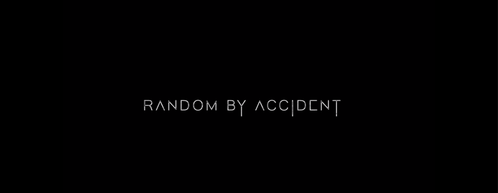
This experiment was a reflection of Fraser Muggeridge’s lecture, most specifically his note on the importance of not following the rules, experimenting and also not depending on predetermined results, also considered as using randomness.
I started off by thinking about what the meaning of random is and what process it involves. Randomness is essentially unpredictability or lack of pattern, lack of choice even. Based on these thoughts I used a random expression technique in aftereffects in order to achieve these chaotically generated letters. The core of the random generation is the expression Random By Accident. The idea was for the letters within this expression to be used and shuffled, however as I was dedicating this experiment to not having choice or control I set the shuffled letters to total randomness as well, rather than controlled by this hidden core expression of the work. Another unintentional thing that happened within this experiment is the overlapping of letter which was not in the initial idea, however based on the nature of this experiment it worked out very well and this overlap or leak became one of the main distinguishing features of the very quickly changing circulation of letters.
I generally tend to focus the process of my work on experiments and randomness however I always reach a point where I feel like choice and decision making become an important part of the process too. I definitely believe that such approach to work is in the interest of its development however it is important to recognise when the experiments stop an the structural development towards a targeted outcome begin.
Akis Panousopoulos
Surgeon and Inventor
His most recent invention was developed during the Covid19 Pandemic.
It is an Emergency Resuscitation Devise and in initiated from Akis simply deciding to create his own mask. One which is low in cost materials as well as being protective unlike some other masks on the market.
From there, he saw that as time passed Greece reached a stage where respiratory machines were needed largely to help people breathe. These ventilators were not easy to come across and were also very costly. There were predictions that Greece could potentially not be able to afford them and Akis wanted to help by inventing something different.
The importance of this invention is obvious through its purpose. Hence, the process of making would have been very practical and tactical. The main focus was effective cost and for the machine to proactively work, rather than the aesthetic of it, which in the creative world often surpasses the functionality of the product.
In this session, it was very important for me to thoroughly understand the process that Akis went through in order to realise his idea. I tend not to be precious about my work at all, it is very experimental based and the result is often not a preconceived idea. I let the work be what it is for whoever interprets it and am not worried about someone using or experiencing it ‘wrongly’. Evidently medicine has the exact opposite approach and I believe it is very important for me to explore these ways and understand the importance of them. I start doing so by dissecting the process of making of Akis’s invention:
Hierarchy of Akis�s System and Process of Making
> Problem Solving: what do I want my machine to do? I want a machine that can deliver oxygen with certain parameters
> Trial and error: his issue initially was that he cannot mass produce it so he had to go back and figure out a way for the mass production to be possible.
> Making a rough 3d sketch of all parts and design in 1 night.
> Starting off with 3D Printing one prototype and then the rest were mass produced.
The idea of legacy also comes up when thinking about inventing designs. Ideas have a past to them which they might be inspired from, however sometimes they need to go backwards depending on what the aim of the design is. In the case of Akis�s ventilator, he had to go backward in not using the newest technology available, but accommodating to the budget and I suppose speedy production? His invention might have started with the target of helping Greece during the pandemic, however it seems to be that it has become much more. It is an invention which will help many countries in financial difficulties, it would be accessible not only during the pandemic but as a general equipment which they can afford to buy for hospitals or any sort of medical care provided.
Another invention of his which he introduced us to was a Training Device for surgeons training in Laparoscopic Surgery.
Simulation has been a part of medical training since day1. Simulation not only as VR or AR but also a roleplay of words such as �A patient is a 25-year-old male with symptoms X and Z, what do they have?�
And so Akis decided to use 3D Printing as well as VR to create the perfect training design for surgeons training in laparoscopic surgery. The physicality of the 3D object contributes to the senses and the muscle memory which pure VR could not achieve. Whilst the VR played as an immersive element of imagining this ‘play’ is reality. The device he created can be seen on the image below.
He made many versions until he got it right. For instance, final product uses a raspberry pie (a small chip which has all the elements of a regular computer) with its own camera, instead of a CCTV camera which was the original idea.
Expression similar to Fraser Muybridge’s approach to the process of making work� knowingly wrong or deliberately wrong. Failure is part of the process. Good judgement comes from experience. Experience comes from bad judgement.
This machine trains the brain to not look at a subject directly but look at a camera and make the connection of the instruments on the subject with the screen you see as view for the camera.
So what is the Ultimate System in relation to Akis’s work?
A functionality-based system inconsiderate to aesthetic. With the dedication to making something many times until it is right.
Short Experiment.2
This experiment stemmed with the idea of not considering aesthetically pleasing properties but the rather focusing on the final version working properly. In this case the aim was to hand draw an almost perfect circle. Not necessarily 100% symmetrical but one that creates a loop and is somewhat smoothly curved.

In this composition of circles the functionality and the aesthetic are almost interconnected because for something to work right, it has to be precise and precision in something as simple as a circle is instantly aesthetically pleasing.
I�ve essentially drawn a circle a number of times as a representation of the fine line between functionality and aesthetic.
The process is shown as the disorderly circle becomes a more accurate one. I unfortunately did not achieve a perfect circle but a development in precision is evident in the process which was the basic concept.
In this composition of circles the functionality and the aesthetic are almost interconnected because for something to work right, it has to be precise and precision in something as simple as a circle is instantly aesthetically pleasing.
I�ve essentially drawn a circle a number of times as a representation of the fine line between functionality and aesthetic.
The process is shown as the disorderly circle becomes a more precise one.
Peter Burr
.experimental Animation
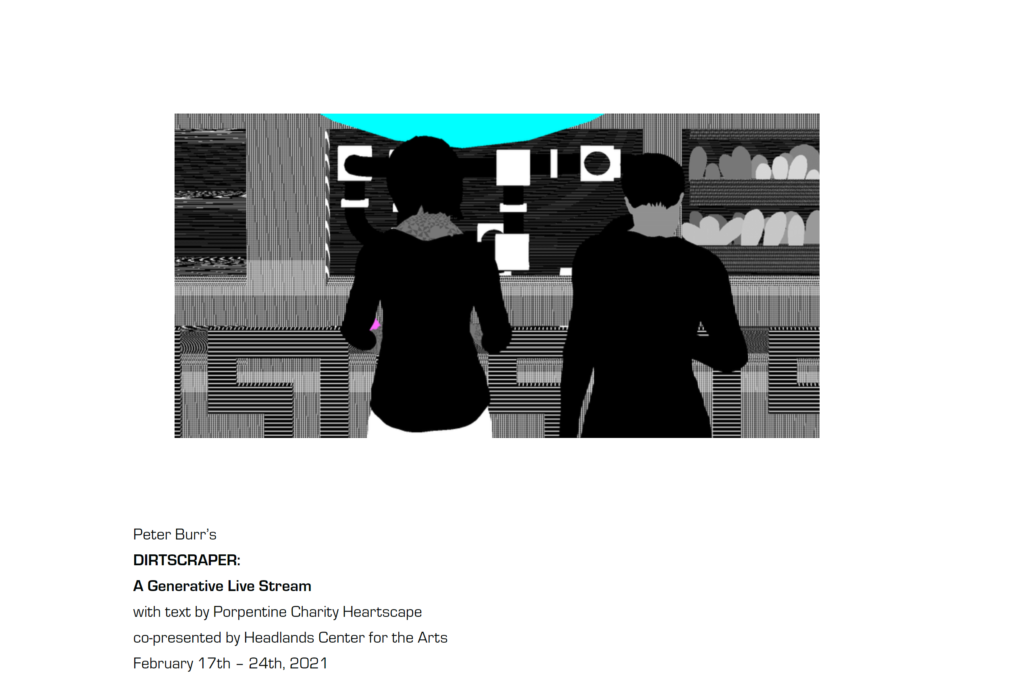
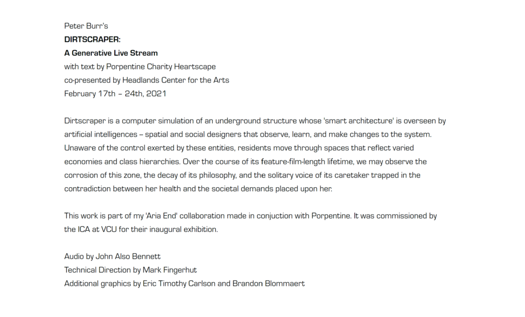
“Dirtscraper is a computer simulation of an underground structure whose smart architecture is overseen by artificial intelligences – spatial and social designers that observe, learn, and make changes to the system.”
This is one of the most recent works of Peter Burr’s and its concept will be explored further throughout this reflection on the session. What interests me most is that it looks at systems as artificial intelligence and as an entity which holds development at the core of its function.
For more of his work visit peterburr.org
Digital Technologies
Animations
Coding
Material in Digital Art is symbols
Peter Burr has a background in animation but didn�t formally study animation. His interest came in art school. He enjoyed the labour involved in making. The high details and spending a lot of time on a piece of work, and he found that this fit very well within the process of making animation.
5 years ago, he started playing with Unity. His obsession with perfection started feeling a bit psychotic so this is what drew him into Unity, where he uses libraries for some objects instead of creating them from scratch. He thought about the forces that engage with an object to create a movement rather than focusing on precision and accuracy.
He thought about systems of dreaming and of imagination.
One works of his which really resonated with me is called Descent.
Descent is an animation narrative which is essentially a software which works almost like a virus. It visually infects a computer with rats, however it doesn’t actually damage anything. Descent gives the user a visual attack of what seems to be a force engulfing everything into darkness. Despite us being aware this virus is an art piece it is very difficult to detach these connotations and reactions of panic and unease as you see your desktop quite literary become infested by tragedy and doom.
I personally find the visuals to have dystopian properties without actually using the usual factors such as the neon futuristic look, the collapsed buildings or a desert. There is an atmosphere created through colour and the glitch properties I believe that contributes to this dystopian feel. The rare touches of intense red is another aspect which make me feel uncomfortable and not welcome into this virtual world. A red meteor flying across screen as if the world is in destruction, to a red door as the entrance to a church, which brings connotations of sin and doomed eternity once again. There is so much happening on screen, so many references, connotations and metaphors tat can be interpreted in different ways, however all as one can only be interpreted as a tragic end.
The tragic end however quickly becomes only a passing thought, a dream or a nightmare. As the software initiates a destruction of the infestation and everything if back to normal, as if this destruction and disaster never was.
Peter also shared with us that an initial inspiration for him was the work ‘The Triumph of Death’ by Pieter Bruegel. He played around with this artist work and picked apart some of his styles and especially the colour choices
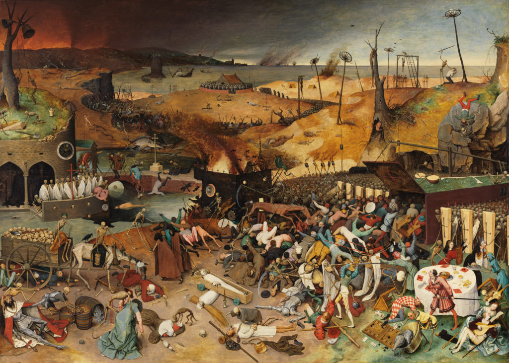
This painting quite literary depicts death carrying human life into a large coffin with no way of escape. Although some figures seem physically alive, there is no life in them. There is no hope. Whilst the forefront of the painting is actually rather peaceful. It is not peace in the positive sense, but rather in desolation. The further I look towards the horizon the more violence appears. Both in nature and human. There is an gradient of intensity created in terms of how busy the different layers of the painting are, however the less busy layers hold the same amount of desperation and doom.
One signature aspect within Peter Burr’s work is symbolism. His work strives to have a lot of layers so that the interpretation of it is more free but it still point towards the same overall theme. This is something we earlier explored within his piece Descent, however I felt it is important noting that he carries this within his overall practice, and no only in Descent.
This particular aspect of his practice is something I possibly unintentionally do within my work. I tend to explore at least 2 themes within a piece which overlap in a sense, yet still belong to their own individual research areas.
Public Space & Systems
Peter Burr notes that cybernetics is a way of seeing the world of just systems. Human beings as part of a system. Cybernetics also considers feedback as an integral part of its core concept. What I interpret from that is essentially cycles and systems feeding on systems with a never ending cycle of every little piece and structure within a system having a particular purpose. Systems are everywhere. You can choose to look at the world systematically. Or as a selection of events, or relationships, which in fact can still e interpreted as systems.
If a relationship is a system, what would the ultimate system for a relationship be? One that functions successfully and proactively develops and learns from itself and its surrounding systems which it intertwines with possibly? Similarly to what AI is designed to do.
Another concept to consider in relation to an ultimate or successful system is the one of affordances: the quality or property of an object that defines its possible uses or makes clear how it can or should be used We sit or stand on a chair because those�affordances�are fairly obvious. Therefore, is something well designed only when the expected and appropriate to society standards are created? Most people will probably answer this question with an indefinite ‘YES’, because this object or system will serve society, so of course it is only successful when it is make to society standards. However as systems change and develop, so does society. What might be accepted as appropriate today might not be tomorrow, or vice versa. In this case, in my opinion, systems, products and concepts become dependant on foreseeing and initiating this development, rather than sticking to concepts of affordances. Much like the basic concept within Peter Burrs previously mentioned work, DIRTSCRAPER.
Realism and Abstraction in Peter�s work. He highlights that he is not too interested about his characters having a personality and this is another thing that resonates with me. I very much use characters in my experimental film as a means to an end. Peter Burr’s work also often explored heavy strobe environments which really gets into you. He is personally reminded of an environment as chaotic as time square. However with such environments which can be very intense and confronting, Peter asks the question of how to build this environment in a more invitational way rather than confrontational?
Artists want to manifest something, to see what the thing becomes rather than have a set plan. Peter Burr�s practice much like the previous artists and inventors we have looked at in this chapter, looks at failure as something to embrace. He doesn�t follow a storyboard to follow but makes the piece by trusting the process. By creating.
Further Research.
After this research I had look into more artists who do experimental animation. I was interested by Sanjana Chandrasekhar work wo uses techniques such as exposure onto 35mm film as well as filming on variety of film as well as scratching and manipulating it and hand drawing animations.
Sanjana’s The Peacock In the Room is a short animated film (seen above) which is very personal to the artist as it explored the relationship between a mother and daughter in difficult times. The mother struggles to fight her hallucinations whilst the daughter strives to embrace her world, her reality. Sanjana’s started off with trying to recreate an visualise her grand-mothers particular experience of seeing threads which would constantly appear around her. To do so she spent a low of time in a darkroom exposing thread onto 35mm film. The process and materiality of it was very significant to the experience of her grandmother. From the complete darkness and trying to feel the threads, to the idea of them appearing suddenly visually as she turned the lights on for a few seconds as described in an interview here.
Further from her process of making Sanjana also talks about the conception of her ideas. How she is excited by not knowing how the final version will look until it has been processed. How se relies on the interpretation of something in her mind to be strong enough for her to be able to visually transfer it into a realised concept without actually having to draw a storyboard and be able to double check the footage as you would on a digital camera.
Looking back at her piece, The Peacock in the Room, I was confronted with a lot of ambiguity at first and had difficulty following the narrative, or the lack of one in a sense. Slowly this lack of narrative became a a central theme in communicating the themes of confusion, hallucination, uncertainty. Furthermore as much as there is a lot of interruption within this short film due to the s udden appearance of threads that one experiences, the choice of animation and the dream like or memory like qualities of snippets merging into one or feeding off each other makes for a fluid communication in these scattered events. The narration of course which I believe was recorded in events of hallucination plays a big part in the authentic representation of the experiences the grandmother is enduring. As well as adding further context to the visuals.
.short experiment
.using sprite pad
In this short experiment dedicated to experimental animation I decided to use a software suggested by Peter Burr which in a way is very systematic in its process of creating a piece of work. What is meant by that is that it works on the basis similar to the one of a puzzle. The software present you with a canvas made up of squares or pixels which exist on the own but together they create something greater. It is easy to navigate but not that easy to realise an imagined visual. Due to that and this being a short experiment I decided to approach it as an abstract piece of work exploring its restrictions as a first time user.
As already suggested the concept was exploring restrictions and one of them for me was curvatures. I started of by aiming to create a circular shape in the centre of the canvas and then disturb it with some sort of more organic shapes of what I imagine could be stems, leaves and other part or particles of plants. I then thought about the learning curve in a system and its development and wanted to create some more intricate and somewhat fragile shapes which were very difficult and in my case impossible to achieve. Due to the pixel nature of the system, it was just not possible to create anything pristine. At this point I just started layering. Maybe I could at least add some depth to this very flat and pixelated image? Maybe I could mask its imperfections with more imperfections?
All in all this experiment made me consider what my ultimate system is in creating artistic work, and it is not one that puts restrictions, such as the little cells present in this software. It is also not one that restricts colour, perception, perspective and space. I didn’t find much room for experimentation within this either as the software is quite simple and straightforward, limited in its abilities. And although sometimes limitation is a tool of getting an idea across more strictly and succinctly, I didn’t find it to be the case with sprite.pad.
What is the Ultimate System?
The question which we have been aiming to answer or explore within this chapter is “what is the ultimate system?”. To do so we were separated into different groups. My group decided to explore this question through an active approach, where we had a weekly response to different artists and our reflections on their concepts and each others ideas and experiments.
To do so we created our own system through an interactive board which we could all access during a pandemic and whilst being a collection of Athens based and London based students. We suggest that our ultimate system for this project is made up of a few factors: good communication skills, access to the interactive board Miro and being open minded to responding to the work of others as a way of exploring different perspectives.
The following is a screen- recording of interacting with our online interactive board system which can give a much better explanation of the system as it is very visually based.
To sum up, our idea of the ultimate system is to reject the existence of one and instead accept that systems are created for a purpose and so the way the system works and processes information and develops itself, is based on the purpose is serves. Therefore if the notion of an ultimate system existed, it would have an infinite variety of ultimate systems depending on the purpose they serve.
Designed Systems
Postcard Project
Designed Systems was organised by Maria Glyka and Jim Hobbs in collaboration with students from The University of Greenwich, Vakalo Art and Design College, and guests Fraser Muggeridge, Akis Panousopoulos and Peter Burr. Artworks were printed at the University of Greenwich between 21-22 February 2021 on Hahnem�hle paper in a limited edition of 25.
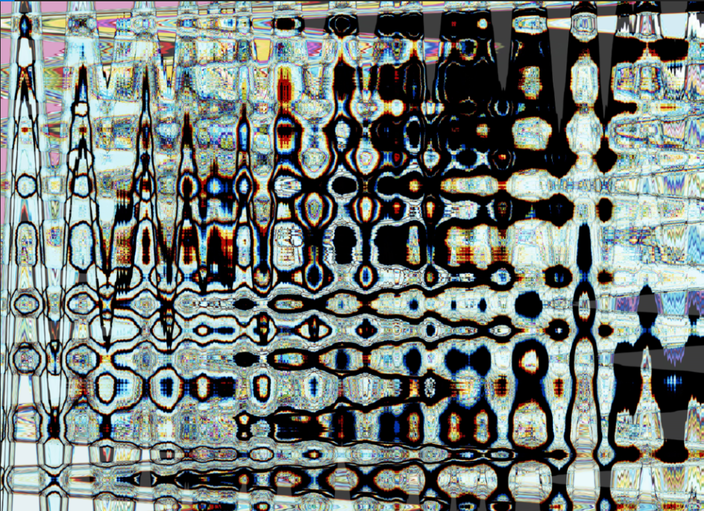
My work as seen below in its digital form explores systems both in natural and digital forms. It takes a very simple image of a tree borrowed from a previous work of mine called Lucid Dreams, which �presents existing locations, transformed to appear as alternate realities.
A tree is often seen as a a way of visualising systems such as a family tree, but it also holds connotations of life, cycles and is an intricate system in itself. I chose to borrow from previous work rather than capturing new images, because of the connotations that the work holds for me . It is a personal exploration of the subconscious in relation to day to day perspective of life. It holds hope and looks for positivity in the often mundane city life. From there I also thought about the systems which exist within a city through nature and developed this concept of systems within tree and nature with a visual focus on the branches of a tree which overlap, interconnect, become separate from and unite.
Further from here, I wanted to disrupt this rigid system the only way I could, through digitising it and focusing on abstraction. The aesthetic qualities of the work are overwhelmed by glitches, errors in information, in some places, the lack of. I guess in a wat it brings up the same question we have been exploring for the past month.
What is the ultimate system?
Does it have to be aesthetically pleasing?
Does it have to be rid of error?
Can error exist in its background as the temporal stamp of the past?
Does it rely on perfection and multiplicity of identical elements?
Or does it thrive on its imperfections?
Group D Logo
Finally me and my group decided to test our system out one last time and create a logo for ourselves, blindly. What I mean by that is that each of us created an element for the logo which we then layered on top of each other to create one united piece. Although the concept was really interesting, the logo itself was a bit too overwhelming. I aimed at creating a layer as neutral as possible in relation to graphics but also thought that I’d like to have a silent as well as a loud coloured version of it. The graphic I created is as simple as the letter D, for group D. It stretches across the frame as a way of almost blending in with it and becoming more neutral and open to further layers.