This page is dedicated to the module “Expanded Art Forms” and will include experimentations with different mediums and media as well as class discussions, workshops and critical evaluations (crit). The aim is to create a work or a series of works which use at least 2 medias in relation to expanded art forms.
What is Multimedia?
Multimedia Art is a lot about combining a variety of mediums. These mediums are usually a combination of traditional forms of art and more modern and digital art forms.
The image below has compiled words from an in-class brainstorming session in which we considered some different medias and mediums that can be used and experimented with for this project.
What is Expanded Art Forms?
Historically, the term expanded, has been used for defining art movements which at the time didn’t have a name.
Often, what is immediately thought of when the word “expanded” is used, is the idea of adding on to a base. In this case, if the base is 1 medium such as a video, could adding other mediums such as a sculpture and projection within it be considered an expanded art-form?
.
Crit. 1
.
.
In out first week of Expanded Art Forms we were asked to create a multimedia artwork to be critiqued the following week.
After going through a list of possible medias and mediums as listed above I decided I was interested in exploring light and movement in a short experimental video. The mediums I used are ink and video. I started by filling a container with water and finding a place for it where it was exposed to some shapes of natural light. As I was using natural light i did have to constantly move the object with the movement of the light and search for new locations where light and shadow had formed a shape which complimented the aesthetic.
I then went on to actually use diluted acrylic paint instead of ink as I couldn’t get access to ink on time for the critique the following week. I decided to play around with the primary colours red and blue as I though they would react better with light reflections due to their vibrancy and thickness unlike a yellow.
I used a washing liquid bottle in order to apply the diluted paint into the water as it seemed like the most controlled way of doing it at the time. It worked okay, but it did create more splashes and air which led to some unwanted bubbles in the composition. I tried pouring it out at different speeds, heights and angles to get a variety of effects so that when it comes to editing I’d have a good amount of options.
Once I had filmed a good variety of shots I went onto premiere pro. I didn’t have a storyline in mind per say. However as I was compiling the shots and thinking about continuity and a sense of development, I decided that I want to create a sense of uneasiness by using abruptness through switching between slow movement shots and quick and snappy ones.
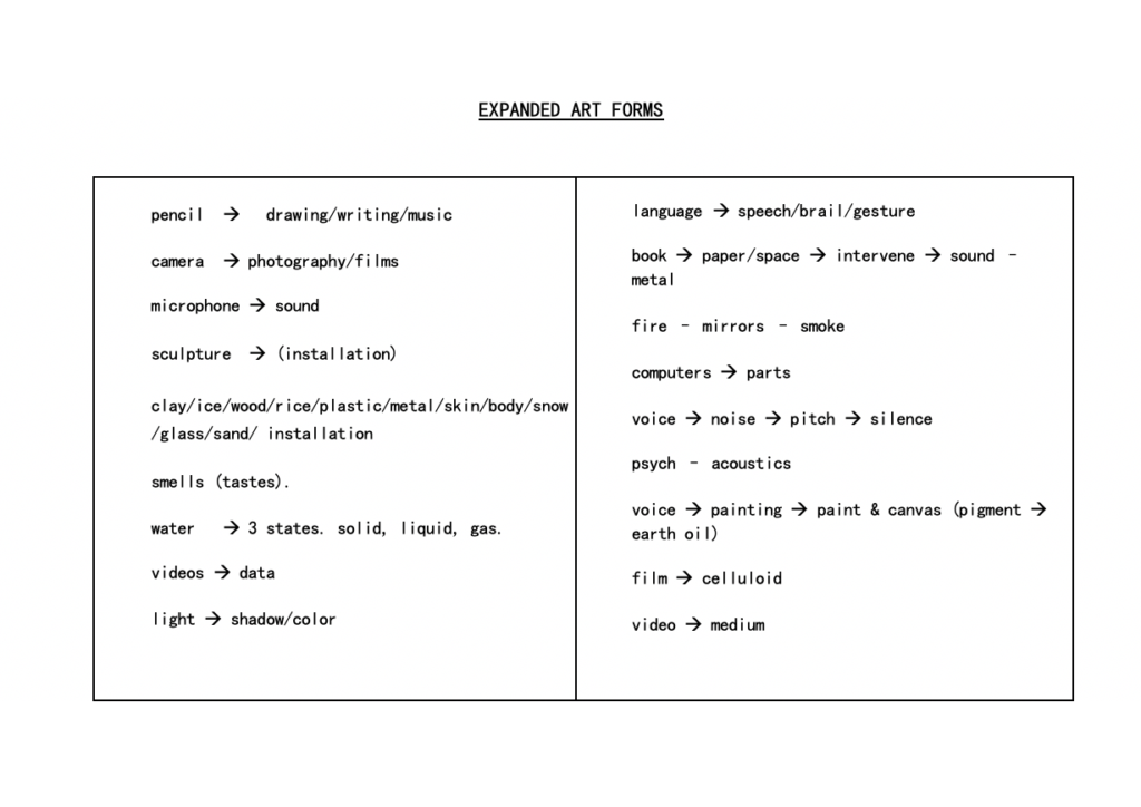
The idea of day and night came to mind whilst editing as well as the pink paint shots were actually shot during the day and the blue during the night whilst using a bedside lamp which created this image which reminds me of the reflection of the moon in some sort of pool of water.
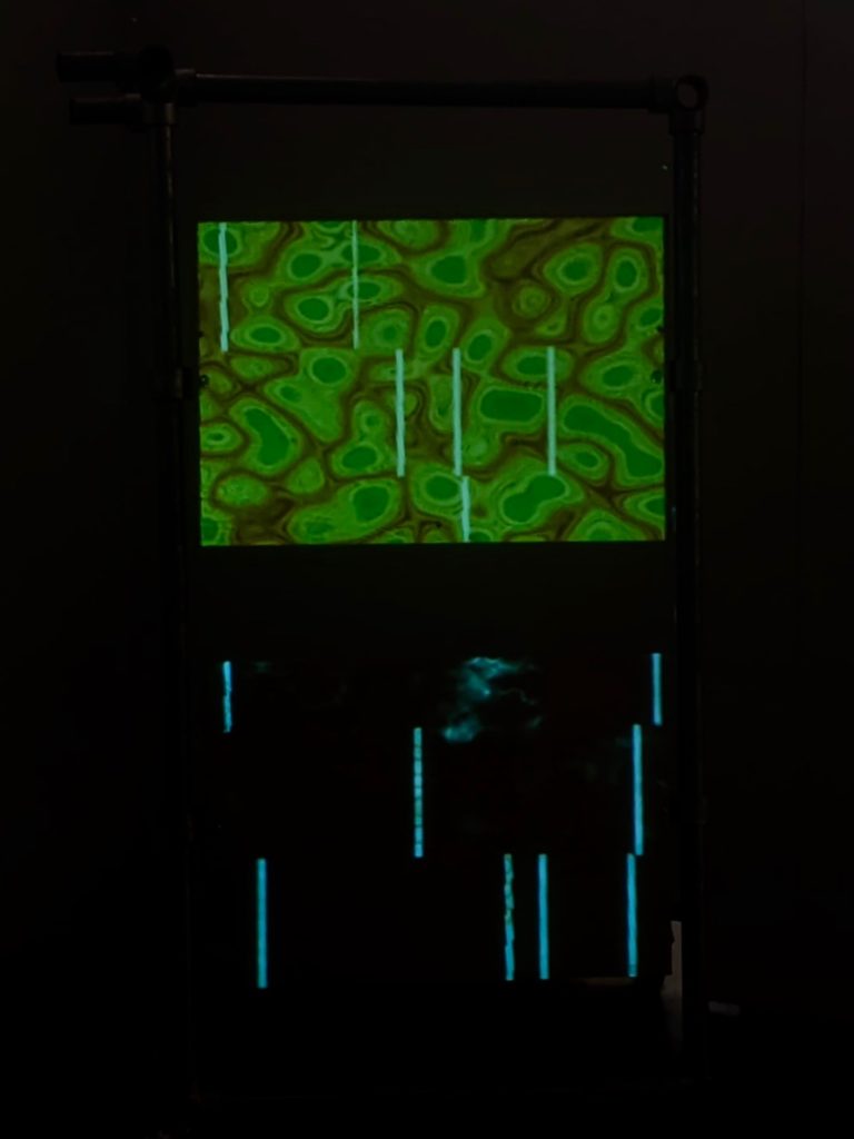
I decided to project this short experimental video as I believe it added another layer to the piece as a whole and as I wasn’t sure on what scale I wanted to present it, a projector worked great in a technical sense too, where it gave me a wide range of scale options to chose from.
Crit. Feedback
When it came to the Crit I got some positive feedback. People enjoyed the fast cuts and the fact that the video jumped into this intrusive almost fleshy looking shot of the red/pink paint instead of slowly building up to it. Also the juxtaposition created through the combination of violent nature of the shots and the choice of cheerful and vibrant colours.
It was also noted that showing the water container as a whole in the first shot was grounding and showing the reality of it was an interesting choice considering the video overall is rather abstract.
It was also mentioned that the technical side of the video needs more improvement in relation to the image quality and gear used to film but also having a more controlled environment, such as insuring there are no bubble formations as they ruin the illusion that the paint creates.
Thoughts on improvement:
- using actual ink for better texture and also possibly experimenting with different colours and think about why I have chosen the final colours, how do they contribute to the overall idea. *I’m thinking of experimenting with blacks and reds for a more sinister approach in order to compliment the editing technique. Yet there will be the usual gentle and graceful movement that inks occupy in water.
- using a dropper for a more controlled & precise movement/amount/ no bubbles etc
- using a better camera. Will possibly use the Canon 5D Mark III and get a couple of lenses to try out different focal lengths.
Ink
(further experiments)
This is an update on the development of the first Crit and and the changes which followed in order to build on the feedback I received and improve aspects.
This is not the final version but another stage of the development.
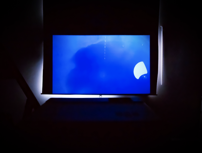
I bought some black, purple, orange and red ink to play around with and thought more about light, reflections and how important is the container I use. The previous shots were taken from above, but this time I wanted to “dive in” with the inks and get some frontal perspective shots.
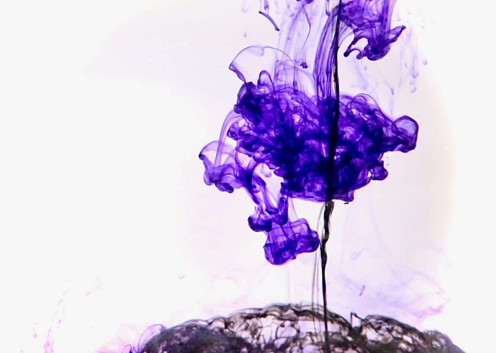
I then borrowed a 5D Mark III camera and a 75-300 zoom lens from the kit room at university, created a mini backdrop using an old box and some A3 paper and used a see through block container for the water and inks so that I can get any angle really. I also was very careful about not getting any bubbles and used a dropper to input the ink into the water.
The set up looked something like this…
And the updated idea and visuals of experimenting with ink looks like this…
As seen in this video, it is quite different than the original one and there is definitely more precision to the way it was filmed. The colours used are also more dark and ominous. There are some instances where the black almost engulfs what is perceived as everything within the limitations of the screen. However other shots are more delicate and appear as a very small fragment of ink piercing the clear body of water. The shots where orange and black collide are even more violent as if the two colours are defying each other yet both are struggling to accomplish dominance.
My filming abilities did not reach my aim this time around either and so I tried to mask some technical mistakes ( most of which are to do with focus) through layers of effects and I think that worked in favour for the orange colours as it gave them even more deep, piercing and almost burning qualities which allows them not to get lost in the darkness and thickness of the black ink.
Overall I have a long way to go when it comes to sharp, beautiful images and better compositions but I think I’m on the right path of this experiment which will hopefully allow me to develop my technical abilities as well as my creative thinking.
Dr. Andrew Knight � Hill on Sound
Dr. Andrew Knight – Hill was the visiting lecturer this week. Unfortunately I could not attend the following workshop, however I did learn a lot from the talk and tried to apply some of it into some practical work in my own time.
The talke consisted in topics around observation and perception of reality, hyperreality and even imagined spaces. The importance of lived experience as a way of recognising reality and the importance of listening in perceiving a reality were both brought up. Thinking about listening as a form of experiencing and/or perceiving something, and recognising its difference to hearing which is essentially sonic data.
The quote I would like to concentrate on in order to execute some sort of experiemntal work in regards to Dr. Andrew Knight -Hill’s practice is by the french film theorist and composer of experimental music, Michel Chion:
“Sound object is both a result of the acoustic action and the listening intention.”
(Chion, 2009)
Sound object is a concept/term created by Pierre Schaeffer who introduced the idea of experiencing sound whilst detaching it from its source and allowing that sound to have its own existence. Also known as the practise of acousmatic listening. the experience reduces sound to the hearing alone, ignoring the thing creating the sound.
Building onto this concept of “sound object” I thought about using 2 different videos , combining them with the same sound and reflecting on how the listening intention changes. In one video the sound will clearly have a source. This way the synchronous sound and image will create perception of what is happening in relation to what we see and hear.
The next video will be abstract and not the source of the same sound shown in video number one. I hope that this little experiment can show how differently we can perceive sound when allowing it to exist by itself. ?
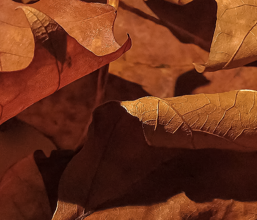
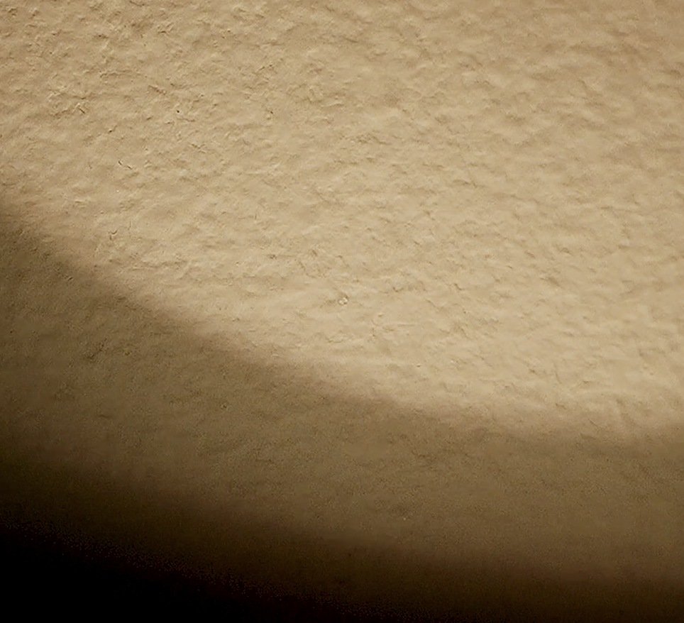
I’ve decided for my initial video to be of some autumn leafs and the sound would be. a recording of them being moved around and interacting with each other. The second video will be something ambiguous, such as a beam of light trembling. They will both have the exact same sound added to them, but will hopefully be perceived in a different way.
Press on the images below which will take you to the video experiment.
Jim Hobbs on 16mm film
Stan Brakhage (1963) – Mothlight
Stan Brakhage was given as first point example when it comes to 16mm film as he is one of the most influential figures of 20th century experimental film.
This particular work relates greatly to the topic of materiality and thinking of the film itself as the material, the actual cellulose acetate, rather than simply the idea of filming on it.
In Mothlight, Brakhage has actually collected dead moths and used their physical bodies as the image appearing on this film projection. Their bodies which most likely gave up functioning because of overheat are not literally stuck to a matter which travels through light and the light projected in combination with their bodies could be considered an embodiment of what their experience might be when their navigational systems get confused by light and lead them into this death trap. The randomness of the shots and their uneasy and abrupt cuts almost mimic the movement that moths would make when trying to get away from the light but simultaneously are almost hypnotised by it, convincing them they have to be near it.
Stan Brakhage – Stellar (1993)
In this particular work, Brakhage has hand painted the film and as seen used many vibrant colours. There is a lot of depth in this piece, visually and conceptually speaking. The hand painting seems to have contributed greatly to this visual depth, possibly through its texture.
In regards to the concept of depth, the name of the piece suggests a relation to stars and possibly the whole galaxy? It is almost as if the meaning of life is being explored both through this higher self notion experienced through visualising some sort of psychedelic trip and this idea of the infinity and human kind in relation to the rest of the universe.
This grand concept and the editing choice of abrupt jump cuts reminds me of a depiction of what eternity going by in a flash would look like.
Optical Sound – optical sound on a film strip can be quite fun to experiment with as well. Wether it’s scratching onto existing sound waves or extending your image frame into the optical sound field in order to create some random abstract sounds which visually compliment the image but possibly not sonically. In this workshop however, I concentrated on the visual.
I started off by picking some found footage, but specifically looked for text only as I wanted to see in what ways I could manipulate text rather than a landscape or objects.
I found some text, some used film strips with an orange\red tint but nothing on them and some plain black film strips. I started by just scraping off the top layer and creating some sort of wavy lines. As I went on to do that on every frame, I decided that its starting to take the shape of an eye and so continued to roughly animate an eye opening and closing through this scratching process.
I then kept the scratching technique but started being a bit more violent and not os precise with the movements I was making and didn’t follow the frames as a rules but rather used the wholes trip as a whole canvas.
Finally I decided to cut out bits from the film ( quite a lot of it actually) and sellotape it together, whilst adding some of the residual layer which I had scratched off in between the two sides of sellotape to create some sort of texture.
I also added some whole punches to get some good amount of light to get it as some points in the rotation fo the film strip.
Overall I think the task that I gave myself was not to use sharpie markers, stickers and existing images, as I usually go colourful, but this time I wanted to be as minimalistic as I could be and hopefully still create something nice to look at.
Projection Experimentation.
This video is of the scratched & cut strip being projected in order to see how the visuals have turned out.
There is timeframe whit a lot of condensed text and what I intended by scratching around it in circular motions was to isolate the words in the centre by totally eliminating the rest but that did not work out and these few frames look rather random and out of place. I feel like the rest of the video has a good flow and it then gets disrupted by this overload of text and scratches. Neither is covering the other, it’s just a mess really.
One aspect which makes this experiment engaging is the variation of movement. Meaning the change of vertical to horizontal movement of the lines created and also the inaccuracy and disposition of the objects featured such as the eye and the circles (created with a hole puncher). It creates a certain dynamic which can be considered captivating due the unusual portrayal of movement.
After reflecting on the visuals I observed some experimental techniques when it comes to projection. We layered a couple videos on top of each other as seen below and played around with the size and focus which created some super exciting visuals.
Apart from distorting the image through size adjustments we also had the chance to see what sort of effect a prism could create. As seen in the video we could get multiple mirrored images and also some vivid rainbow like light reflections on the ceiling.
Having all of the space around you as your canvas is a new concept to me. Even in previous times where I have presented work with a projection I have always done it in the ‘traditional’ way. I now see there are countless possibilities in creating and presenting work with projections and I am excited to do and learn more.
These are 2 projections of fellow classmates and I’ve added this video just to note the idea of multiple projections, which they are exploring.
I would also like to explore the idea that the projection on the right hand side uses. It is almost some sort of a masking technique which restrict light from coming through the film, but leaves that 1 line unmasked and plays with its movements.
Projection Mapping
with Jim Hobbs, Manos Kanellos and Robbie Munn
In todays workshop we talked about the creation of illusions in art, starting from works such as Michelangelo’s world famous work at the Sistine Chapel (1508-1512) and the way it creates space where there is actually walls to Richard Haas’s large scale murals such as the Fontaineblau Mural (1985) in Miami Beach which gave the impression that people could walk through the Sorrento building of the Fontainebleau Hotel, to more current digital ways to trick the eye such as projection mapping.
Some great examples of this metamorphosis happening through projection mapping are the contestants at the iMapp Bucharest Competition. The 2016 winner, Interconnection, (seen below) challenges the perception some people might have, that the inner and outer are separate things. It explores the interconnection of all things through a symbolic dialogue created by the visuals within the illusionistic space.
Before starting to experiment with some projection mapping programmes we were given some basics of projections which are very important to note and incorporate in order to create as best illusion as possible.
The Do’s:
- shadows
- high contrast/bright colours
- textures (e.g.photo of sculpture texture projected onto that sculpture > creates hyperrealism)
- use of architecture (windows, doors etc)
- outlines/simple text ( Interconnection, iMapp Bucharest 2016 winner, creates some amazing visuals just through the use of lines, sort of dystopian/ cyberpunky vibes)
- animations
The Don’ts
- NO GREYS! They get washed out
- fast movements do not work
Experimenting with MadMapper:
The image is not of the greatest quality but is unfortunately the only shot I got of my little in class experiment with MadMapper.
I simply created two canvases for the 2 projections and used the effects from within the MadMapper software. I played around with their direction of movement, speed and colours and the final image on the top panel end up reminding me of some sort of collection of cells of a living organism but also as if something is not quite right with them, possibly radioactive. Similar to the way movies show an average human turning into a superhero or villain when the ‘magical’ substance enters their body and the camera zooms into the inside of their body.
The projection on the bottom panel however doesn’t quite collaborate with the one on the top, they don’t unite but they don’t contradict either. It’s just very random and not thought through.
The white lines I applied in order to test out movement from one canvas onto another.
Photogrammetry
with Simon Withers and Phil Hudson
Photogrammetry History
The first time photogrammetry was used was in photography in 1911 by Theodor Scheimpflug. He was an Australian army Captain who created a method and device which corrected perspective distortion in aerial photography. Now known as the Scheimpflug principle.
Softwares to use
There are a few softwares which have been developed and are largely used nowadays to practice the art of photogrammetry. One being Metashape, which allows you to process digital images and generate 3D spatial data. Metashape has a 30 day free trial.
Another famous software is the french Cloud Compare which started its development in 2003 with Daniel Girardeau-Montaut PhD and it is entirely free.
A few things to note:
- The recommended point amount is 5.3million in order to have a crisp and accurate image.
- Shadows might pick up as form rather than something on the surface.
- Difficult to do photogrammetry when it comes to glass because of reflections.
Example Project
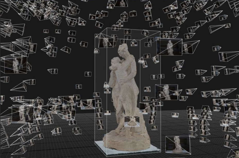
The Three Graces is originally a marble sculpture from the Neoclassical time period. The second version of this statue is residing in the UK, shared between the Victoria & Albert museum and the National Galleries of Scotland and this PointCloud was taken at the V&A presenting the amazing technology that photogrammetry is.
Experimenting with Metashape
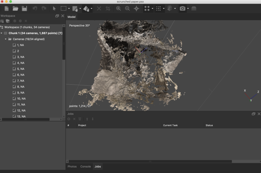
This experiment took about x40 landscape photographs (landscape captures texture better) of scrunched paper. I input it into Metshape & only about x25 photographs were actually enough to be recognised and read by the software.
It clearly is not a crisp and accurate image of the scrunched paper as there are many particles missing from it, however in a way that made me think about how what is seen as a limitation and as inaccuracy can actually be used as an advantage to a certain concept.
We had discussed the notion of chaos this week and I thought that this surreal and incomplete version of what an object as simple as paper is could actually be very fitting when thinking about a state of disorder.
From here I went on to do a short experiment to do with order and chaos, using Metashape to create a sort of environment within the game engine Unity.
As mentioned I’d like to use Metashape in an unconventional way. This unconventional way would mean that I am not looking for an accurate scan of an object but a different visual representation of water as a substance. Through scanning the constantly moving molecules of water I am hoping to achieve an abstract visualisation of water which will contribute in portraying both chaos and order. I thought that the pressurised downward movement of water would be captured in a rather chaotic way as the process of photogrammetry requires a still object therefore the outcome of the continuously running water would be very unpredictable and possibly chaotic. Yet I was hoping to find some sort of symmetry or at least composure in the stillness of a photogram.
Unfortunately, this experiment was not successful. The majority of photographs (seen above) were not recognised by the software Metashape. There were 2 aligned photographs out of the approximately x30 I took. I believe the problem possibly lies in the lack of texture due to the transparent nature of water in combination with the very bright white background. The software also does not agree with reflections, whilst the photographs I�ve taken definitely have a good amount of that too.
I then thought about other substances that represent a fine line between chaos and order visually, but also decided to think about gases rather than liquids as previously discussed their molecules move even more rapidly which could mean a more chaotic environment. I went ahead with a quick experiment of that and this time I got a bit more visual information. Due to the substances I am choosing and their unstable structure it is only expected for the outcome of this scanning process to be rather abstract.
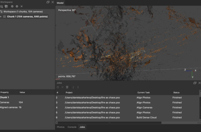
The outcome of the fire experiment is the following. This is how it looks in Metashape however I decided to export it as an object and try to input it into unity and use it as a walk-through or float through environment.
I�m thinking further into whether there is a way to make these separate points within the cloud could have motion. I imagine having a virtual environment where the fragments seen on this image are moving past the explorer of the space, creating an otherworldly experience. The movement changing randomly between fast and slow.
I started by adding the object into unity and playing around with situating it onto a terrain. I went onto making the terrain a black colour and the skybox a sunset with burning dystopian properties. These choices feel right at the moment when thinking about the aesthetics of the environment but might not be the best choice in finding the balance between the representation of chaos and order. I added a first person character and attached the camera to it in order to be able to explore this environment, which for the time being is quite limited. A screen capture video can be seen below.