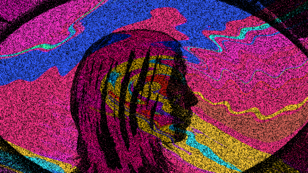
Juliana Cerqueira Leite
Juliana Cerqueira Leite’s work concentrates on body and movement, and it is highly based on the process of making it. She suggests that Materiality and Process can be a methodology of approaching our work. Thinking about the materials more than the aesthetic they might create and focusing on the physicality.
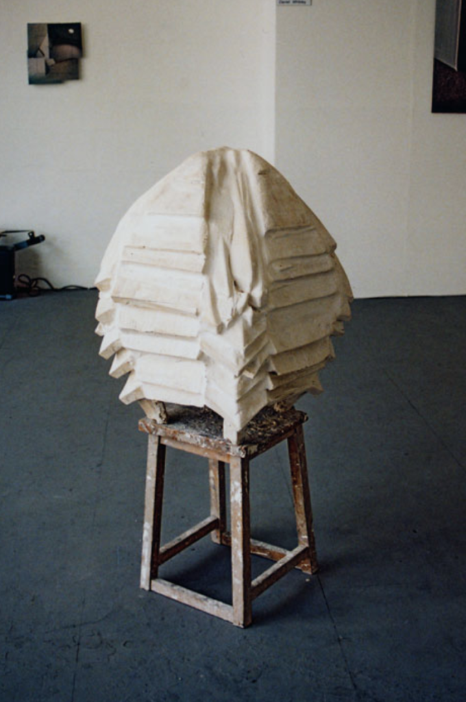
Violent Object is one of Juliana’s first pieces and it’s one that I find really intriguing, as a stating point to her practice.
The chair is being used as a ‘violent object’ and it becomes represented and embodied within the clay which was beat with the chair to take the form it appears in. The sculpture itself consists of many layers which gives an impression of time being revealed, possibly the time it took for the process of creating. The layers are smooth, positioned orderly and almost identical, however when I think about the way it was created, through violence and destruction, I see a contradiction.
At large, this work can be seen as a start in her interest in manipulating clay with a physical body (the chair), rather than using the traditional way of sculpting it with instruments or hands.
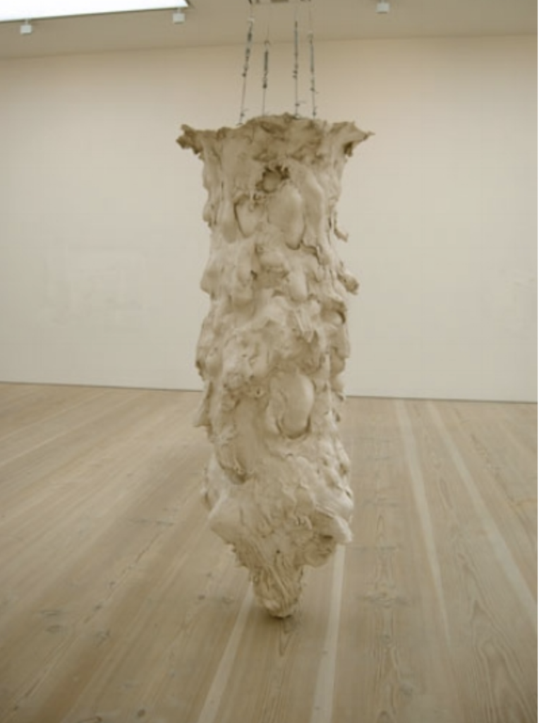
Further on she moved onto using her own body in the creation of Down (2009). The process of creating this piece entailed her climbing at the top and digging out a hole. In the process of digging, she has left imprints of parts of her body which reference the physical process of making the work and the importance of it.
I can imagine the process would have been intense and challenging. The amount of body marks left suggest struggle to me and the confined space in combination with that struggle create an embodiment of what a panic state might feel like.
I would like to explore and express my interpretation of this work of hers further through a video which will aim to embody the suggested panic state.
Resilient Objects: Surviving the Collapse of the Institution
By Juliana Cerqueira Leite
The text talks a lot about temporality and how excavations are determined not by time, but by the systems of cataloguing, arranging and displaying objects.
Systems vary depending on the location of the collection they present. Spaces such as museum which show large collections for educational purposes (historical, anthropological, ethnographic artifacts, and art) catalogue their artifacts based on the museum�s �fixed morality and historicism� as well as the academic restrictions.
I guess the question the text is asking is where can objects exist free of the museum’s fixed morality and historicism?
A Symbiotic View Of Life: We Have Never Been Individuals
By Scott F. Gilbert ( J.Sapp & A. I. Tauber)
Symbiosis in animals is transforming the usual concept of individuality to one where interactive relationships blur the boundaries of the organism and blur the idea of identity being essential.
Whilst discussing the interactive relationships of multiple organisms and how they work together, the text notes that there are many different concepts of individuality.
The most known one is the genetic individuality which is the conception of the individual being rooted in sex and based on the inheritance of the chromosomal complement acquired at fertilization. Whilst another well known individuality, immune, describes the immune system as a defensive network against a hostile exterior world.
Developmental individuality follows a more complex concept, where in some cases the the symbiosis may be parasitic, which means that one organism would be benefiting at the expense of another. This made me think about the survival of the fittest and how organisms become extinct as a means of evolution. However there are other times in developmental individuality where this bacteria (parasites) may be needed for the development of the organism – Squid Euprymna scolopes lacks an organ which only develops with the help of bacteria.
It soon becomes evident that living entities are not individuals ” by anatomical or physiological criteria because diversity of symbionts are both present and functional in completing metabolic pathways and serving other physiological functions.”
This notion of individuality, or the lack of it, is rather highly reflected in Juliana Leite’s work. She portrays is as unstable. Wanting to disrupt the notion of what an individual might be through the way she uses body and detaches it. She is not presenting her physicality as an individual but using her body to concentrate on the dependence on the balance of that ecosystem (seeing a human as an ecosystem).
Hotel Marajoara, 2020 (video)
By Juliana Cerqueira Leite
In Hotel Marajoara, Leite comments on humans and their development and survival. When development is in question, so is mutating: which parts of ourselves do we want to keep, and which do we want to leave behind?
Survival is explored though body and instincts and catalogued through different defence responses: fight, flight, frighten, faint, freeze or beg for mercy.
The final point made is that change is inevitable and uncontrollable.
For more insight into Juliana’s work, her website can be found here.
Further Research
During this seminar, it was mentioned that Manga is a field where inner emotion being transferred physically is a very important part of the work.
Manga is an art form, often used in Japanese comic books. The style became very popular in the 20th century with certain restrictions regarding such comic books being lifted and Manga becoming a big part of Japanese Culture.
Manga characters are know for their unusual looks and over exaggerated emotions. Thus turning inner emotion being very obviously transferred onto the surface and visualised intensely through bodily expression.
Manga is then very often translated into an anime ( Japanese animation) and is even a big influence among some artists.
Manga World, by Aaron Albert (2018) on liveabout
Urasala Naoki, for instance is a very well know manga artist, who recently had an exhibition at the pristine Japanese cultural centre Japan House London. His characters explore the hopes, dreams and underlying fears of humanity. One of his most famous works and the one that was his breakthrough is called Monster. It tells a story of a Japanese surgeon who living in Germany, whose life changes after meeting a patient which turns out to be a dangerous serial killer.
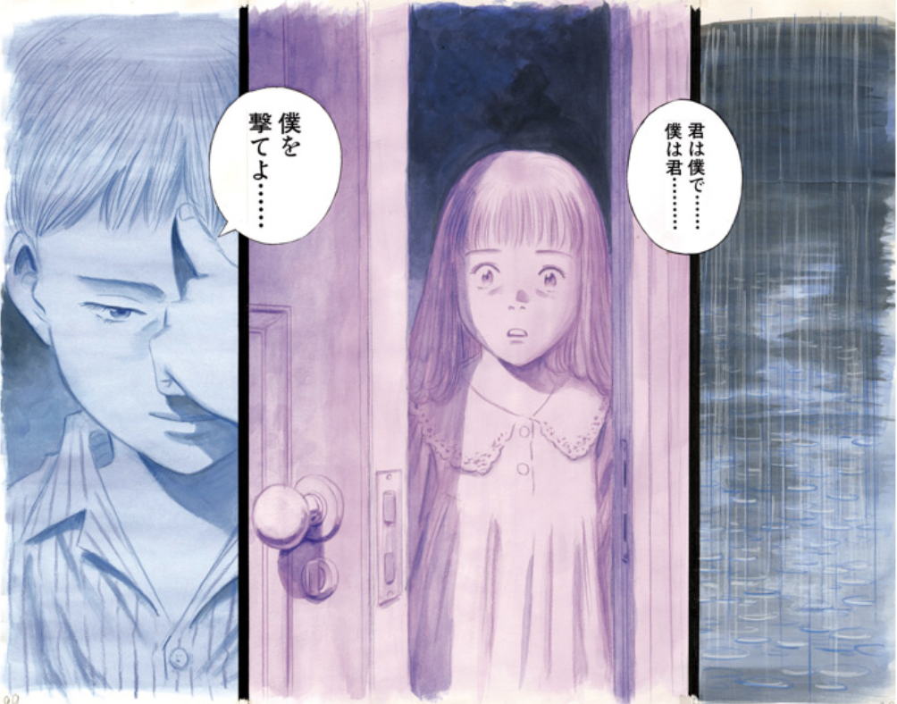
This is an image exhibited at Japan House in 2019 as a part of the Monster project.
I tried to look up what the meaning of writings in the speech bubbles, however had no luck with that.
However I also became interested in the colours he has chosen to use. Is there any meaning behind it or is it purely a gender representation?
There is clearly and exaggeration of internal emotions being presented on the surface, however the lack of context is rather challenging when trying to read the signs of the artwork.
Discover the craft and legacy of Japan’s most famous manga master in a new retrospective, by Giacomo Lee (2019) on digitalartsonline
At a first glance I did not come across work of Urasala Naoki’s which I could interpret in relation to the response which I want to create as an experimentation for this weeks workshop. I therefore decided to look at another one of the greatest manga artists.
Tezuka Osamu has been referred to as “the god of manga” and his work has been compared as to the equivalent to Walt Disney. Apart from his well known animations which were famous worldwide, such as Astro Boy, which I even watched in my childhood in Bulgaria, Osamu’s work extended into a large variety of genres. One of his series called The Crater (1969-70) tells stories of horror, suspense and mysteries. These stories include one of a man anxious about his future (The Octagonal House) and another where people suffer from the sense of guilt upon the sound of a bell ringing. (The Bell Tolls). I want to use Tezuka Osamu’s representation of these emotions of anxiety and guilt, possibly even fear, in order to create a visual piece as a response to Leite’s Down Scultpure.
Possibly take videos of some very exaggerated and extreme close up facial expression with a transition entering the mind of the protagonist and turning the physicality back into inner emotion.
Practical Response
When thinking about the practical response I decided want to go in the original direction rather than experimenting with the exaggerated emotions in characters of manga. One way of recreating the originally mentioned panic state could be to create a confined space, a small sized sculpture, resembling Juliana’s but with much simpler materials and technique. Its purpose would be to use it as small set, as a tunnel through which a small camera (go pro) would pass through.
Another way of realising my idea would be to use the materiality of film to and physically paint frame by frame a chaotic and disturbing visual representation of a tunnel.
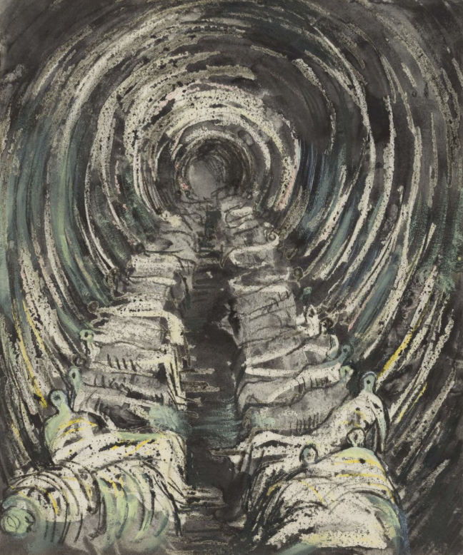
This led me to think about a painting of Henry Moore’s Tube Shelter Perspective (1941), where he depicts those who took shelter in London’s underground during WW2, Blitz.
The story behind this painting is much more in comparison to the idea of panic and claustrophobia I am looking to portray thorough my short experiment, however the painting has this emotive qualities of “the gloom of this strange and terrifying underworld” (Florence Hallett, Henry Moore: The Artist in Wartime)
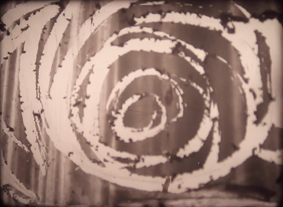
Inspired by the kind of textures and spiral movements that shaped the tunnel, I am now considering the possibility of mixing digital and analog on further experimentation. Layering a video of a walking tunnel with the temporal of manipulating film.
click on image for video of film projection
Dr. Stephen Kennedy
Dr. Stephen Kennedy’s is a writer, an artist and a philosopher.
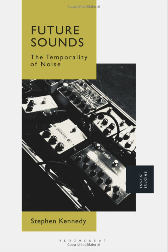
His most recent published book called Future Sounds: The Temporality of Noise (Bloomsbury, 2018) looks at the connection of noise, sound and music to political, economic and technological events. Through theory and practise discovers how sound, noise and music can shape history.
This can be considered a rather controversial approach in a way as history is generally thought about in a rather visual way, whether it has been painted or written and so this radical way of approaching history might be upsetting to so the general public, but enlightening for those who seek to look outside the box.
The lecture entailed the story of how Dr. Kennedy came to be the the type of artist he is today. It was amazing to hear him pin point the moment of choosing his path which he described as the inspiration to all of his life’s work. The moment he referred to was a TV cast of the Sex Pistols on Bill Grundy’s Show (1976). I suppose it was their controversial behaviour and appearance that made them stand out and inspire the unique perspective that his work takes today.
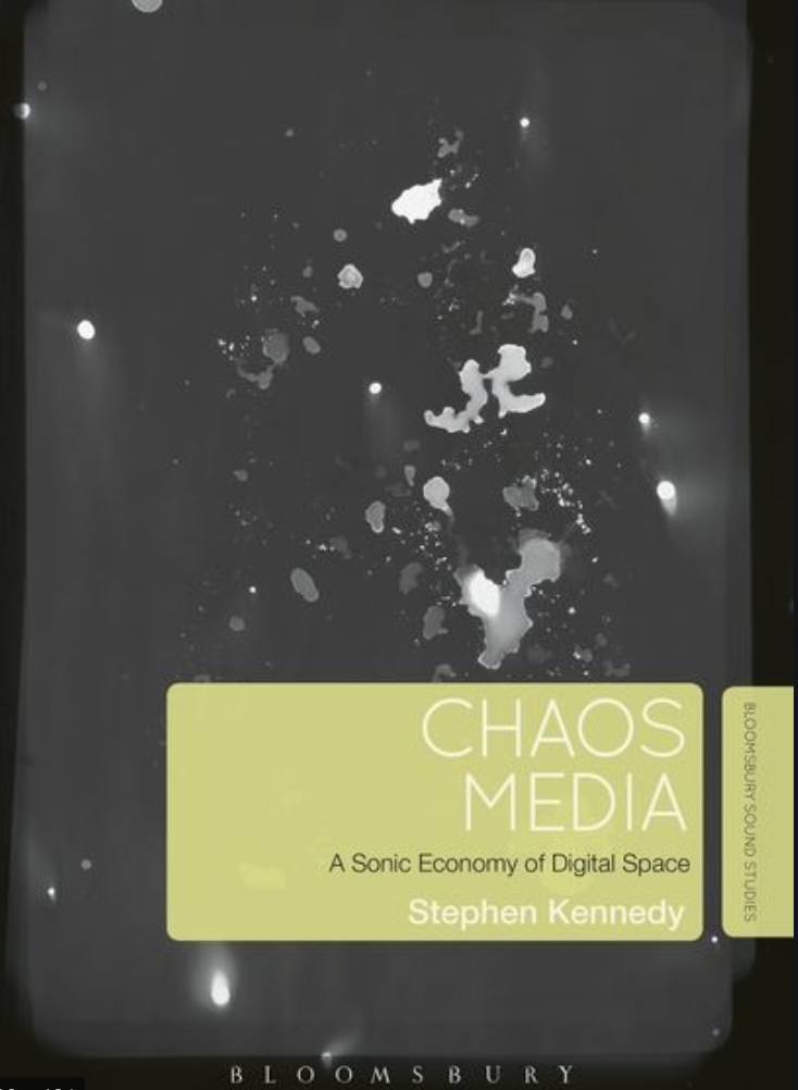
Another very well know written work of his is Chaos and Media: A Sonic Economy of Digital Space
Dr. Kennedy shared with us that he wanted to write something that is informed by music and sound, but it is not what is considered sound. He was considering the relationship between analogue and digital, but also the one between chaos and order.
This idea of searching for a connection between chaos and order which is not their opposition reminded me of a work I created last year where I tried to make a connection between the sense of euphoria and a dystopian state. In a way thinking about how chaos (thought about negatively) could be perceived as an extremely positive thing (just how orderly has the positive connotations).
Moving on… Dr. Kennedy noted that as soon as he started writing the book, it became clear to him that the process became about collecting things (information) and ordering that chaos. He was questioning if he is doing this out of his own will or it is rather happening to him.
Author as Producer by Walter Benjamin
Address at the institute for the study of Fascism, Paris, April 27, 1934
Benjamin has used this piece of writing to address the fight against fascism.
He starts by questioning the right of the artist to exist and create what they want. He suggests that everyone has to choose a side and the one they choose highly depends on whether they are proletariat or bourgeois and their tendencies based on this social status.
He then continues on to question whether an artist has to be very well educated to create an amazing piece of work. They was I see it, creativity comes from deep within and to be creative and to be different and unique, can’t be achieved by only intellectuality. Intellectuality might bring high quality in the sense of production, but it won’t bring value to the creation itself in its final form. In fact, intellectuality might only limit a person. Knowledge introduces certain facts which could create barriers and restrain an artist from exploring in unknown ways.
However, what was discussed further in class was a different view of his argument which suggests that if you’re a good person and have the right tendency you will always make great art, as it’s coming from a good place. On the contrary, some horrible people and highly immoral people have made some pretty epic pieces of work. Int has recently come into the people’s knowledge that Harvey Weinstein has been manipulating and sexually abusing women throughout his career, within the film industry, and yet, many movies that he has been a part of are praised. The movie Inglourious Basterds, for instance, has received a Golden Globe, BAFTA and many other recognition awards and he was serving as an executive producer. Therefore Benjamin’s statement might not be as true or as literal as we’d like to view it.
I think the ultimate question that Benjamin is asking us, almost rhetorically is the following:
Do we, as artists, choose what we create or is it in fact, out of our hands, and based on our circumstances of life?
Further Reading on The Epic Theatre and Bertolt Brecht found here.
This article takes us through the history of Brecht and Epic Theatre. It details the techniques Brecht used to distinguish his practice from his competitors and how his name and techniques became so highly recognised.
Bertolt Brecht lets the audience experience situations differently in comparison to other theatre plays. He shocks the audience by interrupting a situation. That doesn�t only cause tension but also gives the audience time to rethink the situation and reflect on their own life and situations outside of the theatre. This idea goes further into him wanting to distance the audience from any emotional involvement with the characters, also know as the v effect (verfremdungseffekt).
One of his most successful works was The Three Penny Opera (Die Dreigroschenoper) which actually disappointed him, as its big success led him to believe that the audience didn’t understand his criticism towards Nazi Germany as their reaction should have been dramatic and overwhelming, whilst in reality there was an overflow of simply positive remarks which could make the play seem rather basic and generic.
Overall, I find the way Brecht approaches his work very positively contradictory in relation to the approach of many other artists/performers/producers etc. The ‘usual’ sole aim is to navigate and evoke certain emotions in the audiences, regarding the characters, whilst Brecht wants to eliminate that. A rather interesting and rebellious methodology of practise, if it could be called such.
Thought and Reflections
I became rather interested in the idea of looking at chaos as something with a positive connotation and also in the use of the detachment of emotion as a methodology as Brecht uses in his Epic Theatre. I would like to explore that further through my practical experimentation for this week.
I started by googling the word ‘chaos’ to see what comes up at the top of the search engine. What I came across was the following quote:
“We adore chaos, because we love to produce order”
by the Dutch graphic artist M.C. Escher, known for his drawings and prints of impossible, paradoxical spaces, playing with infinity, reflection, and symmetry.
I’m not sure how much I can relate to that but I think what is meant is that chaos can produce order and chaos is all around. Whether we recognise it or not, chaos and order are separated by a very fine line and people might prefer chaos more often than they’d like to admit.
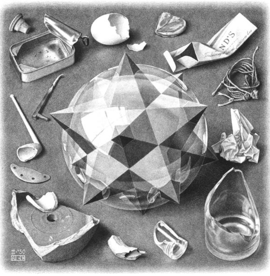
I had a look at some of Escher’s work in relation to chaos and the one that popped out for me is Contrast (Order and Chaos)
(as seen on the right)
The positioning of the objects is very precise and orderly. The large crystal in the middle however is very large and taking up most of the space in the frame. The rest of the objects therefore are restricted to space and the way they are crammed is unsettling and uncomfortable to look at. These objects are also chaotic in themselves as they have been manipulated in ways which makes them unfulfilled. They have all either been broken, twisted or scrunched up. I would like to experiment with the idea of concentrating on one object/substance and visualising its orderly existence in a chaotic way or verse versa, rather than my initial though of solely concentrating on how chaos can be orderly.
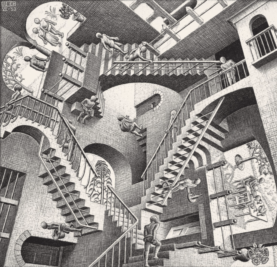
Meanwhile Eschers’ Relativity, concentrates on perception and illusion, however I believe that there is something very chaotic and unsettling about it. There is also most definitely a detachment of emotion and a much deeper look into what is real, why are these spectators there and what is happening to them….
Developing Idea
As already mentioned, the practical piece I would like to create in reflection to this weeks seminar is the idea of seeing chaos as orderly or order as chaotic.
When thinking about a single substance which could represent that I questioned the states of water.
In a solid state water is certain and precise. However in a gas or liquid state, the attractive forces between molecules weaken and individual molecules begin to move around each other, more rapidly with gas than liquid.
I imagine the molecules moving around without destination or purpose per say, which I visualise as chaotic. However the level of chaos visually for a person depends on the way that water is manipulated. Water in a stream, a calm sea or even coming out of a tab at a slow speed seems rather calm and orderly. Yet if you manipulate it with external factors…it introduces a totally different sensation.
I will therefore see how I can manipulate water, which could be considered permanently chaotic, in different ways to visualise the relationship between chaos and order.
Work in progress
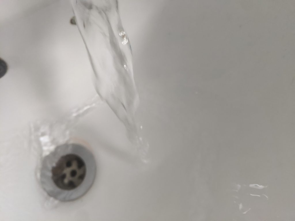
I was recently introduced to the process of photogrammetry and I had an idea of using it in an unconventional way. This unconventional way would mean that I am not looking for an accurate scan of an object but a different visual representation of water as a substance. Through scanning the constantly moving molecules of water I am hoping to achieve an abstract visualisation of water which will contribute in portraying both chaos and order. I thought that the pressurised downward movement of water would be captured in a rather chaotic way as the process of photogrammetry requires a still object therefore the outcome of the continuously running water would be very unpredictable and possibly chaotic. Yet I was hoping to find some sort of symmetry or at least composure in the stillness of a photogram.
Unfortunately, this experiment was not successful. The majority of photographs (seen above) were not recognised by the software Metashape. There were 2 aligned photographs out of the approximately x30 I took. I believe the problem possibly lies in the lack of texture due to the transparent nature of water in combination with the very bright white background. The software also does not agree with reflections, whilst the photographs I’ve taken definitely have a good amount of that too.
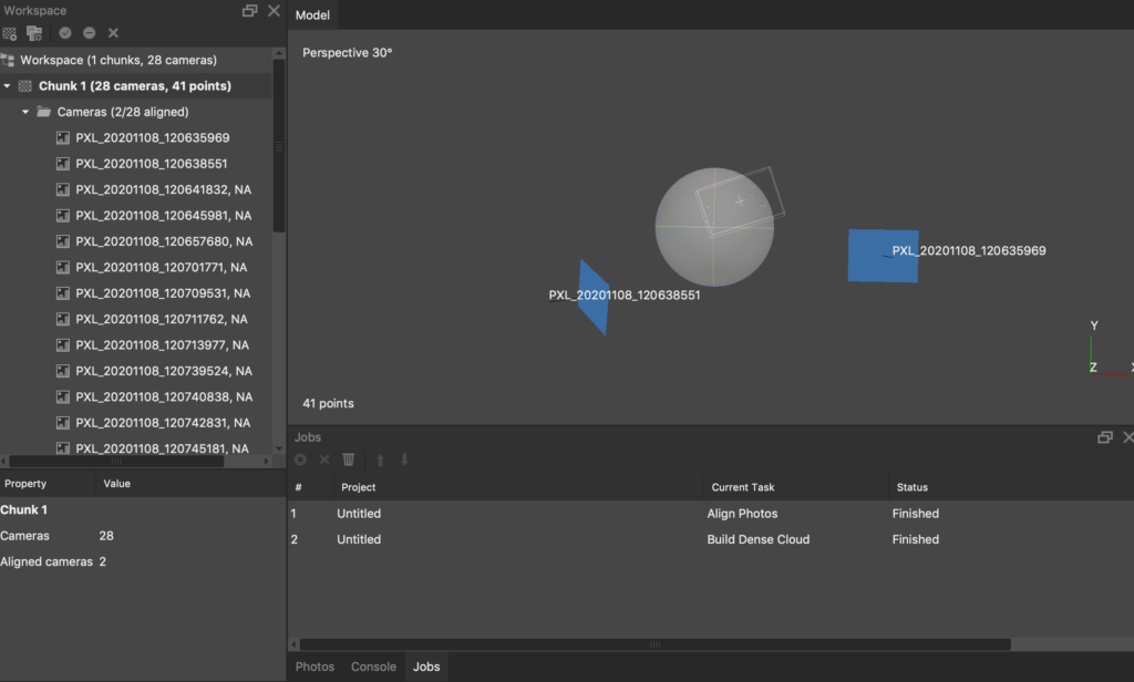
As seen on this screenshot from Metashape, there are literary 2 photographs aligned and at such minimal resolution, the software refuses to build a dense cloud as there is not enough information.
I then thought about other substances that represent a fine line between chaos and order visually, but also decided to think about gases rather than liquids as previously discussed their molecules move even more rapidly which could mean a more chaotic environment. I went ahead with a quick experiment of that and this time I got a bit more visual information. Due to the substances I am choosing and their unstable structure it is only expected for the outcome of this scanning process to be rather abstract.
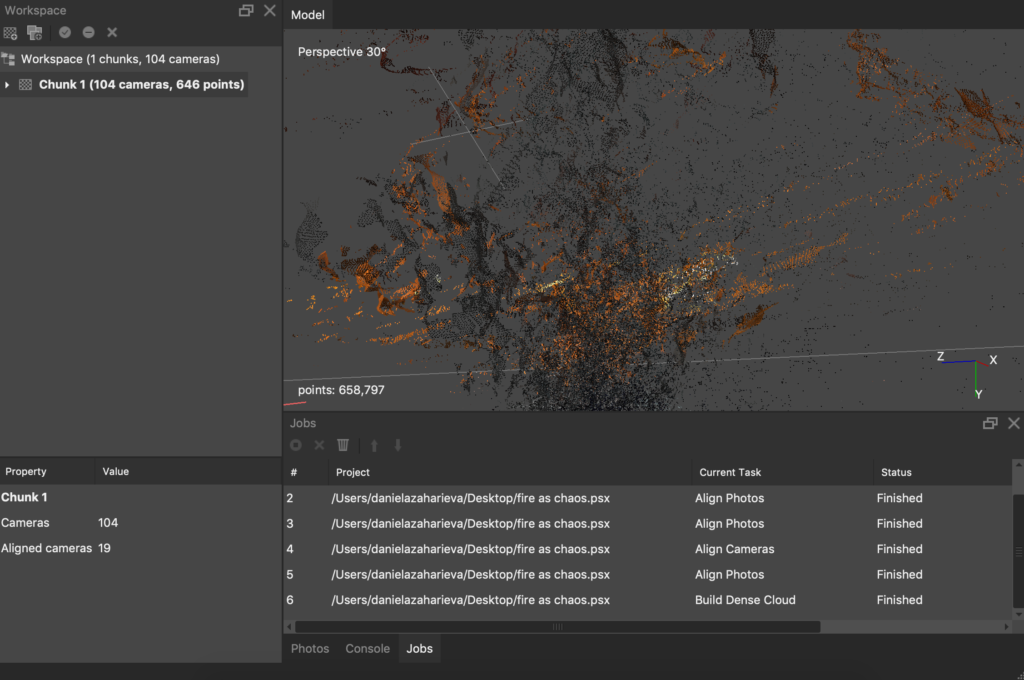
The outcome of the fire experiment is the following. This is how it looks in Metashape however I decided to export it as an object and try to input it into unity and use it as a walk-through or float through environment.
I’m thinking further into whether there is a way to make these separate points within the cloud could have motion. I imagine having a virtual environment where the fragments seen on this image are moving past the explorer of the space, creating an otherworldly experience. The movement changing randomly between fast and slow.
I started by adding the object into unity and playing around with situating it onto a terrain. I went onto making the terrain a black colour and the skybox a sunset with burning dystopian properties. These choices feel right at the moment when thinking about the aesthetics of the environment but might not be the best choice in finding the balance between the representation of chaos and order. I added a first person character and attached the camera to it in order to be able to explore this environment, which for the time being is quite limited. A screen capture video can be seen below.
For a screen recording of the virtual environment press on the photograph below.

Dr. Ed Wall
Dr. Ed Wall’s research focuses on the processes and forms of public space, landscape and cities
In todays talk, Dr. Ed Wall shared some of his inspirations and previous works, but he also talked about his approach to research through a site specific methodology. I’ve come across the term ‘site-specific’ before when I’ve though about creating artwork at a specific location but not for a specific location. I’ve done exercises where I’ve created sketched work in relation to movement within the City of London, however hadn’t though more about the idea of site-specific work and the methodology of it. It was very intriguing to have an insight into Dr. Ed Wall’s work and his inspirations.
When it comes to inspiration the name Mary Miss came up a few times. She is an artist and designer concentrating on the experience of an individual moving in a particular landscape and the history that the landscape carries. She often transforms given landscape in order to create a new environment by introducing a sculpture on installation.
Another way of processing and transforming a landscape which I am personally more interested in due to its nature of practise is by using thermal imaging photography. Richard Mosse is an Irish conceptual documentary photographer who initially used colour infrared film in order to create a new perspective on the war in eastern Democratic Republic of Congo. Kodak Aerochrome is a now discontinued film which was used for military observation of a region, in order to locate an enemy or simply for being aware of anything affected by this invisible spectrum of infrared light which the human eye can’t detect but this type of film can.
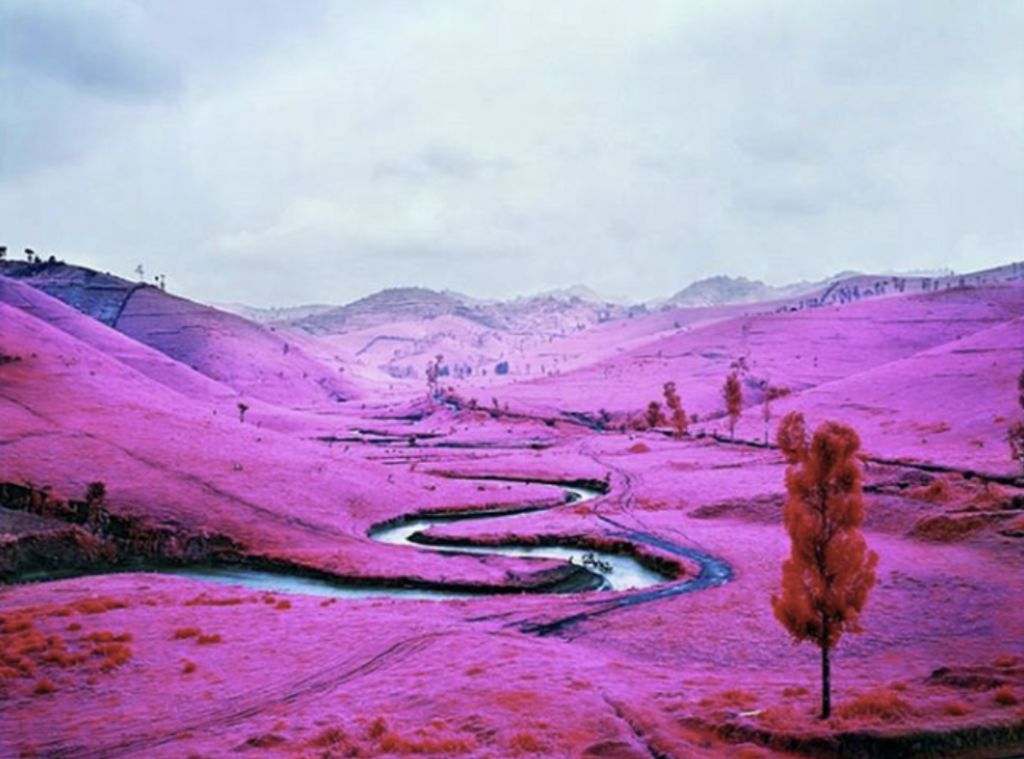
In his Infrared series, Richard Mosse has transformed a landscape which at the time served as terrain for war, into a totally different reality, something out of sight for the human eye, something that is other-worldly.
The vibrancy of the fuchsia colour creates a distraction from what is really going on within the landscape being portrayed and that initially made me question whether the artist is demeaning and discrediting what is actually going on.
As a documentary photographer, Richard Mosse is certainly expected to document war through its aggressive and devastating reality, yet it seems like his approach of revealing beauty in the landscape of war through the use of military apparatus could in fact, be bringing more attention to the matter.
The idea of exploring landscape through relationship was a reoccurring theme in Dr. Ed Wall’s practice. Wether it is the historical relationship that Mary Miss looks for, or the relationship that the military might have with a certain landscape with the help of the Kodak Aerochrome, in contrast to a civilian who is unaware and blind to this alternate reality, explored by Richard Mosse. Dr Ed wall gives a further insight into what relationships might exist within a landscape. He starts with Patrick Geddes as an example where his map of an area includes names of people which relate to how they were situated in the landscape through their work or else.
Finally during discussion, Jim Hobbs brought up the concept of the uncertainties of landscape in relation to time. Time is an element which we have to be very aware of as it can make the development or existence of things rather unstable. When designing these things how much does the idea of time play into the process of making?
When thinking about space and landscape in time and how to represent them in relation to it, it becomes clear that there is no indefinite answer and spaces are constantly transformed through time. Sometimes unintentionally, other times intentionally.
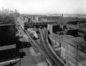
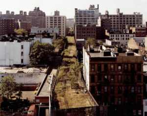
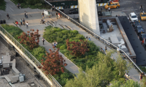
An example of a landscape being transformed with the intervention of time is The High Line in New York City. The High Line in New York used to be a freight rail line in the 1930s-80s (reference) which the mayor wanted to demolish because it was out of use and not relevant to the landscape or useful to the people of New York. Some locals however, fought to keep it which led to the transformation of this space into a public park walk through. This decision let to a competition to redesign the high line which was complete in 2009. There is an overwhelming variety of what designers imagined the space could be transformed into as seen on the design page of the official website here.
The 3 images seen below show what it used to be in the 20th century when created, into the unintentional transformation of the space under the duress of time when abandoned, and finally into the intentional 21st. century final transformation.
Further Research
The Kodak Aerochrome film has also been used by a variety of artists such as Jimi Hendrix and Frank Zappa who would use it for psychedelic effect on album covers years later as suggested in this article.
The reason behind using such visual style for both was that their music had psychedelic connotations probably not coincidently based on the ongoing Psychedelic movement happening across America in the 60s. And so, such colours were used for communicating concepts of altered states of consciousness.
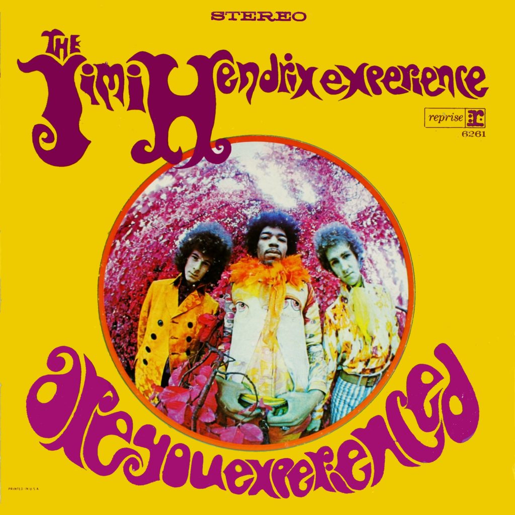
One very well know album cover is Jimi Hendrix’s 1967 album �Are You Experienced�, as seen on the left here had a very interesting concept behind it. The graphic designer, Karl Ferris, was inspired by the music within the album to come up with a whole backstory about “group travelling through space in a Biosphere on their way to bring their unworldly space music to earth.” Based on that backstory he decided to use the Kodak Aerochrome film to achieve these other-wordly qualities in combination with the use of a fish-eye lens which also gave a distorted perspective of the cover and contributed to the developing concept.
(reference to image and information above is linked to the image)
As much as this cover is referencing psychedelic states and links back to times in which a lot of people were experimenting with drugs, certain choices of creative direction can be used in the type of work I look to create which is much more about sober states of mind, yet still interrupted by some sort of external factor such as trauma, inherited susceptibility or others.
Particularly the fish eye lens is a perspective I have explored before in relation to exploring a state of panic. Similarly to the album cover, my work encompassed its focal canvas within a circular entrapment rather than using a square or rectangular one. It served as a way in communicating a sort of loss of control which in my work had negative connotations, however I believe that the album cover also communicates this idea of loss of control but in a positive way, one where the loss of it is instigated by the one who holds it as a way of opening up and being in an experience which is not entirely driven by ones conscious.
Practical Work
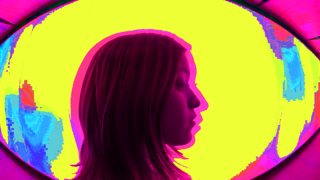
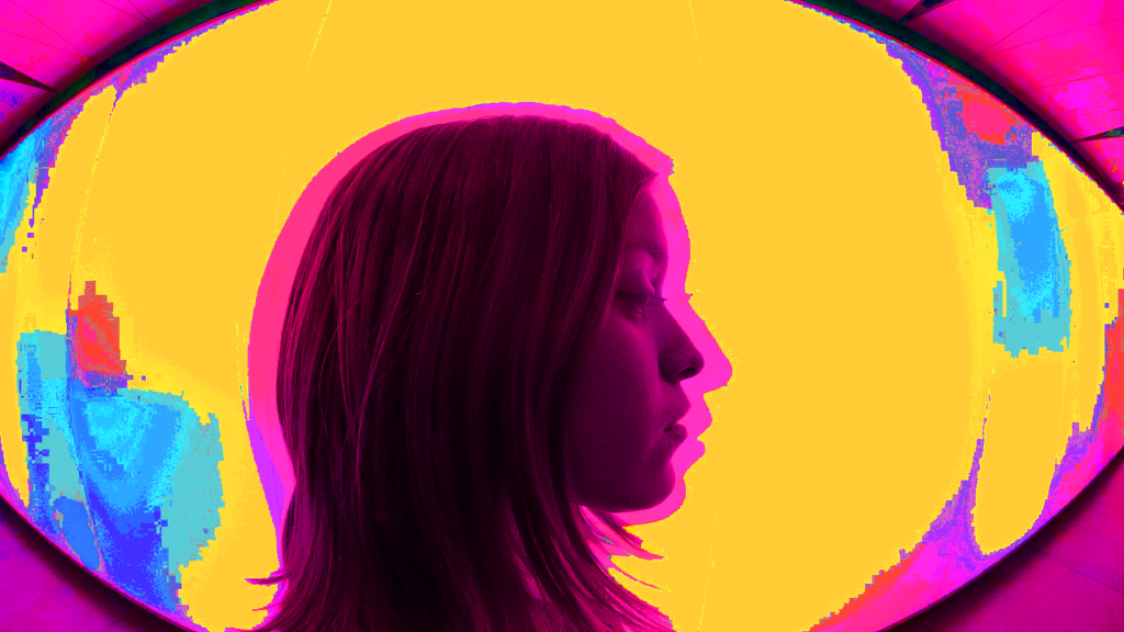
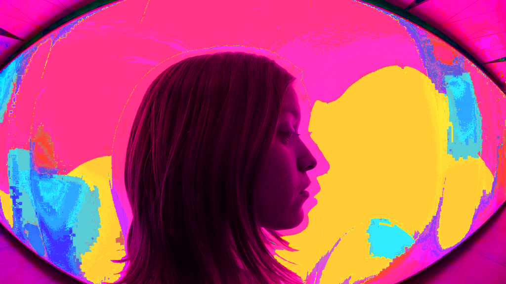
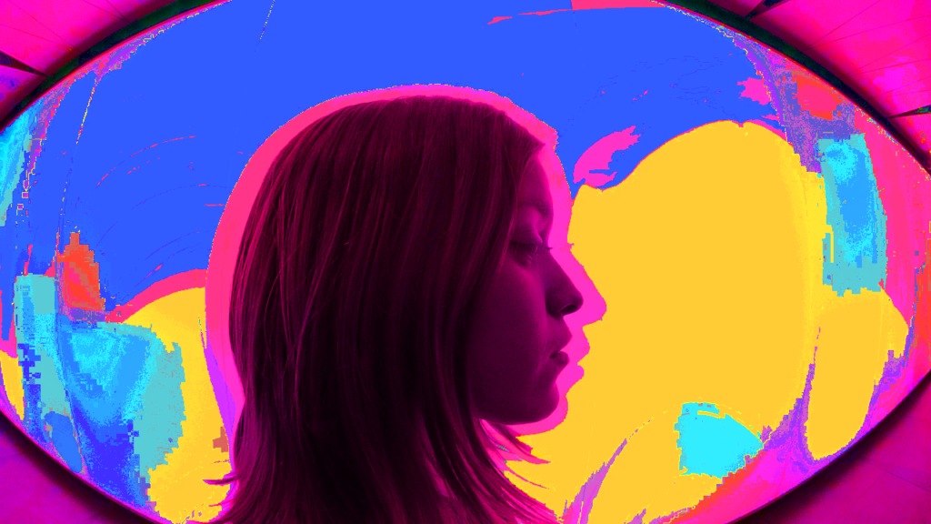
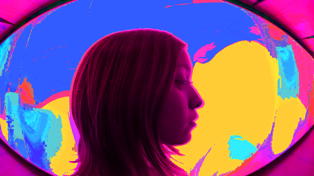
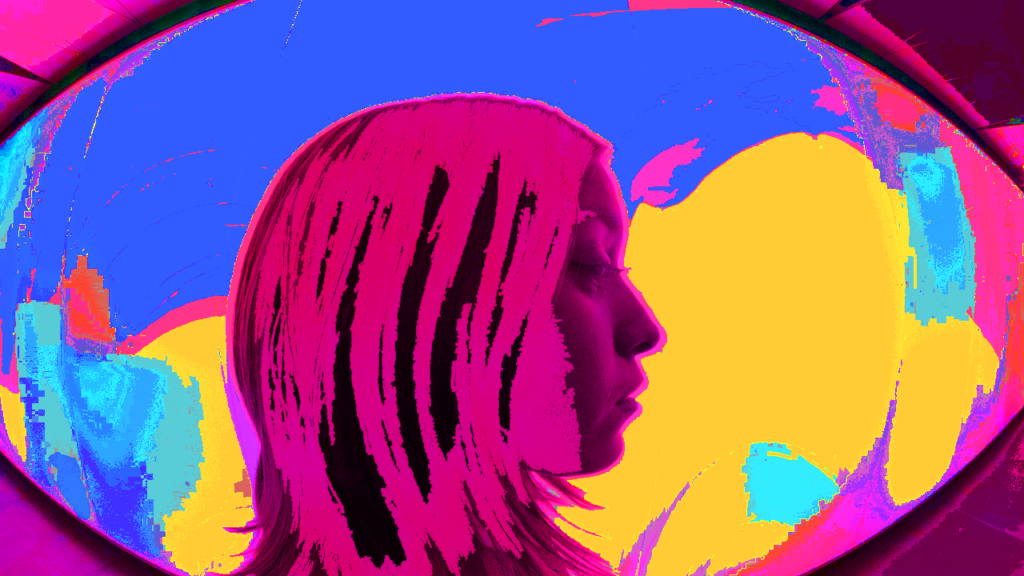
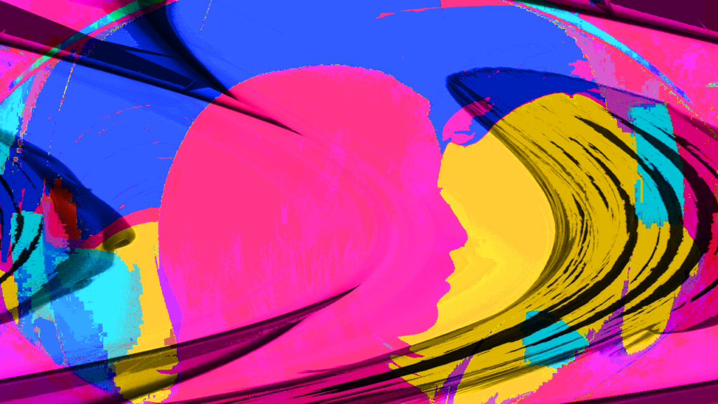
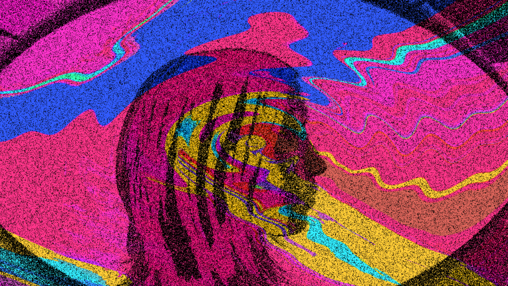
For some practical work in reflection to the lecture and my further research I decided to play around with one existing photograph using a fish eye lens, alter it’s perspective a bit more through some editing techniques through photoshop but also add a multiplicity of layers of the researched memorable kodak Aerochrome film inspired infrared shades. Below is the variety of prints of the photograph used. The experiment was very practice led in a sense that there was no pre-planned results. It was rather very much a layer onto layer on manipulating until it reached a more compelling visual. The final print seen below reminds me of what an album cover, a poster or some sort of other promotional material might look like rather than an art piece which would be put up in a gallery. Possibly, unintentionally I was reflecting on Jimi Hendrix’s album cover for hi album �Are You Experienced� as seen earlier on.
Unfinished Works
Student Led Seminar
Ollie, Matt, Ting
In todays seminar the discussion evolved around unfinished works.
Matt questioned whether completing a piece of work is natural.
He perceives it from a point of view considering the natural world around us. All the things and materials in nature tend to have a process which works in cycles. For instance, the rock cycle. When is a piece of rock in its final form, similarly when is water in its final form?
Another idea that was brought up was to think of unfinished work as unstable and finished as stable. If a piece of work can stand for something and provides a message or has achieved some sort of meaning, then it is finished. However in reality it can be not as simple as this – psychologically there can be too much potential within a work or too many options and we as humans are often unable to make a final decision. Maybe instead of concentrating on a piece of work being finished, we should actually concentrate on its potential, or its concept, the materialism of it even…
Georges Bataille, French wrtier-philosopher, introduced the concept of formlessness.
“argued that art should be brought ‘down in the world’ from its elevated status to its base materialism – and that this debased state should be celebrated as a tool for creativity” (Tate)
He sees art as proof of technical skills, and considers the materialism of it to be of much more importance than the concept or spiritual but also possibly looks at art as something that is finished when it is technically well executed.
Based on the very minimal and and broad information I have read through on Georges Bastilles, I cannot say I fully understand his stance on what art is and how it is measured in value or success. I find it rather plain and undignified to measure the value of art as purely technical skill and also to claim that the importance of it is not in the conceptuality. If art is not for enlightening people, making them see different perspectives and making them question their beliefs, then what is the point of it? Simply a way of grading artist on their technical skills?
Many artists such as Jeff Koons, Damien Hirst and others, do not even ‘execute’ their own work. These are not just artist but ones that are very successful. Jeff Koons has sold his work for the highest price of any living artist. Therefore I am struggling to grasp this concept of the value of the art is based on the technical skill of the artist. Both in the the sense of cherishing the work in value as well as its materialistic value.
Further into the Unfinished
Thinking about unfinished movies…
Some unfinished movies which were originally not praised but end up gaining a big following such as ones explored in this article. The ones which did not turn out to be successful were not particularly because of their ‘unfinished’ nature. The movie, Sphere (1998, Barry Levinson) for instance, was considered unsuccessful due to budget issues as well as plot issues. It is said for its middle section to be overstuffed with too many philosophical aspects and character expositions, which made the audiences struggle to connect with it.
Unfinished movies bring on further questions and considerations.
Blade Runner is a movie which original cut is considered unfinished, however the way I see it in fact it has alternate finales. Each finale suggest a different plot twist. One considers Deckard to be a replicant based on the fact that Gaff created a unicorn, similar to the one in Deckard’s dream as if he is aware of his dreams, hence they are implant. Whilst another cut makes us consider the paper unicorn simply as a sign of mercy.
In my perspective, this sort of analysis looks at unfinished work as non existent. Even though the first cut is considered unfinished, it in fact has an ending. It is simply an alternate one to the rest. Similarly when it comes to a piece of artwork, whether it be made out of a time-based medium such as video, or not such as a painting, it can be considered that the work is always finished, complete.
Another way to consider work can be that it is in fact always unfinished. There is always the potential of adding something onto it, even that ‘something’ might not be considered as adding to the aesthetic or value. Banksy proved us so with his ” most audacious stunts in art history, arranging for one of his best-known works to self-destruct after being sold at auction for just over �1m. “, as perfectly worded in the Guardian article.
This bring me back to the point that artwork should not base it success on its technicality or the skill of the artist solely. Rather its success and value comes from the message it sends, the question it asks or the emotion it evokes. The artwork can even be destroyed, and still teach us more than we ever expected to learn. Weather it be from a painting, a graffiti, a sculpture, a video, an installation and more.

