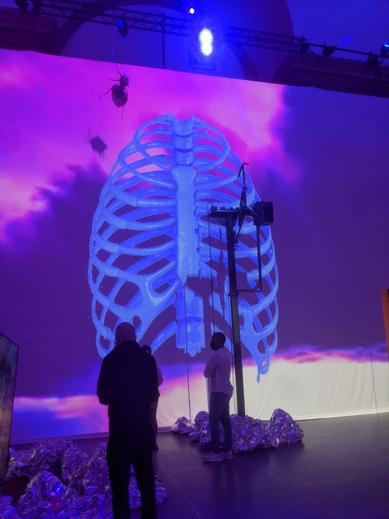
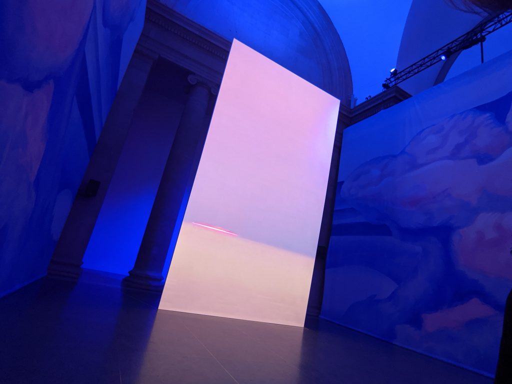
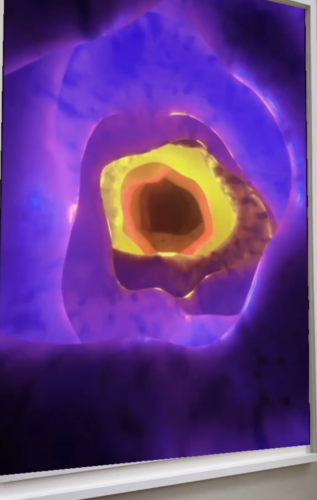
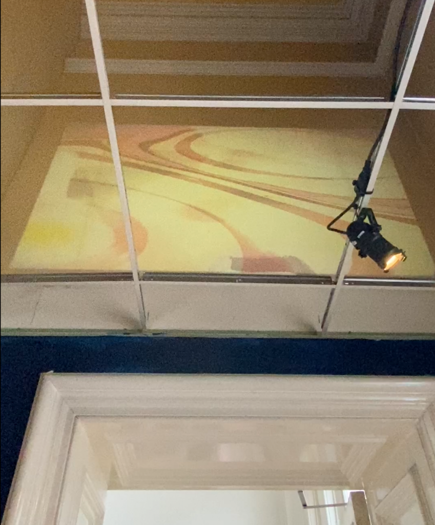
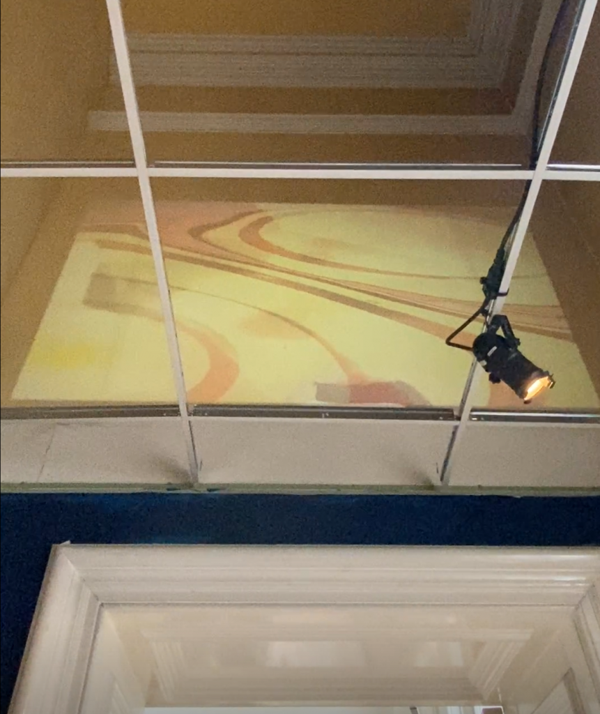
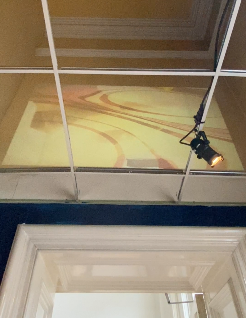
Heather Phillipson, RUPTURE NO 1: BLOWTORCHING THE BITTEN PEACH, Tate Britain
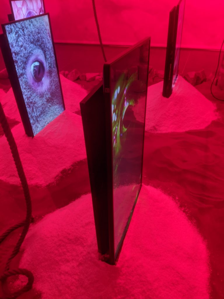
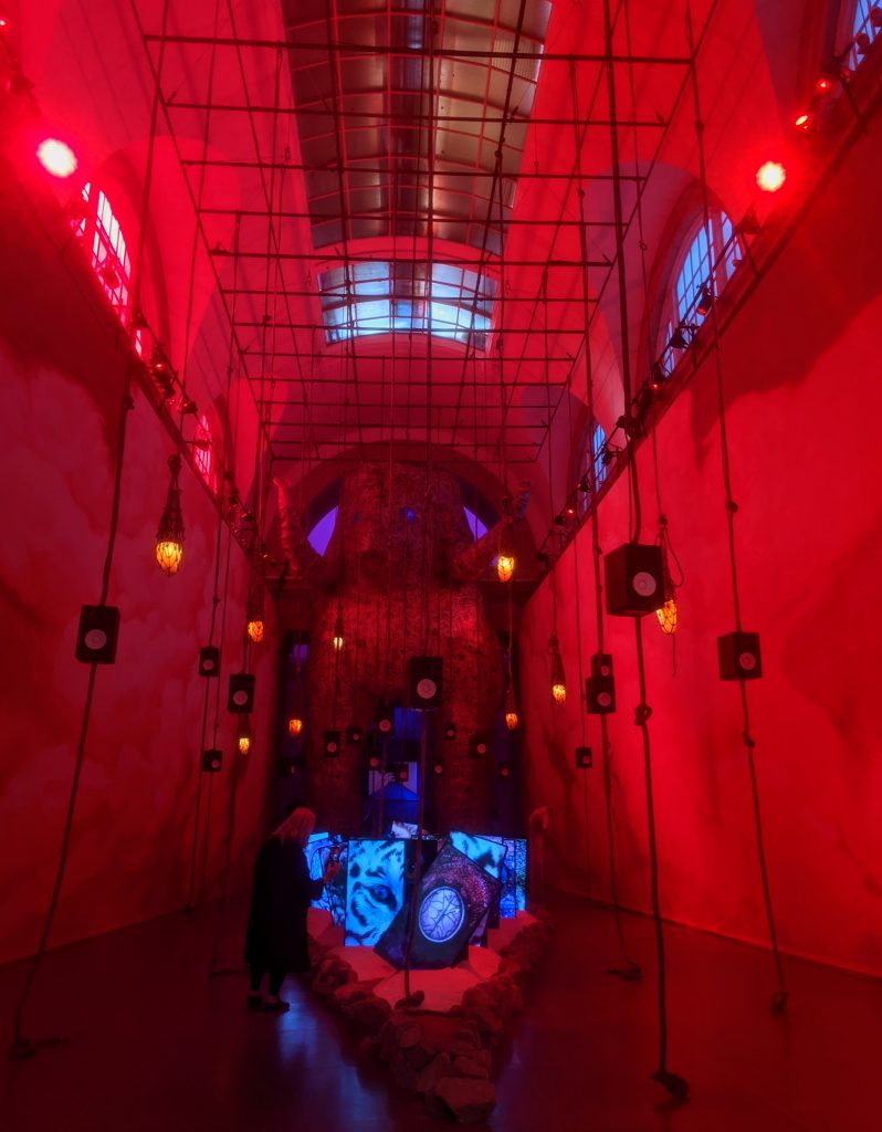
This exhibition was more than different pieces of work installed within the gallery. It was a whole experience, an other worldly one for sure. She describes her work as one which exists in a parallel time zone and one that uses strangeness to provoke an ecstatic experience. (Tate Britain Commision: Heather Phillipson)
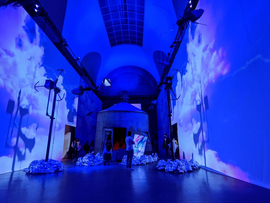
I can thoroughly relate to that in relation to my work, as I aim to create immersive experiences which take the viewer on a journey into another realm. One where time doesn’t work quite like it does in reality as we know it. I also aim to create environments which at first sight would seem like a dreamscape, but turn into something uncomfortable or alarming the more time you spend watching/experiencing. I found for Phillipson’s work to have a similar effect on me. I walked in, intrigued and overwhelmed by the beautiful colours and epic scale. Excited about this new experience, but my excitement quickly turned into hesitation about the intentions of this world I’ve been introduced to as well as a feeling on unease that something is not quite right, not quite natural. Such as the enormous ribcage which appeared in the beautifully coloured skies, or the peach which appear instead of a sun in the sunrise and sunset sequence.
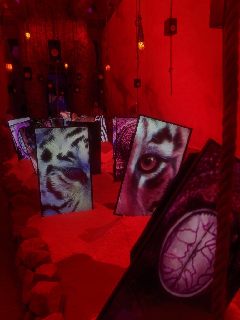
Although the red room is the first room to enter and it then follows on to the blue room, I did find the red room much more calming and easy to absorb, despite the big animal eyes constantly blinking on the carefully positioned flat screens. Speaking of which, I would like to note that when it comes to installing my work I do see a potential in taking inspiration from the way she has dug the screens into this pile of white dusty substance and possibly propping projectors or portals for my final piece in a similar way but instead with sandbags or other prop which might fit in better than a plinth.
I feel like there was so much sense of communication in her multi media installation that language could not quite make use to describe it. I found out that she comes from a background of writing poetry and even then she often focused on ideas behind the fusion of mind and body.
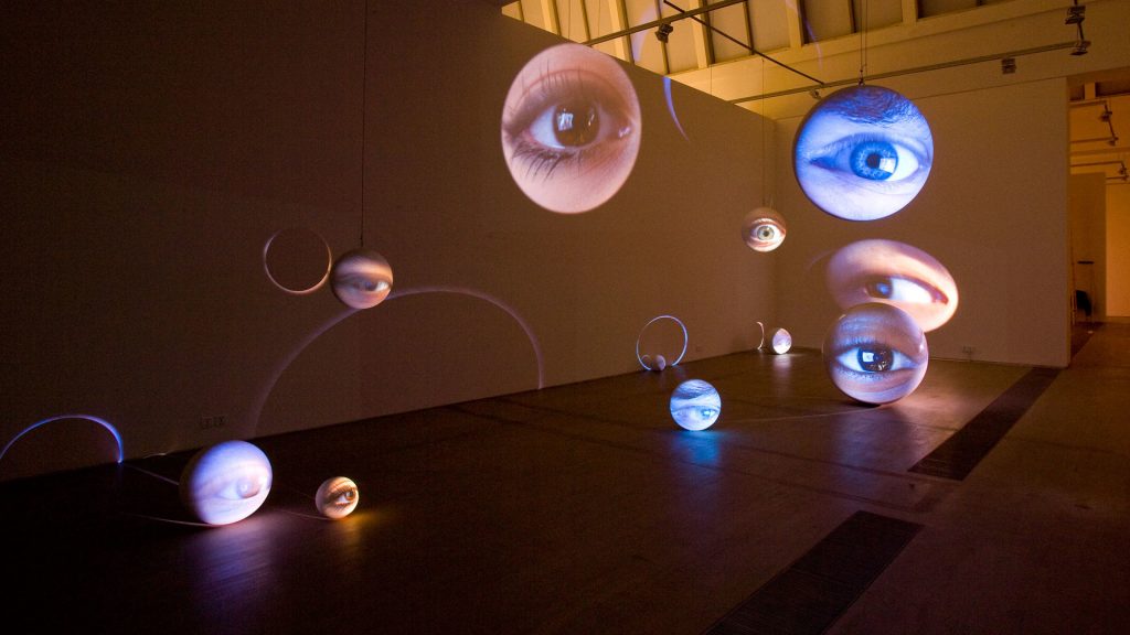
When it comes to installing my work and considering how Phillipson has exhibited and used props I also had a think back about Tony Oursler’s work in regards to installation and this image shows his work Number Seven, Plus or Minus Two, 2010 which has a very interesting arrangement I would also like to take this work in consideration when installing my piece. Although hanging pieces from the ceiling might be challenging in the space we will exhibit our Summer Show, it is not impossible. I think this type of installation can add more fluidity and balance to my work. Having multiple portals which vary in shape, size and position will also add to the idea of a multiverse or plural realms or realities that my work explores.
Rory Prout, Views from the Cloud Chamber, Project 78 Gallery
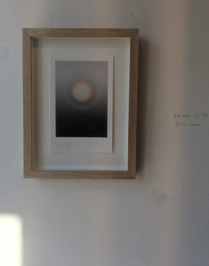
Broken Spectrum 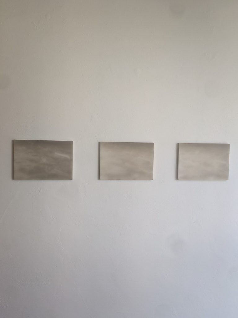
Cloud Chamber 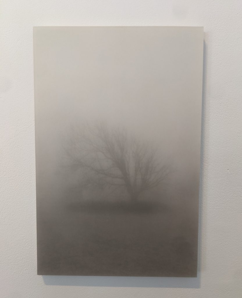
Trails. Tree
Rory Proust’s work is largely attached to his location and process is a very important part of it. He uses oil and chalk being bound in wax, but in his most recent works he has started using resin. His choice of process and materials is what puts his work on the boundary between two realities; the work could be called a photograph but could also be called painting. This uncertainty reminds me of the concept of hovering between 2 distinct states or realities when it comes to my practice. As his works are almost always landscapes I also see inspiration in that aspect. He transforms existing places into something or somewhere new. Trails. Tree for instance is a part of a series of works which were taken as a part of a landscape in Ireland. Proust has transformed that environment into visuals which exist in a mystical land, there is a vagueness or even an unimportance to location that appears through the foggy layer which sits on the forefront of Trails. Tree. There is importance to the tree, the place and possibly some personal connection to them from the artist, but there just doesn’t seem to be an importance of location in my perspective. It is about a journey into a new place.
More about this exhibition can be found here.
Alice In Wonderland, Victoria & Albert Museum
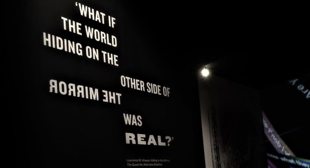
The quote seen above is taken from Lawrence M. Krauss’s book Hiding in the Mirror, which explores the possibilities of the existence of alternate realities. He investigates the obsession that people have with parallel universes and realities beyond ours as we know it and does so trough spiritualist as well as physics related ways. What I found interesting from the limited information I have read on this book is that he is interested in peoples restricted perspectives and uses physics to explain what we could see if it wasn’t for our limitation. For instance I learned that although we live in a 3 dimensional world our perspective in fact only absorbs information in 2 dimensions. Our brain simply puts the images from both receptive eyes together to create depth. I suppose this is just a simple way of saying that a lot exists beyond our perspective and so with the quote above he asks, is there only one true reality and if so could it be that it is not the one we live in and see through our eyes.
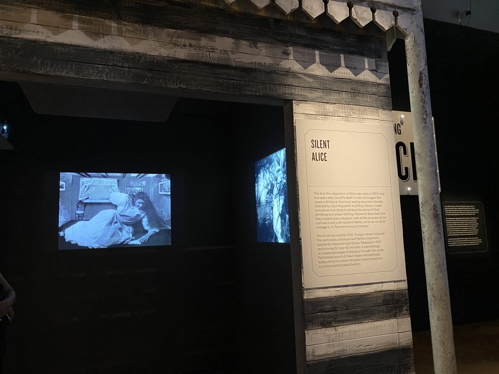
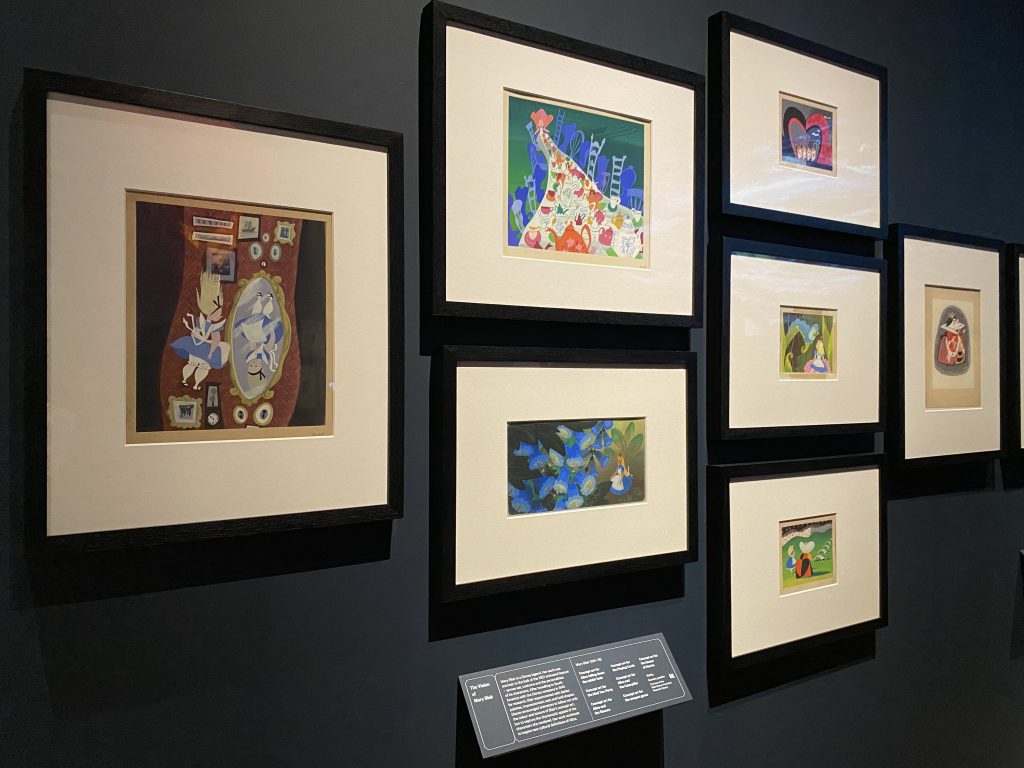
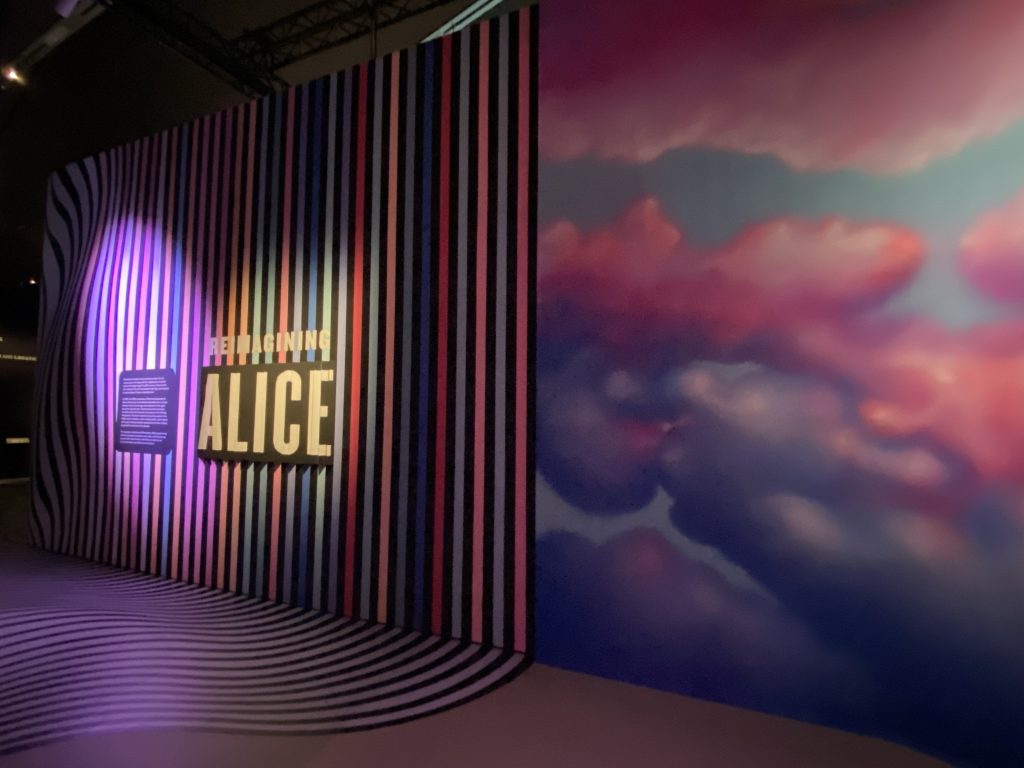
My overall experience at the Alice in Wonderland exhibition was amazing. The V&A museum had curated a magnificent way to explore the world of Wonderland from inception to evolution, adaptation and inspiration all around the world. From the first Alice film, Silent Alice (1903) to some of the first sketches behind the Walt Disney Alice in Wonderland animation , drawn by concept artist Mary Blair. The colours and the sense of scale and unrealism in the works she has created in 2D are at the core of what we know as Wonderland today. When it come to the alternate reality I am looking to create for my final piece I would like to potentially create some graphics of Wonderland inspired aspects whether it be colour or rather more focused on landscape and nature as a way of communicating that this realm is not one we might perceive as real. I have also included an image of a wall which worked as an introduction into one of the divisions of the Alice exhibition, because it repeats an image I had seen not long ago at the Heather Phillipson exhibition. One of her projected dreamscapes was primarily made up of skies in the same blue and pink hues we see on the mural type wall at the Alice exhibition. I suppose the vibrant pink and blue sky works as a type of representation and visual language of communicating the otherworldliness of the environment being explored.
Although Dodgson was a writer of the magical and imaginary, he also found photography to be a form of storytelling where he could conjure up fictional worlds. Thinking about Alice through the looking glass there are aspects which come up as if inspired by photography.
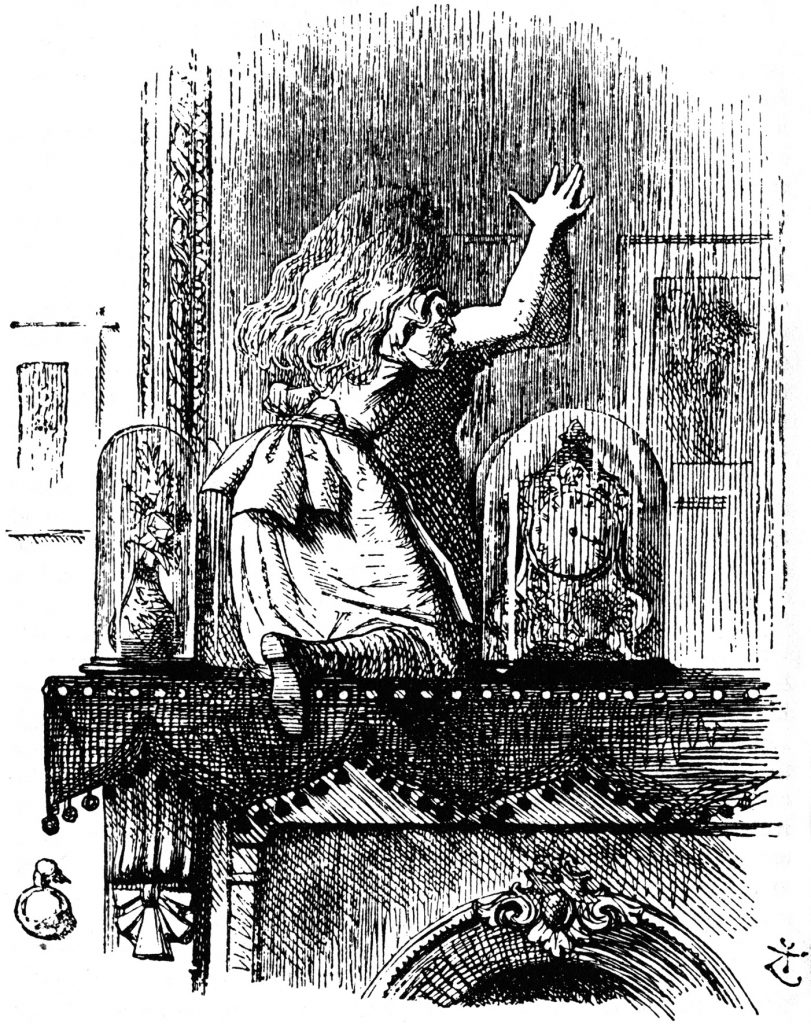
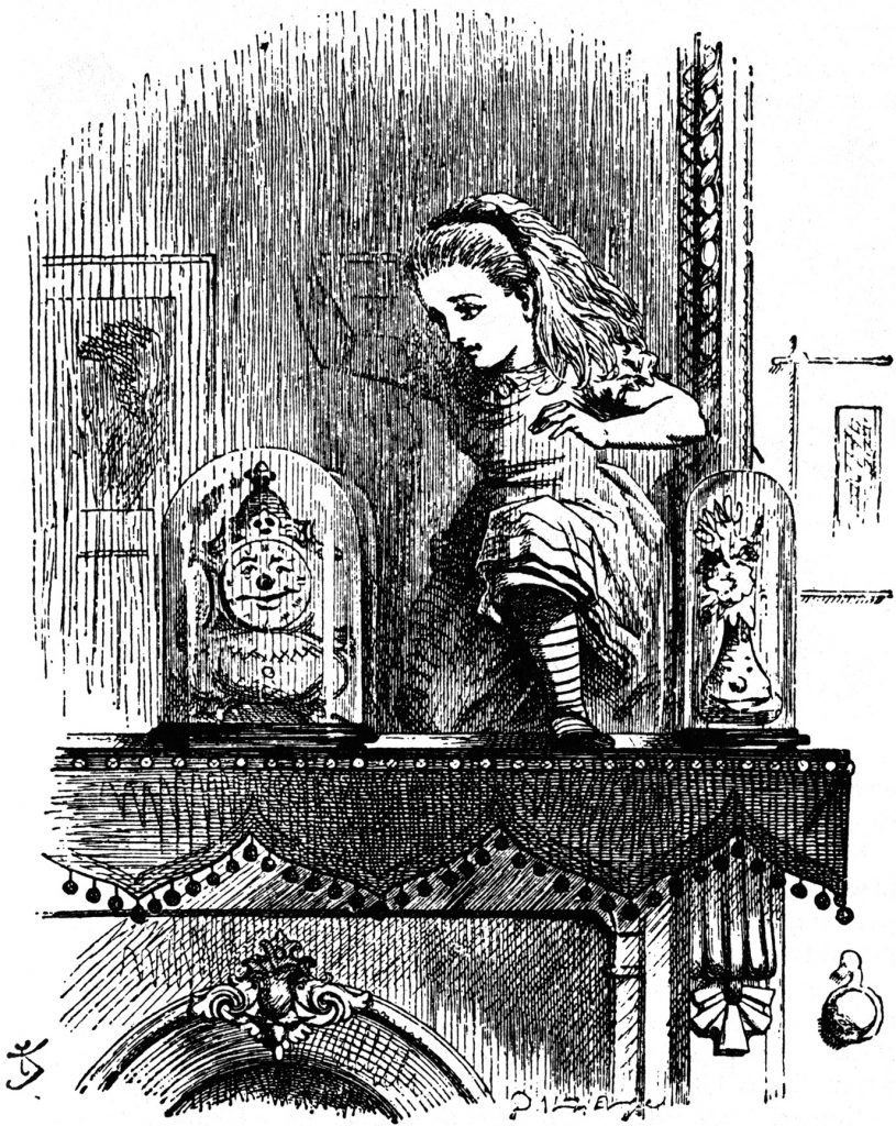
For instance, a camera reverses what you see and produces a mirror image, much like the backwards world world in Alice through the looking glass. In the images seen here the reverse is rather obvious as they are being presented along each other. However I believe that using such a technique, de mirroring the visuals, in film could work as a very subtle way of communicating an alternate reality.
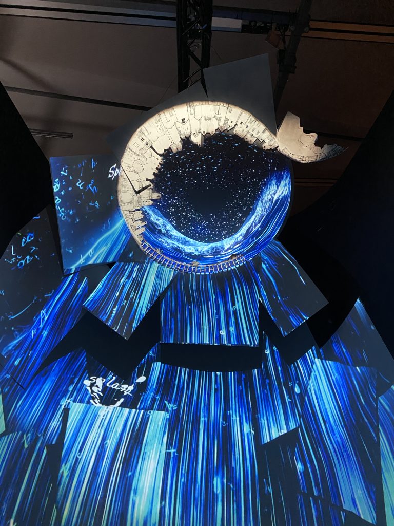
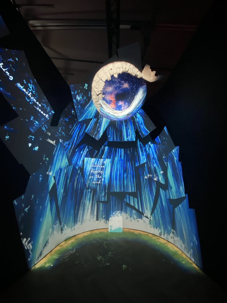
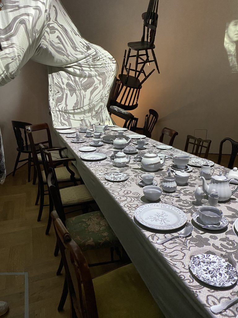
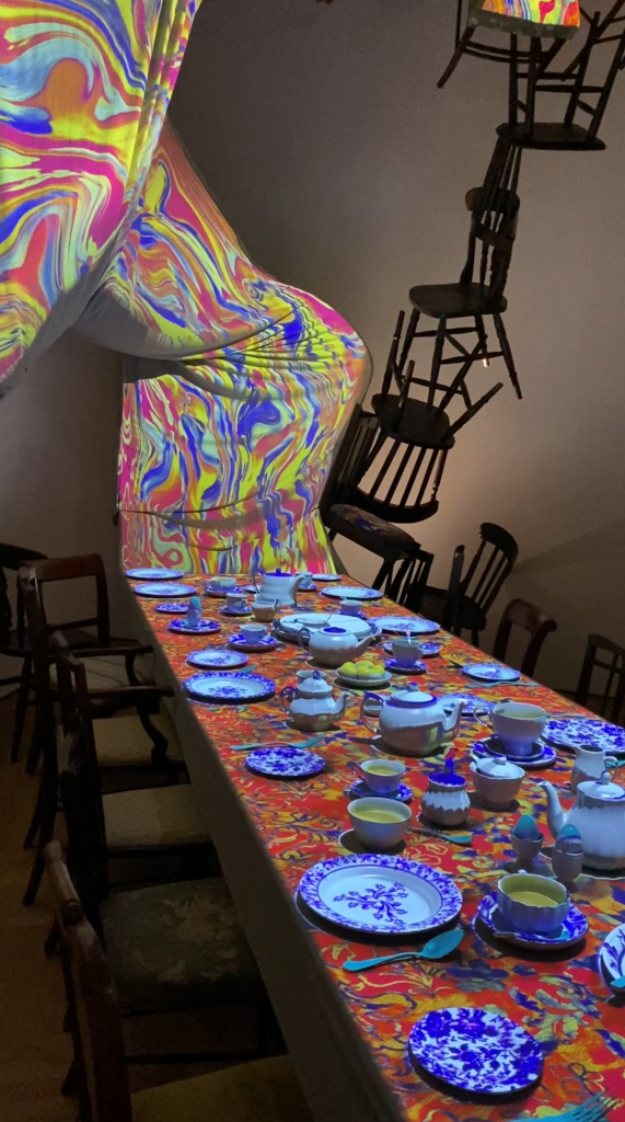
The exhibition also included more immersive and recent art works which included projection mapping, as seen below.
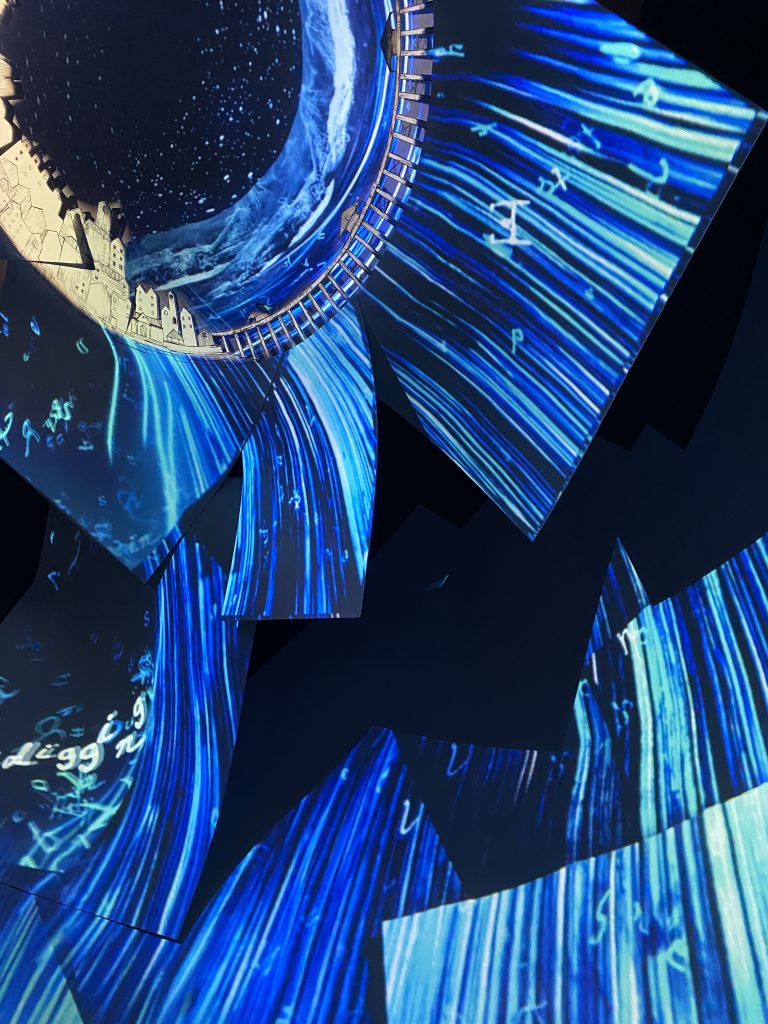
The first work seen on the left drew the viewer to step within it and experience it whilst being a part of it. It felt like stepping into a portal, the way that the projections surround the viewer from the sides and above plays a big part in the detachment of your surround and the neglecting of the fact that this piece of work exists within the walls of a museum. Although the installation and concept gave me some great ideas and experiences, I couldn’t help but notice the last minute attachment at the bottom and middle of the work, which was an A4 piece of cardboard leaning on the previously built sculpture in order to ‘hide’ a speaker.
The table cloth experience (images on the left) was a scene inspired by the Mad Hatter Tea Party. It was exciting to see this almost theatrical set up combined with the projection mapping as a piece of art. At this point the exhibition had just passed the 1960s era which apparently brought Alice in Wonderland to even more fame. The psychedelic patterns known to the 60s can be seen on the projection mapping in this work. It is almost as if the table and all of the items on it come to life. The psychedelic patterners are continuously changing and looping, also featuring a time theme where we see a pattern of what seems like an infinite amount of pocket watches. The pocket watch is quite clearly a nod to the one that we see the white rabbit use in Alice in Wonderland but also the concept of time being explored right after the 60s division is quite interesting in relation to how we perceive time but also how time is being represented as still or moving in a different way in Wonderland in comparison to the ‘real’ world.
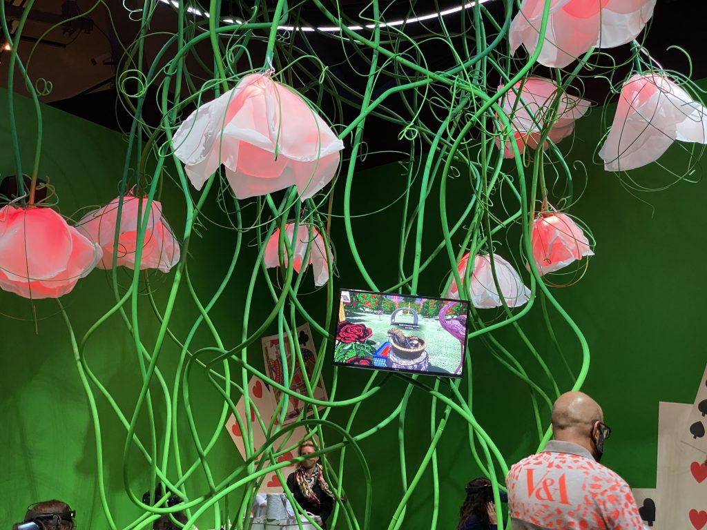
About VR and Immersion & Installation of Sculptures of Flowers:
The VR experience follows the storyline of Alice in Wonderland and so there was no unique experience for me there, however there was something I found intriguing about the commands and their importance. There were signs that appeared such as ‘eat me’ ‘drink me’ which give the participator a specific directions as to what they are supposed to do, they are presented as indefinite actions one needs to take. When it come to more vague or fluid works of art, the question of instructions often comes up. Should there be instructions for the viewer to follow, if there are would that impair their experience, or would they even follow the instruction. Based on these questions and their nature of going in a never ending circle, I tend to assume that giving instruction as to how to experience your work of art is pointless and possibly even speaks badly about the work. Professor Jo-Anne Bichard spoke about directions when it comes to design, and what she finds indefinitely true is that if something you have created needs to have a manual as to how to use it, it is poorly made. On top of that my perspective when it comes to my work of art is that I do not want to restrict anyone as to how they are supposed to experience it, in fact I want everyone to have their unique and individual experience because these alternate realities are a lot about places or states of mind which exist differently within individuals, therefore should be experiences freely.
Being Alice.
The exhibition included a description of what being Alice means and it essentially states that Alice is a means of seeing things differently and challenging established perceptions of the universe. Being Alice could be considered to be the methodology of this project. Not only because it is highly influenced by the concept of Wonderland and all of the aspects within it, but because by creating alternate worlds I am aiming to challenging preconceived notions of the meaning of the word reality.
Multiplicity of Wonderland
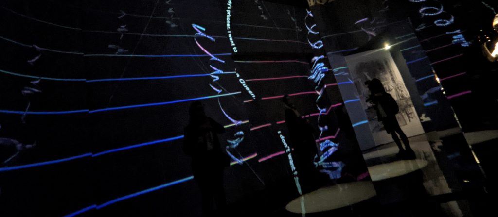
I see the mirrored room above as a less intense version of Yayoi Kusama’s work. The graphics reminded me of what fragmented time might look like in a graph like or linear form. The darkness made the nature of this installation even more confusing, it was as if there was something lurking at the corner of my eye, and often times there was the reflection of someone in that space, or even myself. The combination of darkness and reflection is a new experience, yet there was something missing.
However the idea of reflection and seeing yourself or others in different perspective from the same place, does play a part in the realisation of my project. Throughout research, experiments and crits I have repeatedly been seeking to explore light and reflection and that is because it simplifies the idea of multiple realities/universes visually for the human eye. When we think about Wonderland as an alternate reality, we often think in positives, although Little Simz has a perspective which I agree with more. He said, that Wonderland sometimes feels amazing, sometimes you want to leave, it’s many different things. Thinking about the concept I am developing is about questioning reality as much as it is about this alternate world which proves to not necessarily be better, definitely not somewhere perfect. It’s possibly a psychological space and so it could be controlled more by the ‘host’ than a physical environment.
Art in the Age of Now @ Fulham Town Hall
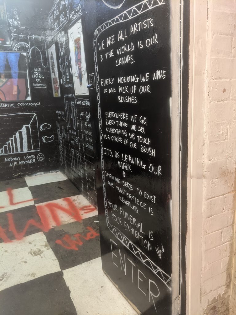
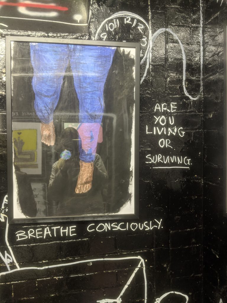
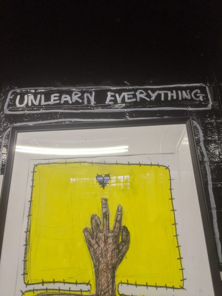
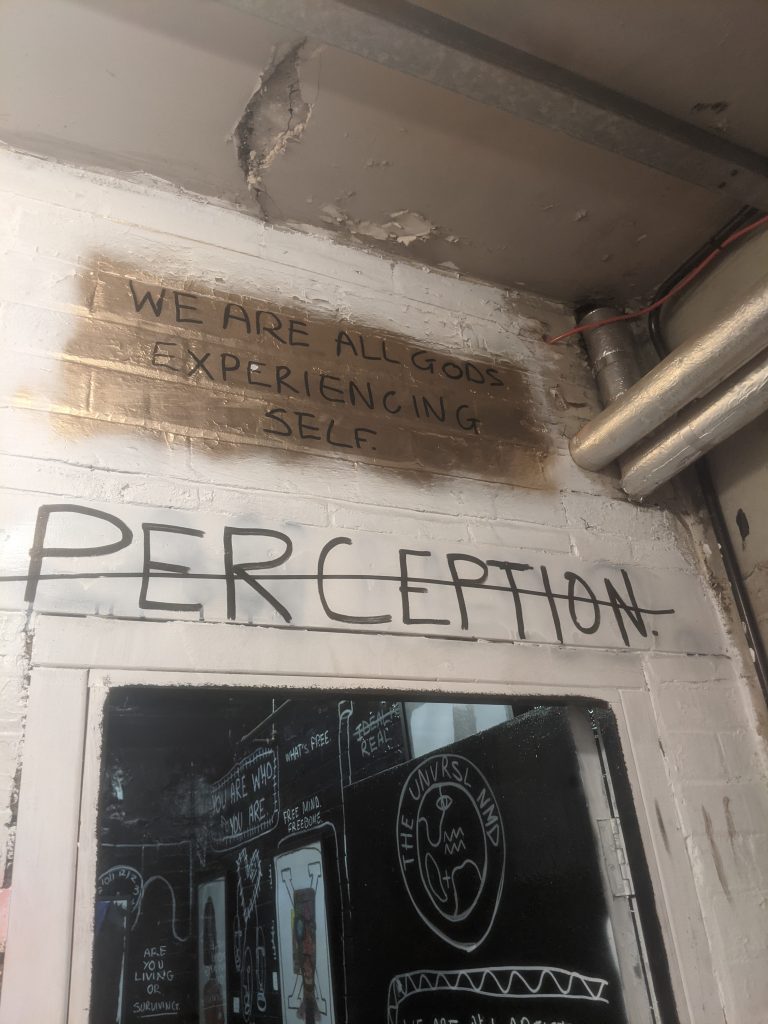
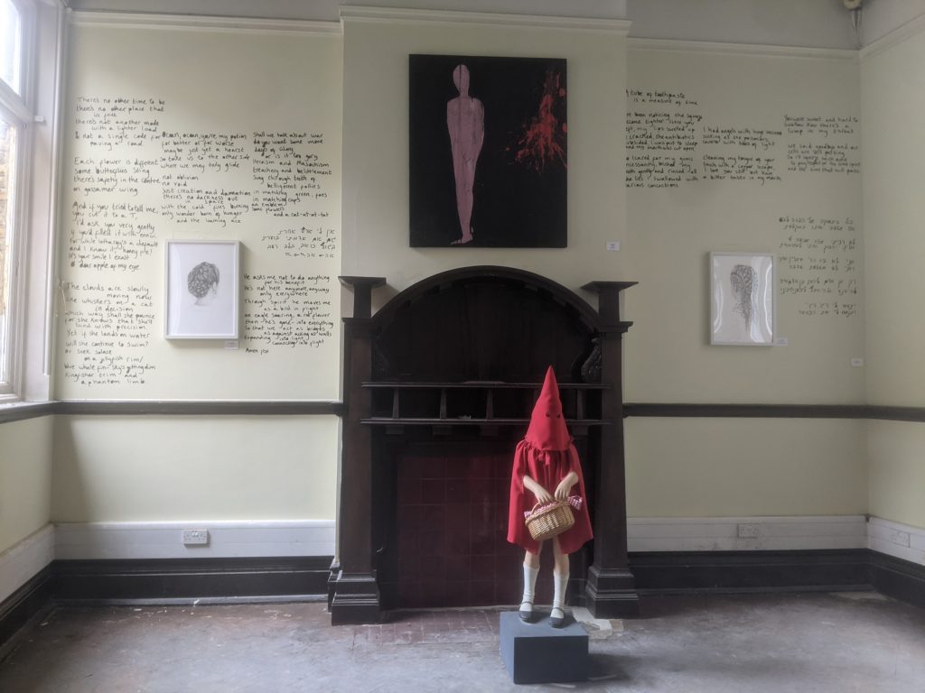
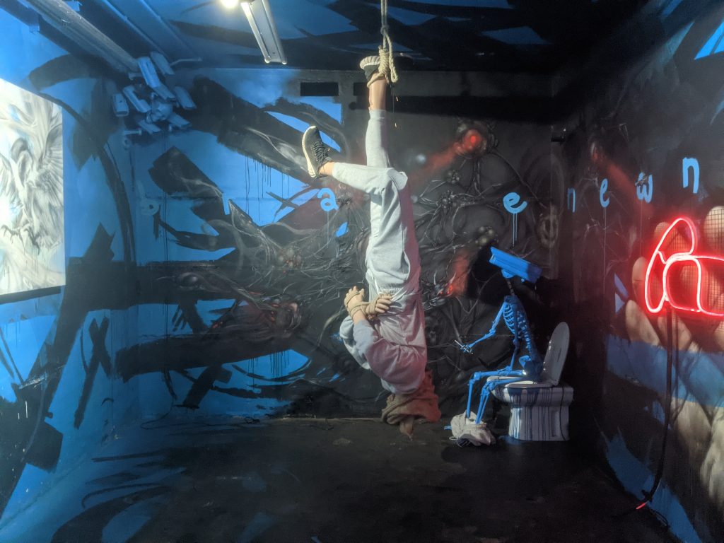
UNVRSLNMD is an artist who, although does not work in the same mediums as myself, I do massively relate to in terms of his work largely focusing on perception. The work I experienced, PERCEPTION, included acrylic and wax paintings as well as poems and statements written in a graffiti style all over the room seen in photographs above. Within perception they also ask what is the highest form of knowledge, which somehow has an almost simultaneous meaning to perception for me. We learn things as we perceive them, although what many might call learning is education, I believe what he means by learning and knowledge is simply what beliefs and morals one has in relation to how they live their life. UNVRSLNMD challenges the viewer to unlearn everything they know whilst experiencing his work. They also remind us to breathe consciously and hide sketches of clocks around the room which ones again bring in the concept of time .
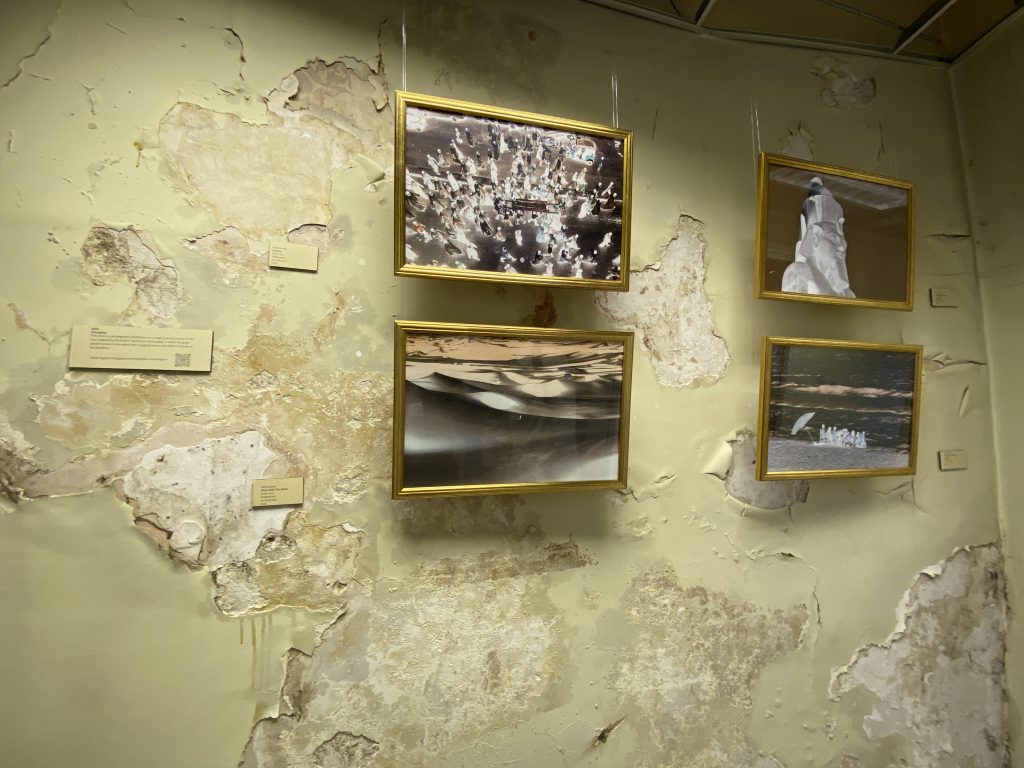
Noha Zayed, Voyaging: This work interested me most through the choice of installing it on this contradicting background.
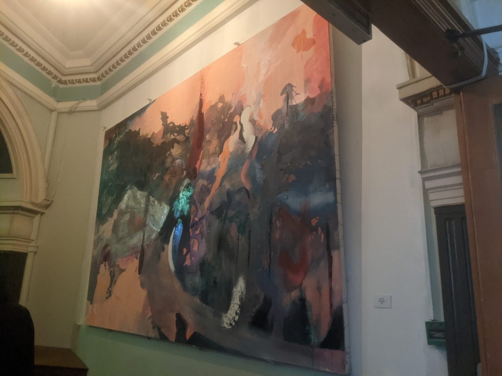
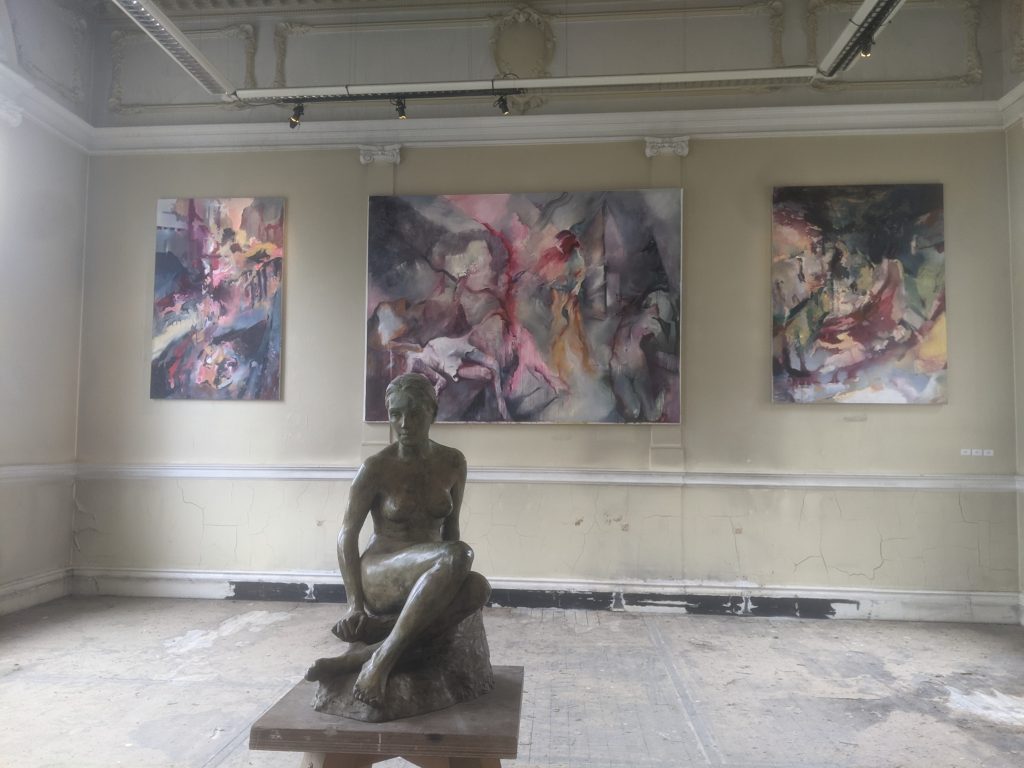
RU KNOX, Oil on Canvas: I found this work inriguing because of the vibrant colours it uses as well as the foil detail in the centre of it. I was thinking about how to represent the abstract world or alternate reality in my work and I felt like it captures abstraction and movement amazingly, despite its static nature.
Unknown: the bottom photograph is of a sculpture and painting, which had no artist, nor title to go with it. The paintings ones again, I found drawn to because of the abstraction and colours, I then found that in fact there are bodies hidden within the painted canvas which somehow made the painting even more otherworldly and even divine.
Within the work on the left I was mostly interested in the poem, written by Dana Berber. What initially drew me to it is the sort of careless way it was written it, or at least it seems so. I also feel like the writing of the artist is not particularly beautiful and anyone else would have probably payed someone else to write their soulful poems with a hand of professionalism in calligraphy. I would like to clarify that I look positively at the fact that the poem is written with these plain visuals. Moving away from choices of installing and into the work itself, one of my favourite abstracts within their poem is the following:
‘Not oblivion, no void. Just creation and damnation, there’s no darkness out in space, with the cold fires burning only wonder born of hunger and the learning ace.’
Of course the words void and oblivion caught my attention, as these are key words in spaces and places I have previously explored as potential alternate realities. This artist rejects the existence of a void and suggests there is only creation and damnation which I suppose is possibly a more religious perspective. I say that because void and creation & damnation do not exclude each other when one or the other exists. The existence of a void or oblivion does not deny that to creation or damnation yet the artist seems to have worded it in such a way. From this abstract alone I could say that the perception communicated in this work or even the understanding of the world is probably the opposite of what I seek to explore through my work. To me, this text is one sided, not allowing multiple possibilities or considering many realities. I could be wrong of course, that is just what I interpret from only one poem or even one abstract of the poem which I have hyper focused on,
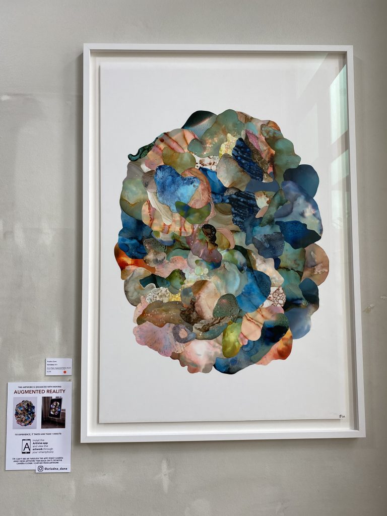
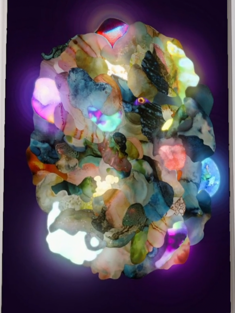
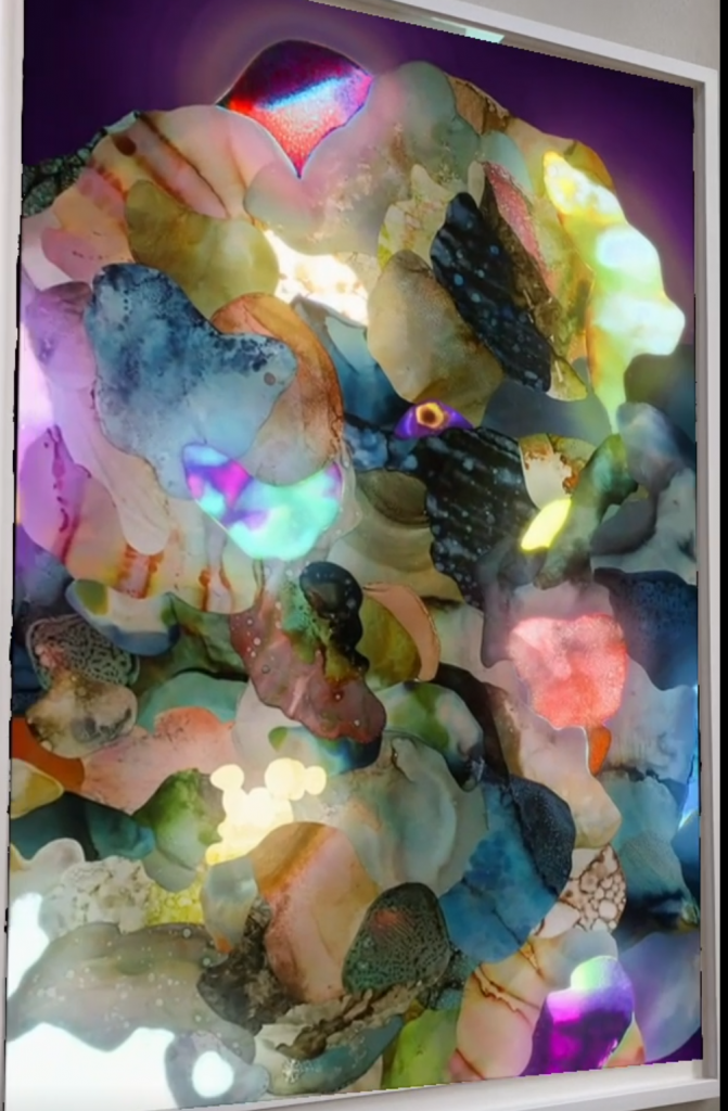
Ariadna work is highly experimental. She aims to use techniques which crate organic forms have a natural aesthetic despite the abstract essence of her work. There is even something celestial about her work, especially when it comes to life through AR.
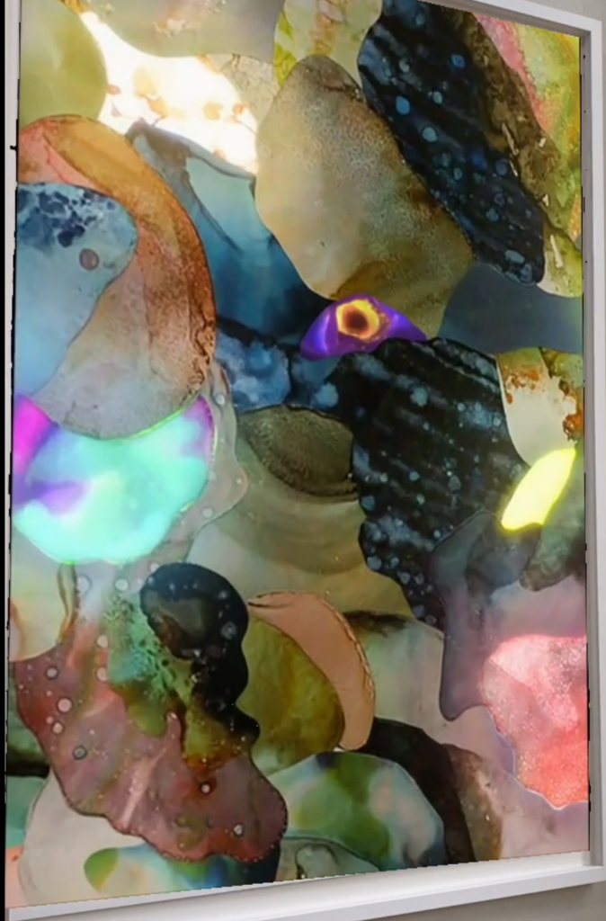
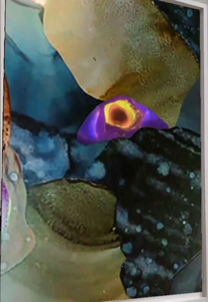
Because of her choice of material and her technique, letting the ink take its own form, the outcome of her work is often fluid and alive, as seen in Serendipity.
Ariadna also repeats and moves around existing shapes, which sort of become to look like a puzzle of sort, one which has endless possibilities, there is no right way of putting it together.
Her work Serendipity also has a large sense of dimensionality in its AR form, it becomes a black hole of a wonderland or a portal into an almost euphoric experience.
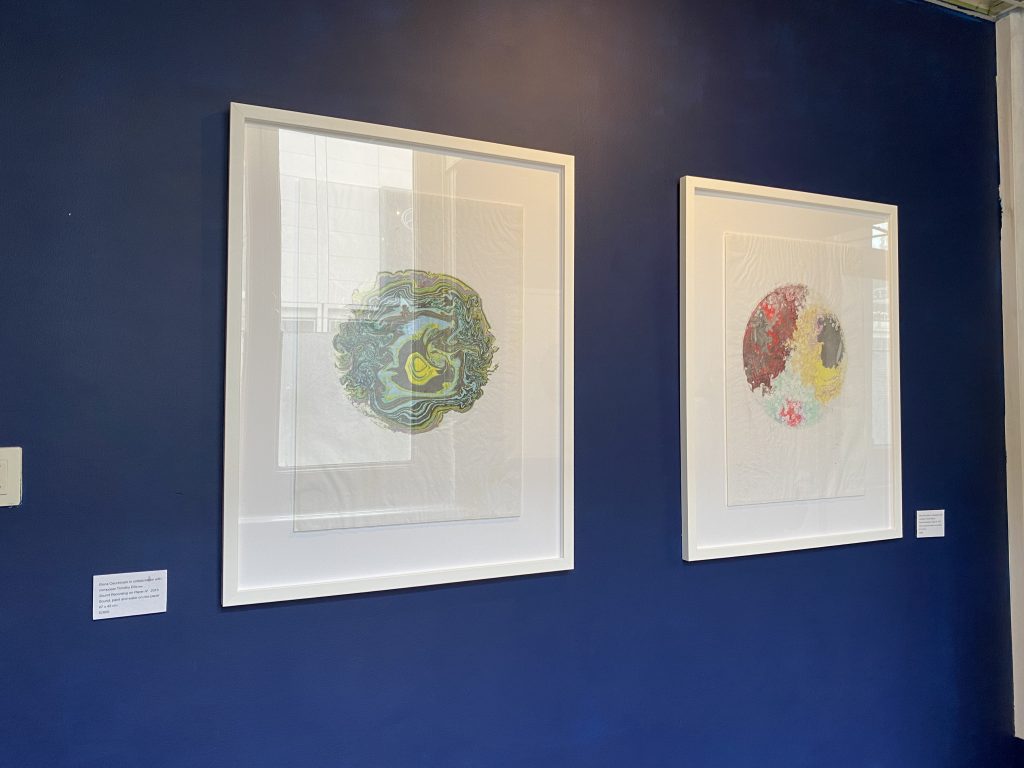
This piece of work included a performance video of the process involved in creating the prints, the prints as well as a musical composition curated by Timothy Ellis in collaboration for this project. Most recently, Cechinato’s work has been focused on transformation, abstraction and the invisible. This particular piece of work presented is what she describes as a painting on water and sound waves.
She paints on water which is placed above a speaker connected to an analogue synthesiser. The sound waves then become the tool for creating these unique patterns. The prints have essentially been created by an invisible force, giving them an almost celestial quality.
As already mentioned, the installation also includes a musical composition. The sounds are ominous, almost lurking in the corners of the room, they’re stretched out and cannot be associated with a particular instrument. There also comes a stage where as a new drop of ink is added to the water painting, the sound becomes glitchy, its presence has been disturbed with the intrusion of the drop.
This piece also partially reminded me of my work Paint & Water, where I explore light and movement through a performance of dropping paint into a pool of water from different angles and momentums, as the natural light from the outside moves and shapes the paint which engulfs the clear water.
Marina Adams
saw her work through a window display, could not enter as it was exhibited in a private building.

I was initially drawn to the colours and shapes she uses in her work. However I also relate to the way she creates her work, she says she is very critical of when it does not become what she wants or it’s not her original desire. She also is aware that she can’t dominate and she need to let the work stand by itself and let the ego go. She starts with a an idea of a definite concept and slowly lets things enter the work fluidly, developing that initial concept.
“It’s all about magic.”
Peter Fischli @ Sprueth Magers Gallery
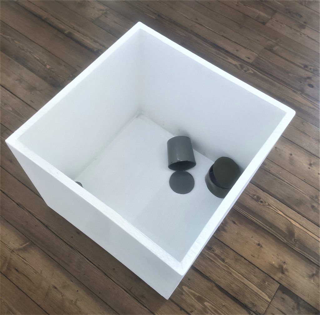
Fischli is a swiss artist who uses simple and conventional materials in order to then shift their meaning. It could be argued that some of these cans are put on pedestals, which seems rather ridiculous as cans are perceived in a disposable way rather than being glamorised. I can relate to Fischli’s aim to lead people experiencing his work to unlearn what they know about the object and look at it from a different perspective and maybe even encourage them to give it meaning. I also chose to share the particular photograph above because even when it comes to the way he has used plinths in installing his work, there is unconventionality to that as well. The rules have been disregarded and a new perspective has been given, which is a very exciting thing. The way he has chose to use the inside of the plinth here has actually inspired some further experiments with graphics, projection and abstraction I collaborated with Yi Ting Liong on. It can be found in the Experiments section of the Major Project.
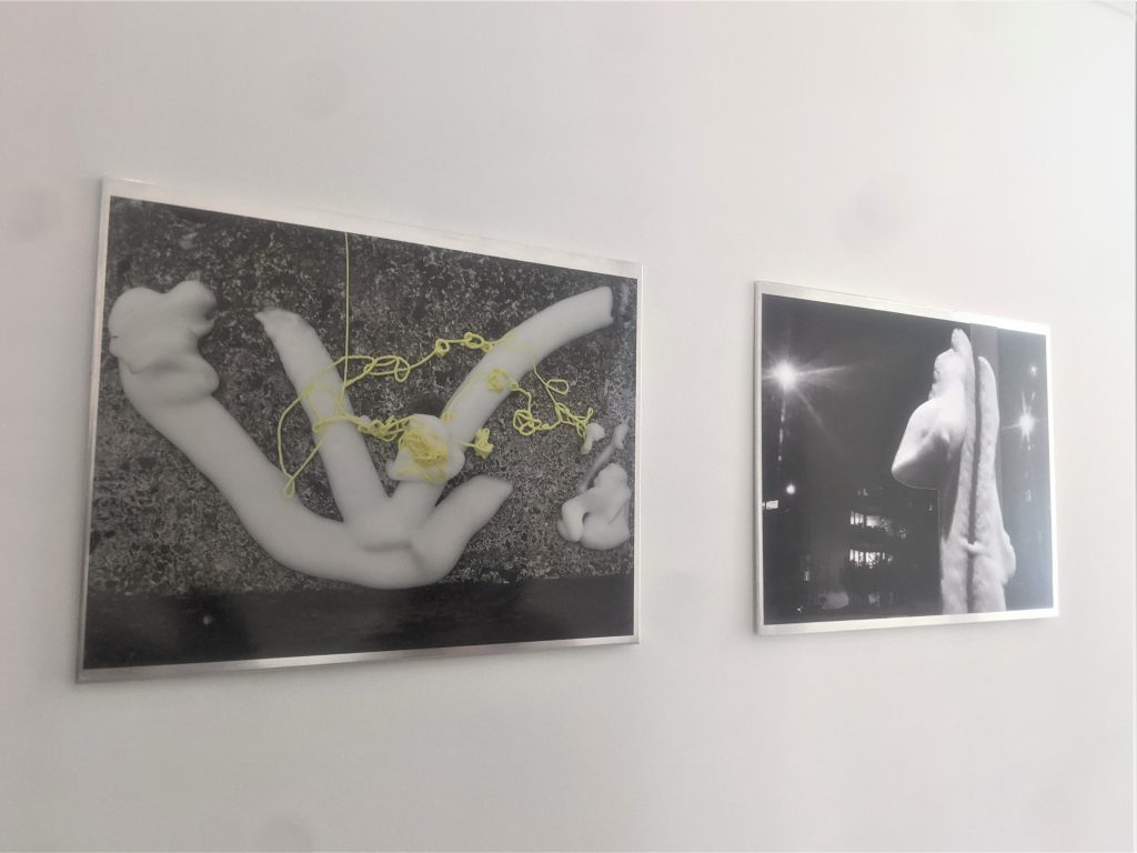
https://spruethmagers.com/exhibitions/peter-fischli-peter-fischli-london/
These collages, made up of photographs Fischli took at night, intrigued me because of the material seen on them. It is white shaping foam which unknown people had used to create a type of graffiti, ones which will is visible not for long before it dissolves. The material becomes a sort of reminder or transience.
Ryoji Ikeda @ 180 the Strand
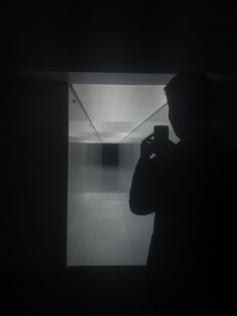
Spectra III (2021)
Ryoji Ikeda is a Japanese composer and conceptual artist whose work has a strong focus on immersion. He uses light, video installations and sound.
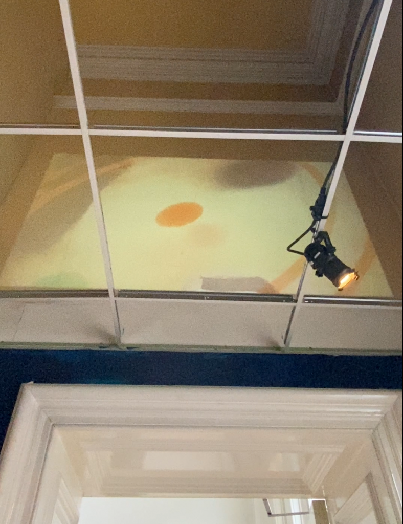
In one of his most recent pieces, Spectra III (2021), he has created a confined corridor out of bright white LED lights, which he has situated between 2 rooms at 180 The Strand, leaving the viewer without a choice but to walk through this corridor. The corridor is not only tight and claustrophobic, but the lights being emitted can also be considered intrusive. It is an overwhelming experience, one which transports you out of the physicality of the room you might be situated in and into an unrecognizable and somewhat spiritual place.
Here, I use the word spiritual to describe something intangible and out of this world. As I walked through the corridor, despite my awareness of it being a confined space, the structure of it began do blur and all I could see around me was infinite light and darkness at either end. It somewhat reminded me, conceptually, of the space I aimed to create in Blue Esc. and the idea of a neutral place or a void.
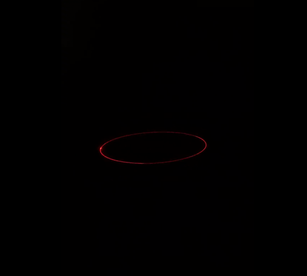
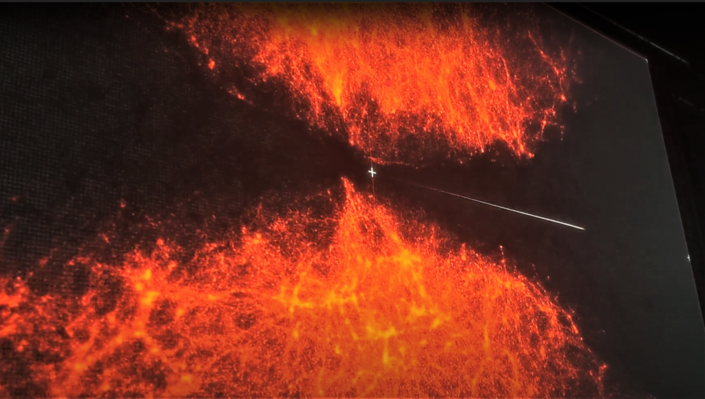
In the same space as Point of No Return, this red laser piece existed. A captivating and almost hypnotic experience. The darkness around it and it being situated on the floor created intrigue in exploring it’s surrounding whilst also leaving the viewer with a feeling that it is either protecting something or acts as a portal, which one could fall into. In my percpective, the fact that the piece next to it is called Point of No Return, says something about the nature of this piece. Possibly that once the space is entered, another dimension is entered and this ‘time travel’ becomes irreversible. The noise that accompanied the piece was a continuous buzz which I would compare to a machine calculating something such as the probability of certain events happening. On top of that, there was also a ping that could be heard every time this sort of portal reset. The combination of these sounds contributes to the hypnotic qualities of this piece through their linear and repetitive manner.
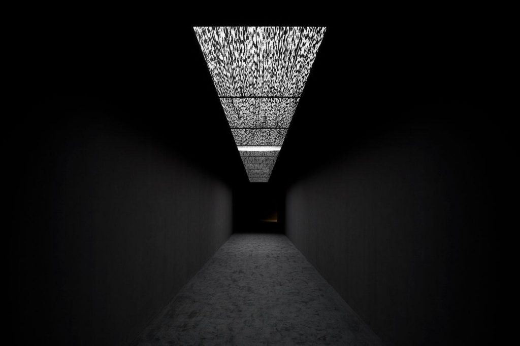
Data Flux (2021)
Photograph by Jack Hems
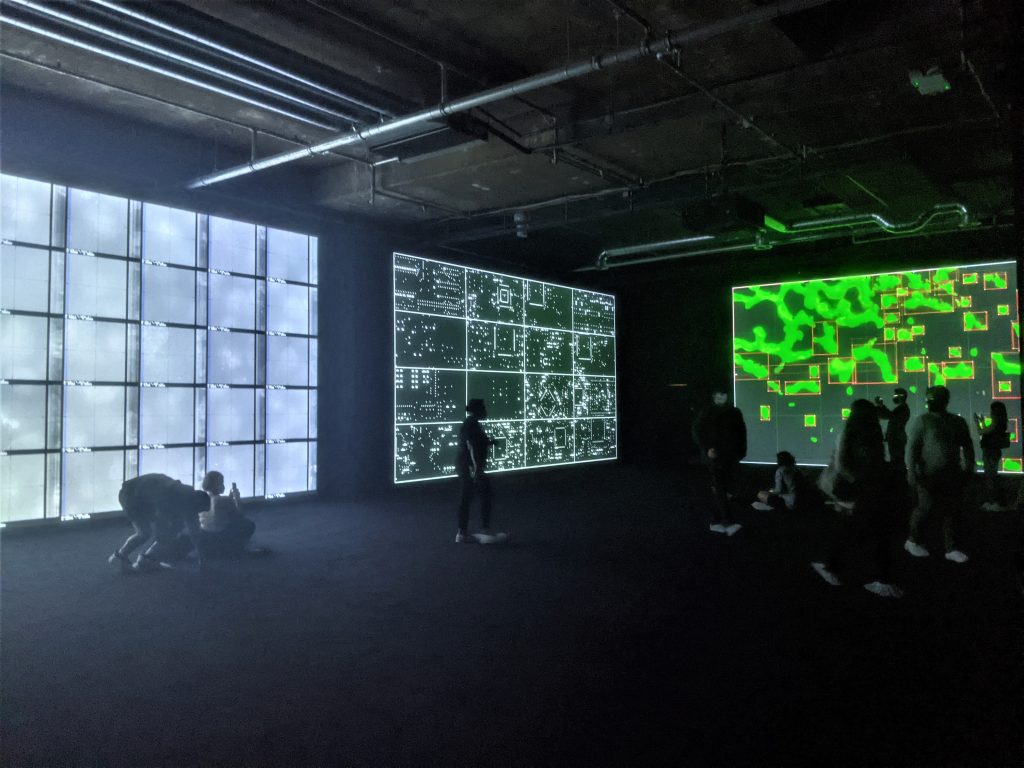
In this case the title of the work speaks for itself. When purely thinking about it as an installation, I would compare its structure to Spectra III, although my experience with it was not as intense. I was however interested in the graphics seen on the ceiling as this time around it was not pure LED light. The movement that appeared within the graphics were counteractive to the movement we as viewers took in following the tunnel towards the next stage of the exhibition. The flow nevertheless gave off some sense of time in comparison to the neutrality of Spectra III. The work also incorporated sounds and flashes and had a dooming feel of a never ending loop.
This work was one of the least intrusive when it comes to choice of installation, however the concept behind it was an information overload. I feel like Ikeda was presenting us with a lot of scientific information such as cells, brain scans to images of space. It all seemed almost apocalyptic, as if it was time for the next stage of human evolution and all this information was being saved onto a drive for safe keeping. The scale of projections along with the distinct and varying imagery being shown also created unease and confusion as to which one should be experiences first. As I sat there, I thought it is probably not about being able to see all the images all at once, the focus is conceptual and is based on the vast information that this particular work exhibits in the time span of about 10minutes or less. I end up sitting up close to one of the three works and trying to absorb as much visual information as my brain will allow me. It became an almost euphoric experience, despite the fact that I did not understand the meaning behind most of the images. It was the pure association I have of the visuals that was enough to take me on a mental journey.
