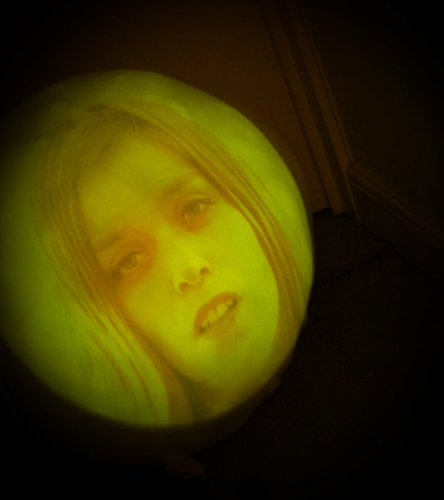
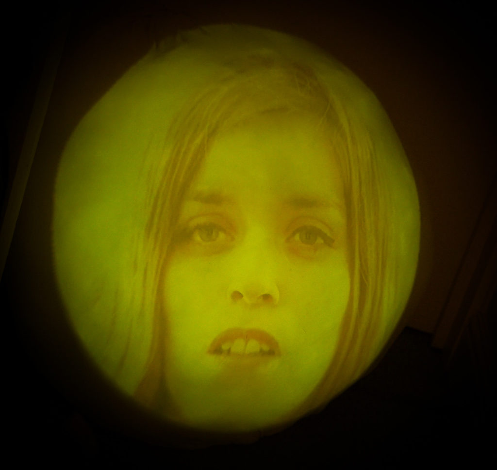
Experiments
The initial plan for this installation was to have a large oval shape sculpture at the high up left corner of the gallery as suggested in previous experiments at the Sound and Image installation. Due to currently being in a national lockdown, I went on with further experimentation as to how the work could potentially be exhibited from within my home or without having access to a physical gallery space. I started off by ordering the materials needed to realise the original projection onto a round sculpture idea and developed an imaginary installation from there, the process of which can be seen further into this page. Even though the original idea did not work out as planned, these experiments and the limits of my home in fact helped me realise that the installation fits better in a corridor as a confined space, rather than as a projection onto a sculpture.
Round Sculpture
Tony Oursler Inspired Installation in Corridor
I firstly had a browse as to what materials Tony Oursler had used for his work in The Dark Side exhibition. I came across a variety of materials however what I end up using was an artextile super soft virgin hollow fibre filling (polyester filling), which is what is used for the stuffing of cushion pads, pillow, and toys such as teddy bears. And as an outer layer which holds everything together I originally ordered nylon fabric, however what I received did not allow for any stretching of the material which was very important in creating the right shape. I went onto doing a bit more research into what would be the best material and end up selecting a viscose rayon lycra fabric which was closer to what I was looking for.
I then proceeded to assembling it all together which was more challenging than anticipated and I found it rather impossible to get the smooth outcome I was looking for. The following photographs are some of the experiments I conducted in attempting to create a trial installation of projecting onto the sculpture.
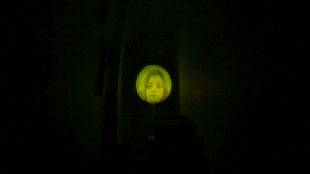
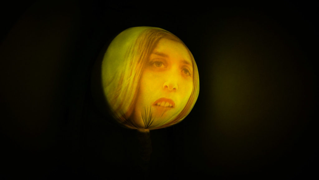
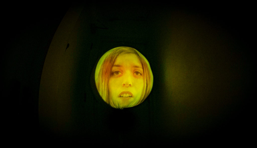
If you look closer, the impurity of the material can be seen. It being the elevations. There are also some visible creases however they contribute to distorting the image slightly and possibly to contribution to this distorted perception and cognition. Whilst the elevations present, simply create an unevenness in the projection colours.
This variation of the same installation was testing out the situation of the sculpture. Should it be floating or propped higher than eye level or lower. Tony Oursler had chosen to present his disembodied heads laying on the floor of the gallery which worked really well for communicating his concept. However as I was only focusing on 1 sculpture which is in a larger scale, positioning it on the floor just seem unnecessary.
Eventually the idea of having this sculpture overall collapsed as this work is meant to highly relay on the installation of it and this choice of installation didn’t really contribute to the entity of the work.
Projecting onto a non-uniform shape
The initial idea was to project the piece in the park, onto a tree in order to see a potential reaction from people walking by…
Would they stop to watch and experience?
Would they just glance at it?
Would they just not knowledge it at all?
A couple issues appeared with the idea of projecting in the park. One being, finding a power source as we came into lockdown as there wasn’t any sort of open establishment near the park which could allow for the powering of the projection. Another one the large amounts of paperwork and logistics to take into account when installing a work into a public space such as a park.
These reasons and the fact that I was purely aiming to project in the park in order to get people’s reaction rather than it being a final installation, led me to make the decision of not going ahead with it.
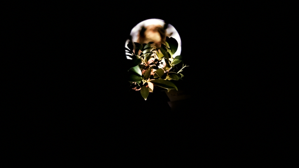
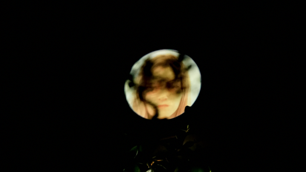
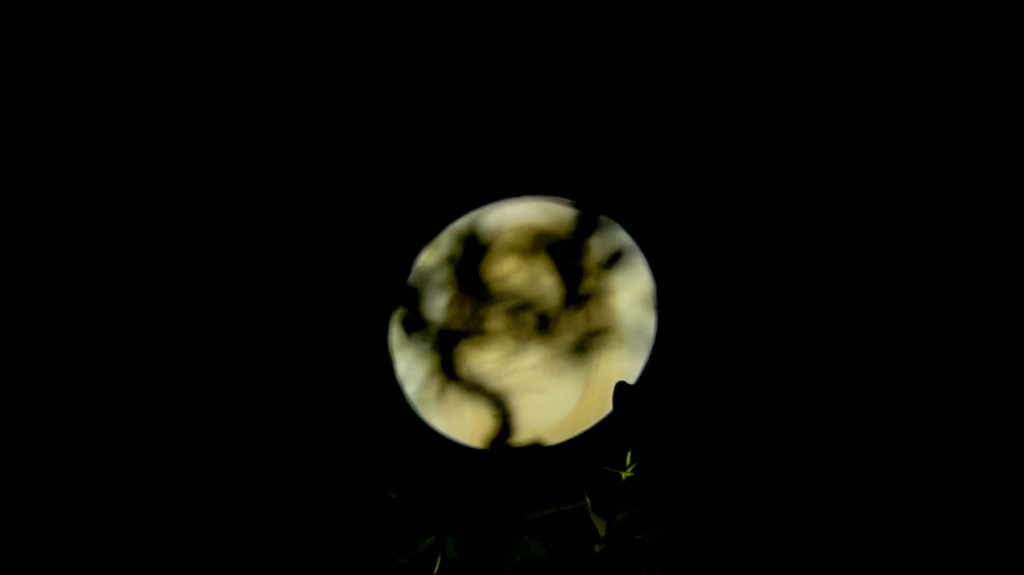
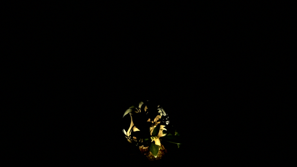
I did however do a a small experiment at home with a bonsai tree as a way of imagining the potential visuals further.
Blind
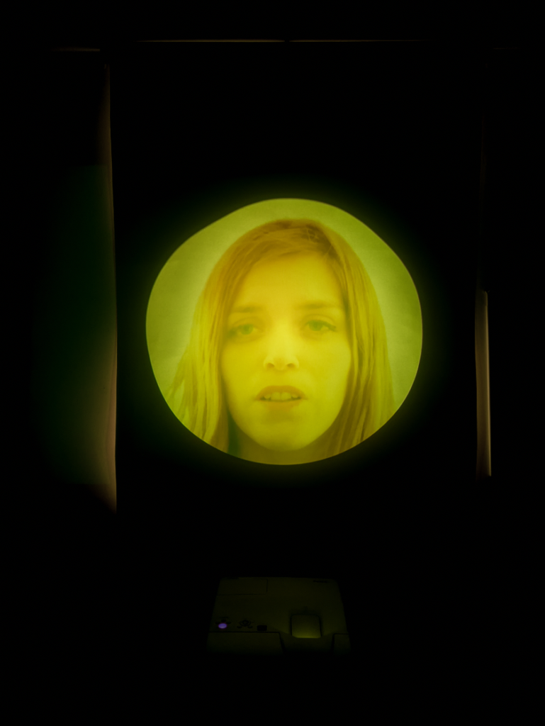
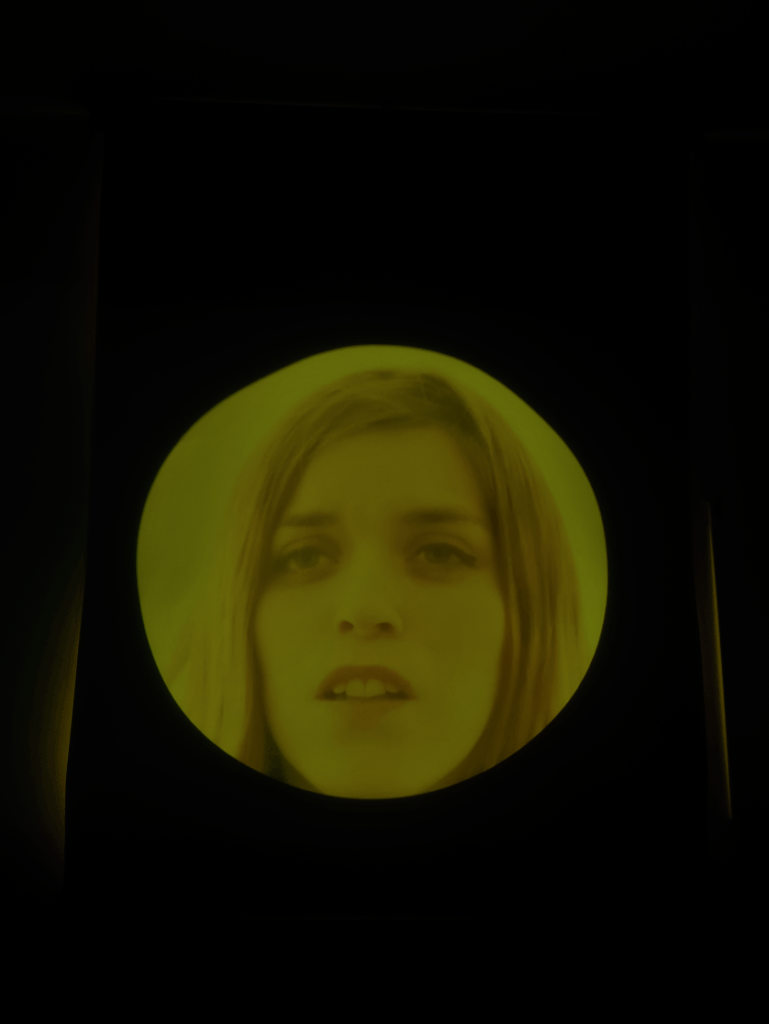
Projecting onto my blinds was an attempt of copying the use of a backdrop. An interesting effect was created by accident which was the light coming through at the back, as I hadn’t realised there was a breeze coming through a gap which led the blinds to move forward and let some light shine through, through the sides.
It is almost like an extension of the glow being produced from the projection itself.
Corridor Experiments
I went onto experimenting with the size and situation/level of the projection in a small corridor in my flat. I was trying out anything that was not eye level and was not the traditional way of exhibiting artwork.
The photos below are of the long angle projection, photographed from different angles.
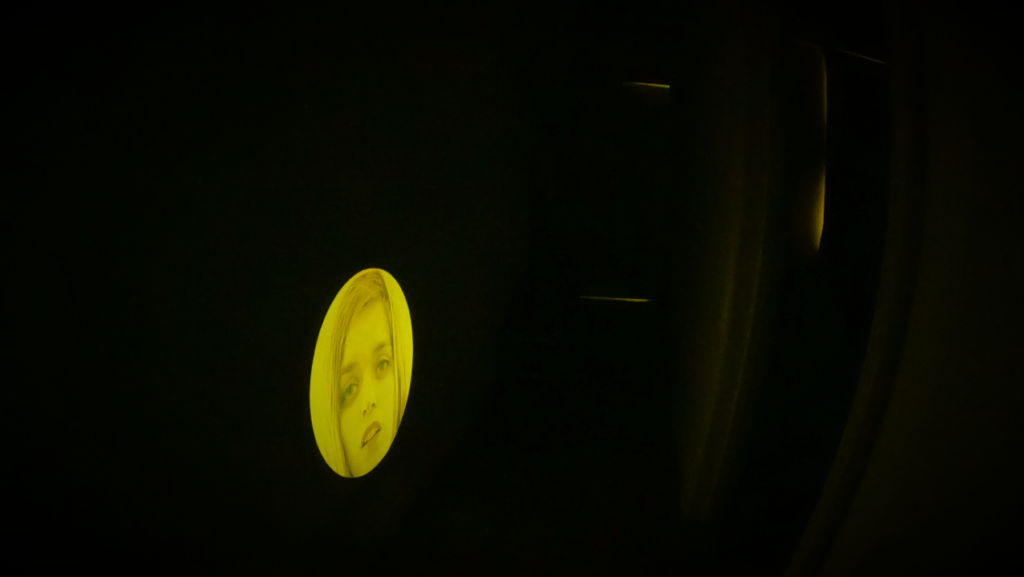
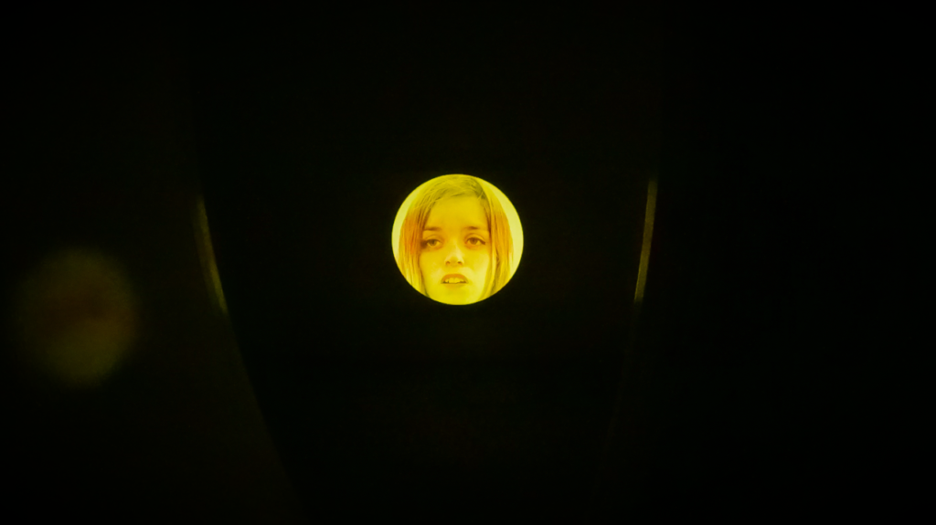
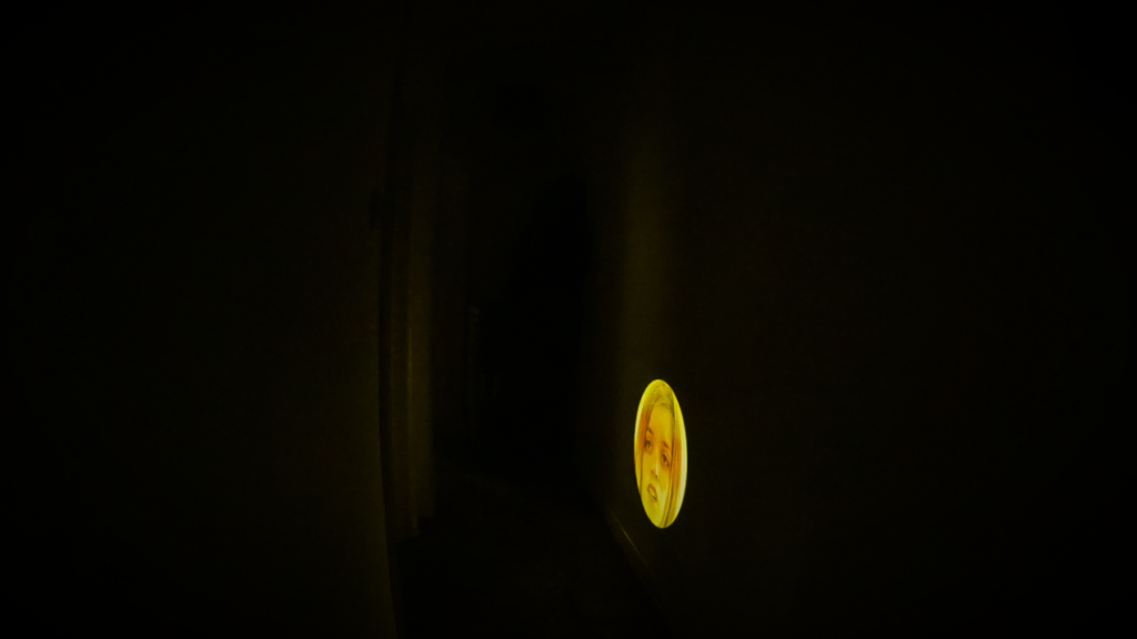
As I had already tried out a few ways of large scale projections, I decided to minimize the size of this one. I was inspecting whether the smaller scale possibly made the expressions more or less visible and in turn more or less engaging/intrusive or welcoming to the viewer. I also though about how wold someone watch this. Would the look down and have this superior point of view or would they sit on the floor and get really up-close and personal with the experience of the character? I would personally prefer the second scenario and so I feel like a larger scale work will inevitable be more up close and personal as the viewer would not have a chance of distancing themselves in the given environment of the confined space in a corridor.
Tracing Paper vs Stretched Viscose Lycra Fabric
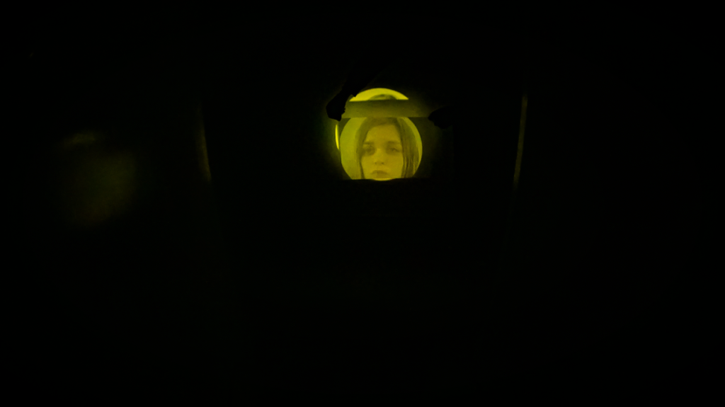
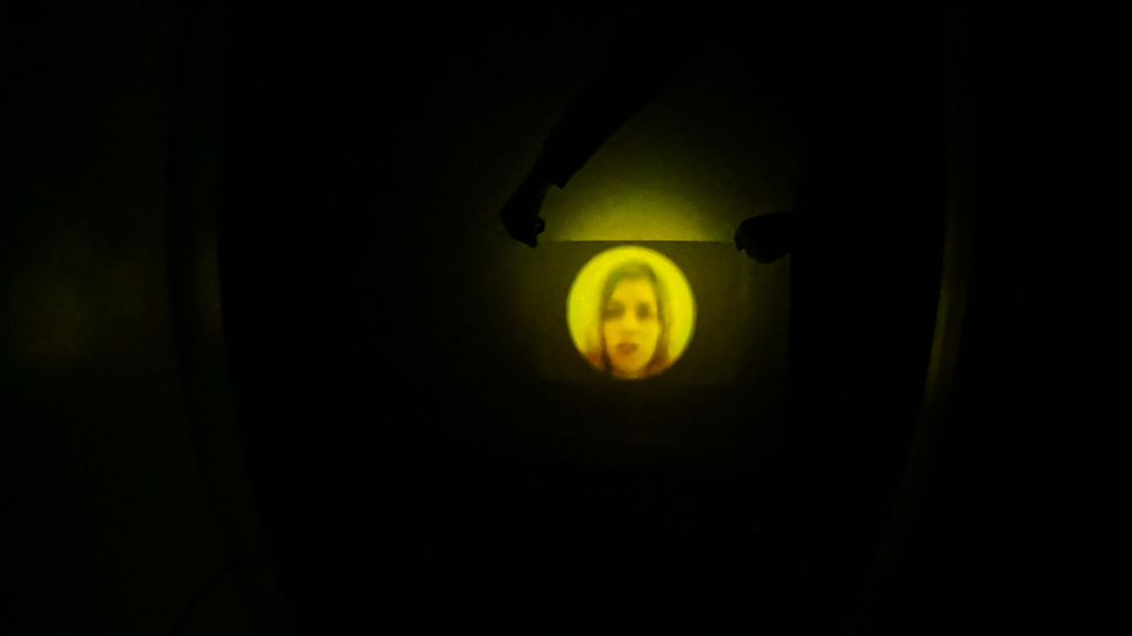
The next step in experimentation that I took was to think about multiplicity. As already mentioned I was looking for an installation of the piece which will contribute in directing the viewer as to how they would best experience the piece. The small scale experiment led me to believe that almost taking away the choice of distance for the viewer would work best. I then though about taking other choices away, such as the choice to look away. This is where multiplicity came in.
I initially tested it with a small piece of tracing paper and later moved onto using the viscose rayon lycra fabric whilst stretching it in order to allow more light through. As much as this 2 dimensional plain worked in communicating the invasive state of panic, the residue like look of the second projection coming through the material did not have a purpose. However, using the fabric to create this duality just confirmed the importance of the confined space for me in executing this project. This led me to the final choice of installation…
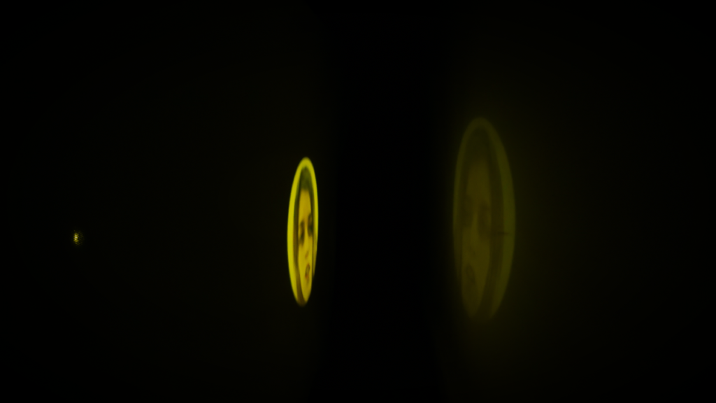
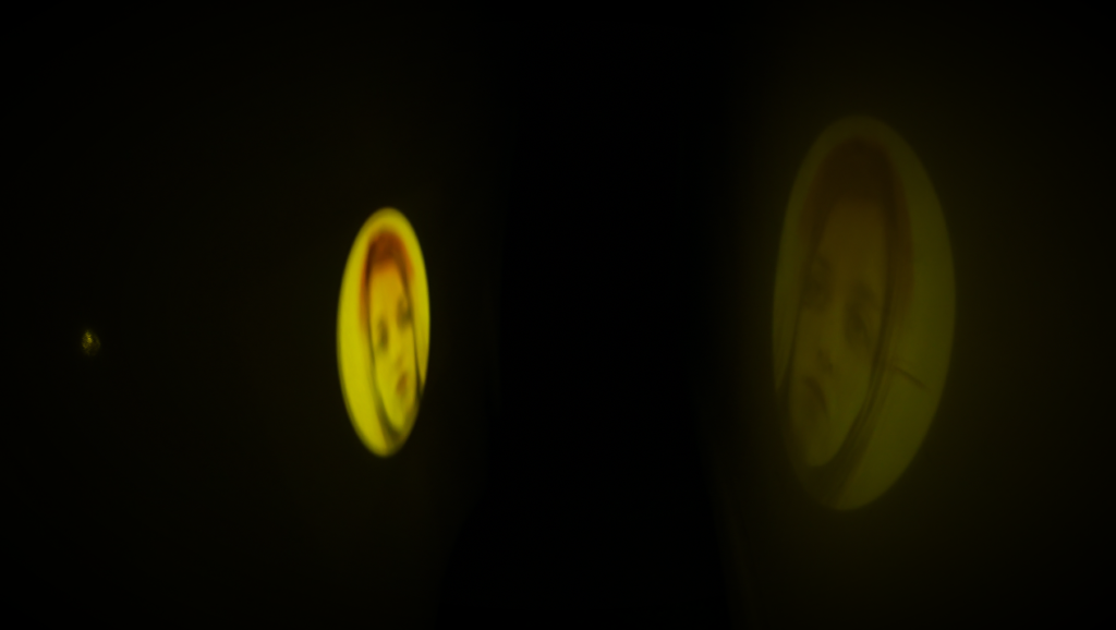
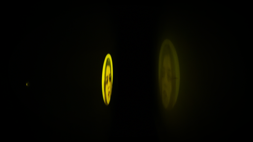
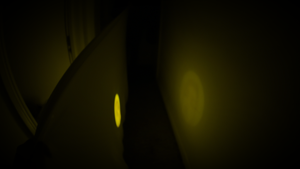
Final Choice of Installation
The final idea of installation is as follows:
To create a digital environment which presents a corridor. In this corridor there are multiple projections of the video work and they are all running at within different time-continuation whilst also being on a loop. The sound is also on a loop which makes it synchronous to only one of the visuals and asynchronous with the rest. As this is a digital installation, the sound is simply required to be played on laptop whilst video is playing, either through laptop speakers or headphones as there is no refined quality to it which requires high quality equipment in order to experience the sound.
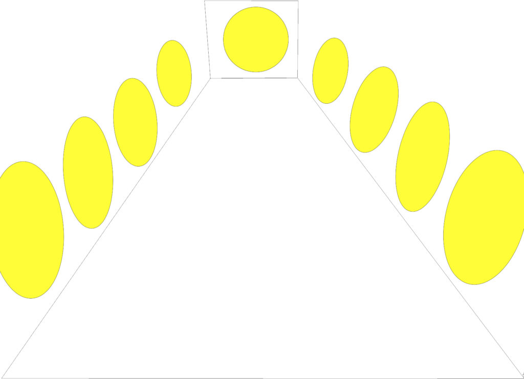
I started off by creating a simple sketch on photoshop to visualise the idea as seen on the left hand-side here. The yellow circles being representation of the videos. Although this sketch came out more spacious than anticipated, it is only for the purpose of visualising what I would further like to achieve in premiere pro as the final digital installation. It was also made with the purpose of thinking about the logistics of where to position projectors and etc, which would ideally be short-throw projectors which I can either mount to the ceiling or the top of the walls if the walls would be moveable gallery walls combined together to create this corridor.
Below we can see the final installation when put together in premiere pro. I simply used the basic 3D perspective in order to twist the plain of the video and re-arrange it as the walls of a corridor. I then went onto shifting the videos within the sequence around to achieve the best possible order of appearance and continuation of the videos. It was very important for me that they do not appear all together, but also do not appear in set intervals of 30 seconds for example but rather in a more chaotic manner, the way intrusive thought of anxiety and of panic would infest ones mind.
Please refer to the final page within Expanded Artforms called Expressions which is the title of this work.
The Expressions Page is the dedicated to the installation of this work. The work there is accompanied by a 500 word statement which aims at summarising the entity of it.
